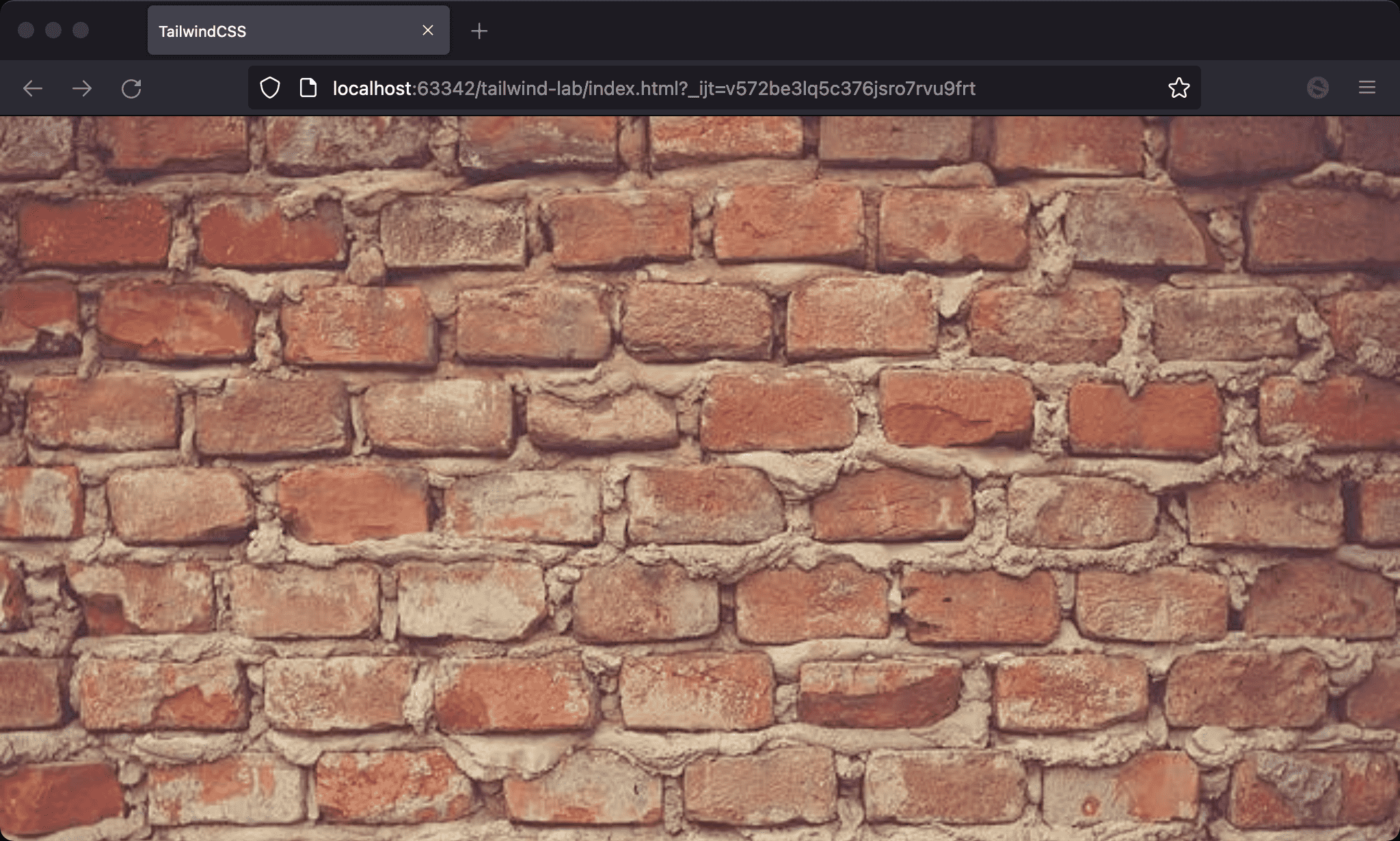
We can use w-screen to set the width of the element as viewport.
Version
TailwindCSS 3.0
w-screen

The width is stretched to the viewport.
<!doctype html>
<html lang="en">
<head>
  <meta charset="UTF-8">
  <meta name="viewport" content="width=device-width, initial-scale=1.0">
  <script src="https://cdn.tailwindcss.com"></script>
  <title>TailwindCSS</title>
</head>
<body>
  <img class="w-screen" src="https://picsum.photos/640/480/?random=10">
</body>
</html>
Line 10
<img class="w-screen" src="https://picsum.photos/640/480/?random=10">
w-screen: width is the same as viewport
Conclusion
w-fulliswidth: 100%, whereasw-screeniswidth: 100vw