We can use w-min to let the content decide the smallest width of the box without overflowing.
Version
TailwindCSS 3.0
w-min
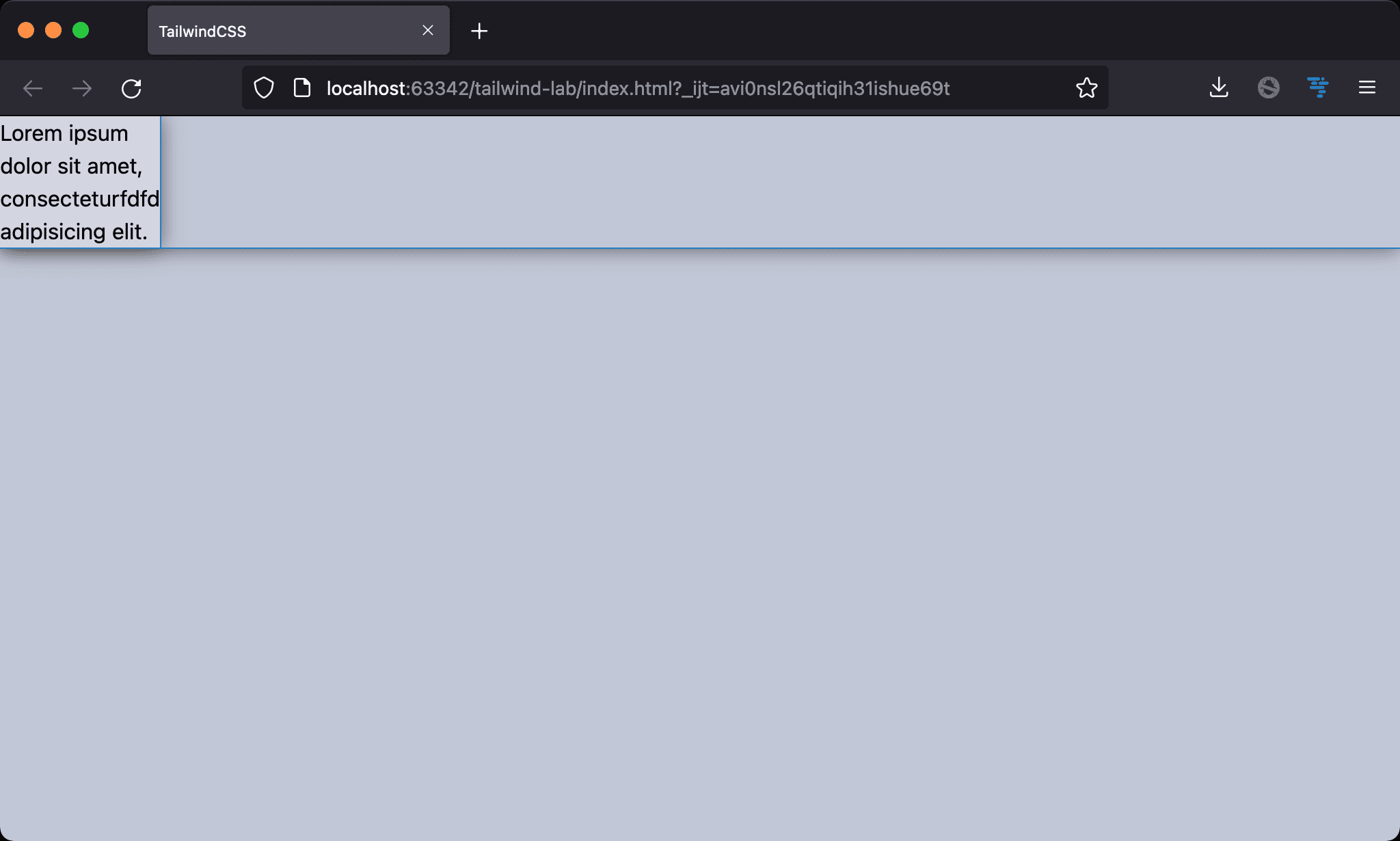
The box’s width is determined by the longest word.
<!doctype html>
<html lang="en">
<head>
  <meta charset="UTF-8">
  <meta name="viewport" content="width=device-width, initial-scale=1.0">
  <script src="https://cdn.tailwindcss.com"></script>
  <title>TailwindCSS</title>
</head>
<body>
  <div class="w-min">Lorem ipsum dolor sit amet, consecteturfdfd adipisicing elit.</div>
</body>
</html>
Line 10
<div class="w-min">Lorem ipsum dolor sit amet, consecteturfdfd adipisicing elit.</div>
w-min: the smallest size a box can take without overflowing its content. The content wraps for the smallest box size. The final width is decided by the length of the widest bit of content in the box and automatically sets that length value as the box width
figure

We often use w-min for <figure> with <img> and <figcaption>. When only w-min is used with <figure>, the result looks horrible. Since <img> also shrinks to the smallest width as <figcaption>.
<!doctype html>
<html lang="en">
<head>
  <meta charset="UTF-8">
  <meta name="viewport" content="width=device-width, initial-scale=1.0">
  <script src="https://cdn.tailwindcss.com"></script>
  <title>TailwindCSS</title>
</head>
<body>
  <figure class="w-min">
    <img src="https://picsum.photos/300/200/?random=10">
    <figcaption>Lorem ipsum dolor sit amet, consectetur adipisicing elit. A amet assumenda debitis, doloremque, earum id inventore laborum minus neque quam quasi quia quos reiciendis sequi suscipit tempora totam, ut veniam</figcaption>
  </figure>
</body>
</html>
Line 10
<figure class="w-min">
  <img src="https://picsum.photos/300/200/?random=10">
  <figcaption>Lorem ipsum dolor sit amet, consectetur adipisicing elit. A amet assumenda debitis, doloremque, earum id inventore laborum minus neque quam quasi quia quos reiciendis sequi suscipit tempora totam, ut veniam</figcaption>
</figure>
w-min: applyw-minto<figure>. The smallest width is determined by<img>and<figcaption>
We should let
<img>decide the smallest width, not<figcaption>
max-w-none

<img> determines the smallest width, not <figcaption>. This is what we want.
<!doctype html>
<html lang="en">
<head>
  <meta charset="UTF-8">
  <meta name="viewport" content="width=device-width, initial-scale=1.0">
  <script src="https://cdn.tailwindcss.com"></script>
  <title>TailwindCSS</title>
</head>
<body>
  <figure class="w-min">
    <img class="max-w-none" src="https://picsum.photos/300/200/?random=10">
    <figcaption>Lorem ipsum dolor sit amet, consectetur adipisicing elit. A amet assumenda debitis, doloremque, earum id inventore laborum minus neque quam quasi quia quos reiciendis sequi suscipit tempora totam, ut veniam</figcaption>
  </figure>
</body>
</html>
Line 10
<figure class="w-min">
  <img class="max-w-none" src="https://picsum.photos/300/200/?random=10">
  <figcaption>Lorem ipsum dolor sit amet, consectetur adipisicing elit. A amet assumenda debitis, doloremque, earum id inventore laborum minus neque quam quasi quia quos reiciendis sequi suscipit tempora totam, ut veniam</figcaption>
</figure>
w-min: applyw-minto<figure>. The smallest width is determined by<img>and<figcaption>max-w-none: TailwindCSS has reset CSS of<img>tomax-w-full. This makes<img>‘s width is changeable. So<img>shrinks to the smallest width as<figcaption>. We have to setmax-w-noneso let its width is unchangeable.<img>will decide the final width ofw-min
Conclusion
- Since TailwindCSS has reset
<img>frommax-w-nonetomax-w-full, this makes the behavior ofw-minfor<figure>is different from Vanilla CSS
Reference
Ibadehin Mojeed, Understanding min-content, max-content, and fit-content in CSS