Block element uses w-auto for width. It will occupy the full width of the parent element. We can use w-fit to make width as the content width, then use m-auto to adjust margin automatically for horizontal center.
Version
TailwindCSS 3.0
w-auto
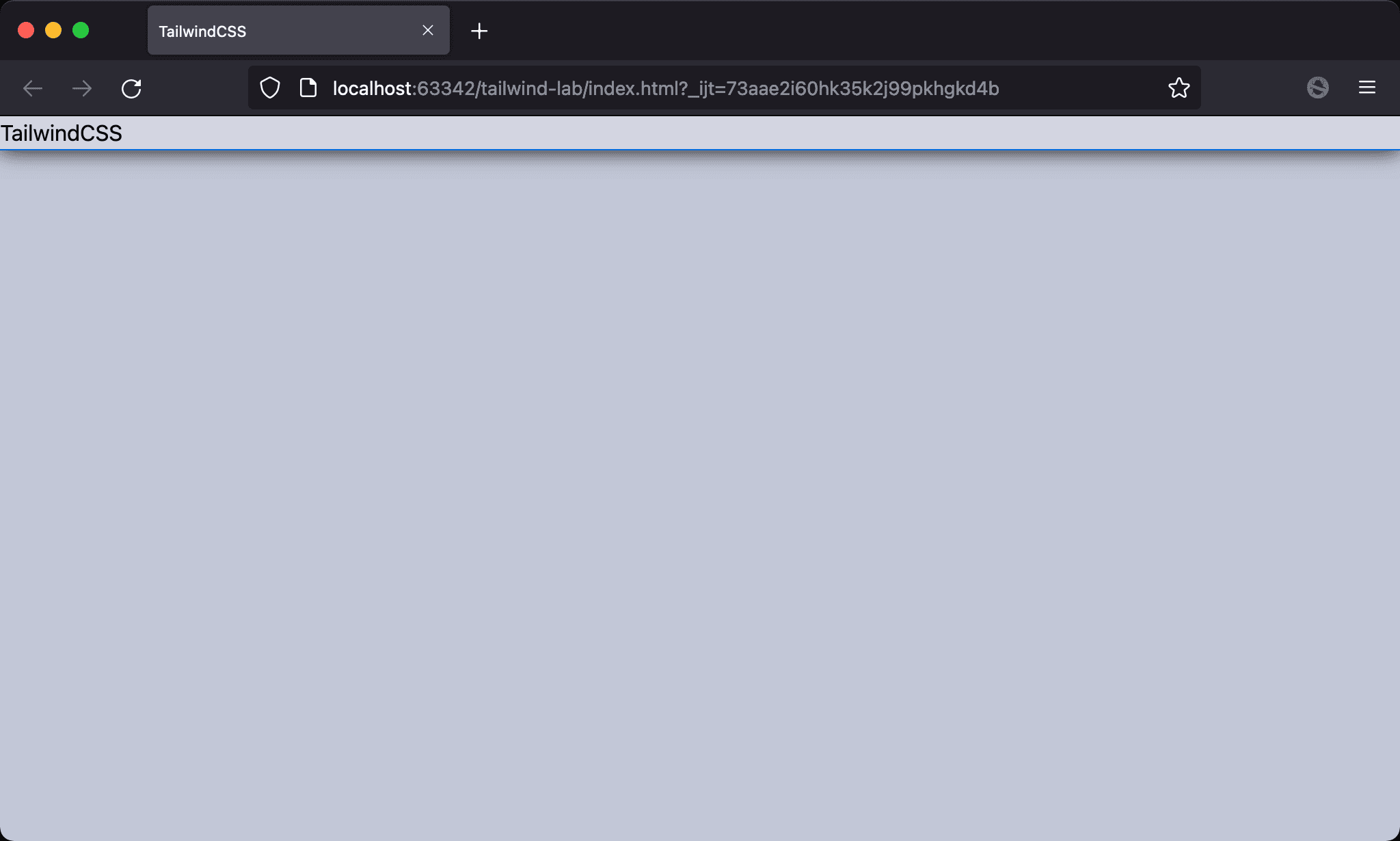
Block element will occupy the full width of the parent element.
<!doctype html>
<html lang="en">
<head>
  <meta charset="UTF-8">
  <meta name="viewport" content="width=device-width, initial-scale=1.0">
  <script src="https://cdn.tailwindcss.com"></script>
  <title>TailwindCSS</title>
</head>
<body>
  <div class="w-auto">TailwindCSS</div>
</body>
</html>
w-auto: adjust width to occupy the parent width. This is the default utility for block element. So we often ignore this utility
w-fit
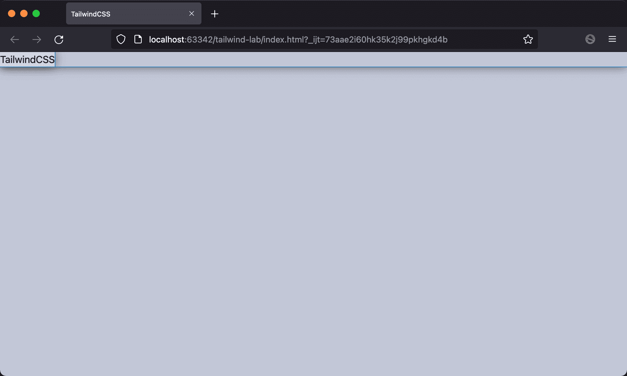
The width of TailwindCSS is shrunk as the content width.
<!doctype html>
<html lang="en">
<head>
  <meta charset="UTF-8">
  <meta name="viewport" content="width=device-width, initial-scale=1.0">
  <script src="https://cdn.tailwindcss.com"></script>
  <title>TailwindCSS</title>
</head>
<body>
  <div class="w-fit">TailwindCSS</div>
</body>
</html>
w-fit:adjust the width automatically as the content width
m-auto
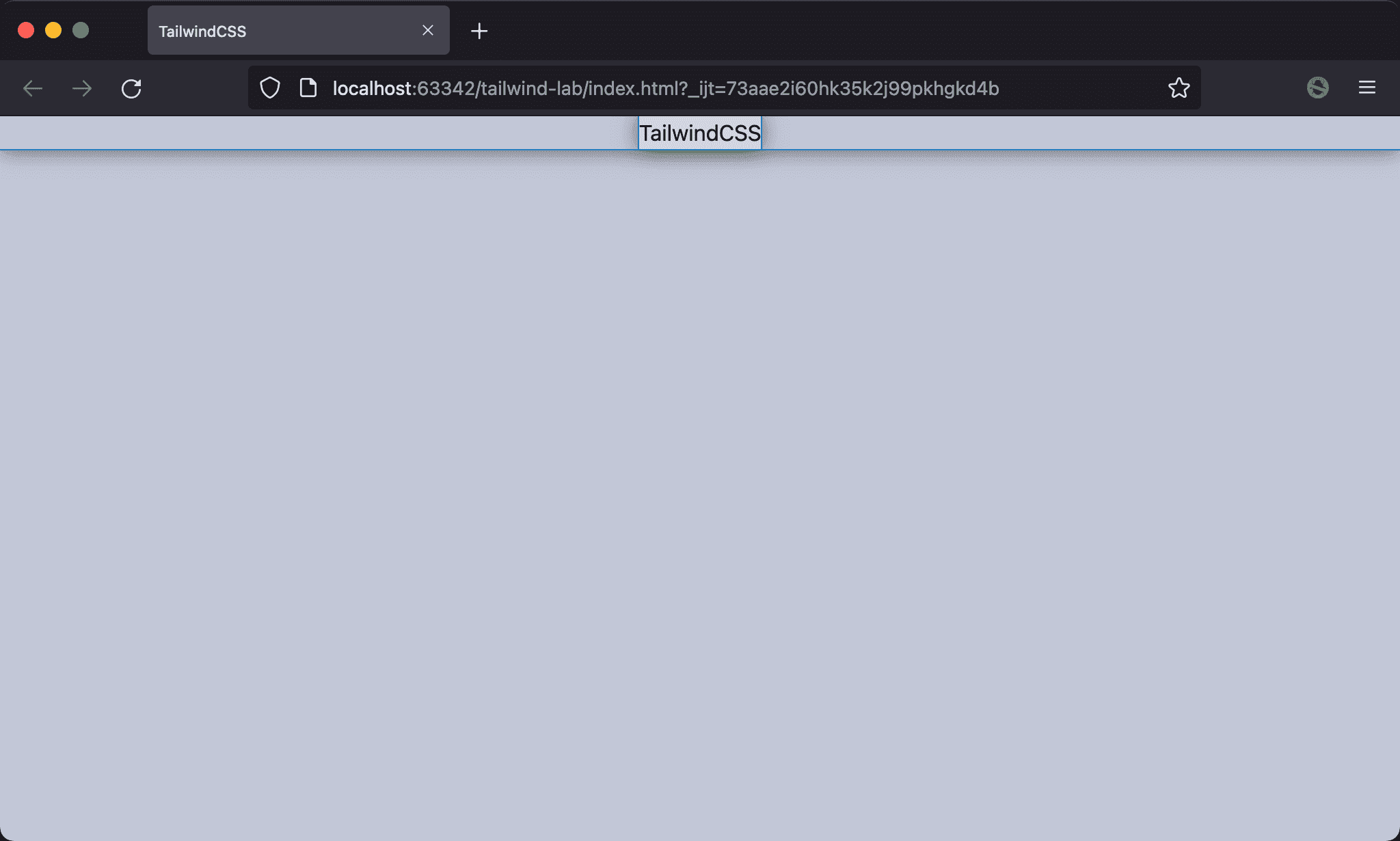
TailwindCSS is horizontal center.
<!doctype html>
<html lang="en">
<head>
  <meta charset="UTF-8">
  <meta name="viewport" content="width=device-width, initial-scale=1.0">
  <script src="https://cdn.tailwindcss.com"></script>
  <title>TailwindCSS</title>
</head>
<body>
  <div class="w-fit m-auto">TailwindCSS</div>
</body>
</html>
w-fit: adjust the width automatically as the content widthm-auto: adjust the available space for margin to horizontal center
Conclusion
w-fitis a new utility in TailwindCSS 3 which iswidth: fit-contentin CSS 3w-fitmakes the element with available space to usem-autoto horizontal center