If we don’t set width of the element, the width is automatically adjusted by the viewport. We can apply min-w to ensure a minimum width.
Version
TailwindCSS 3.0
width

The width of TailwindCSS is adjusted automatically by the viewport, but the width may shrink too much.
<!doctype html>
<html lang="en">
<head>
<meta charset="UTF-8">
<meta name="viewport" content="width=device-width, initial-scale=1.0">
<script src="https://cdn.tailwindcss.com"></script>
<title>TailwindCSS</title>
</head>
<body>
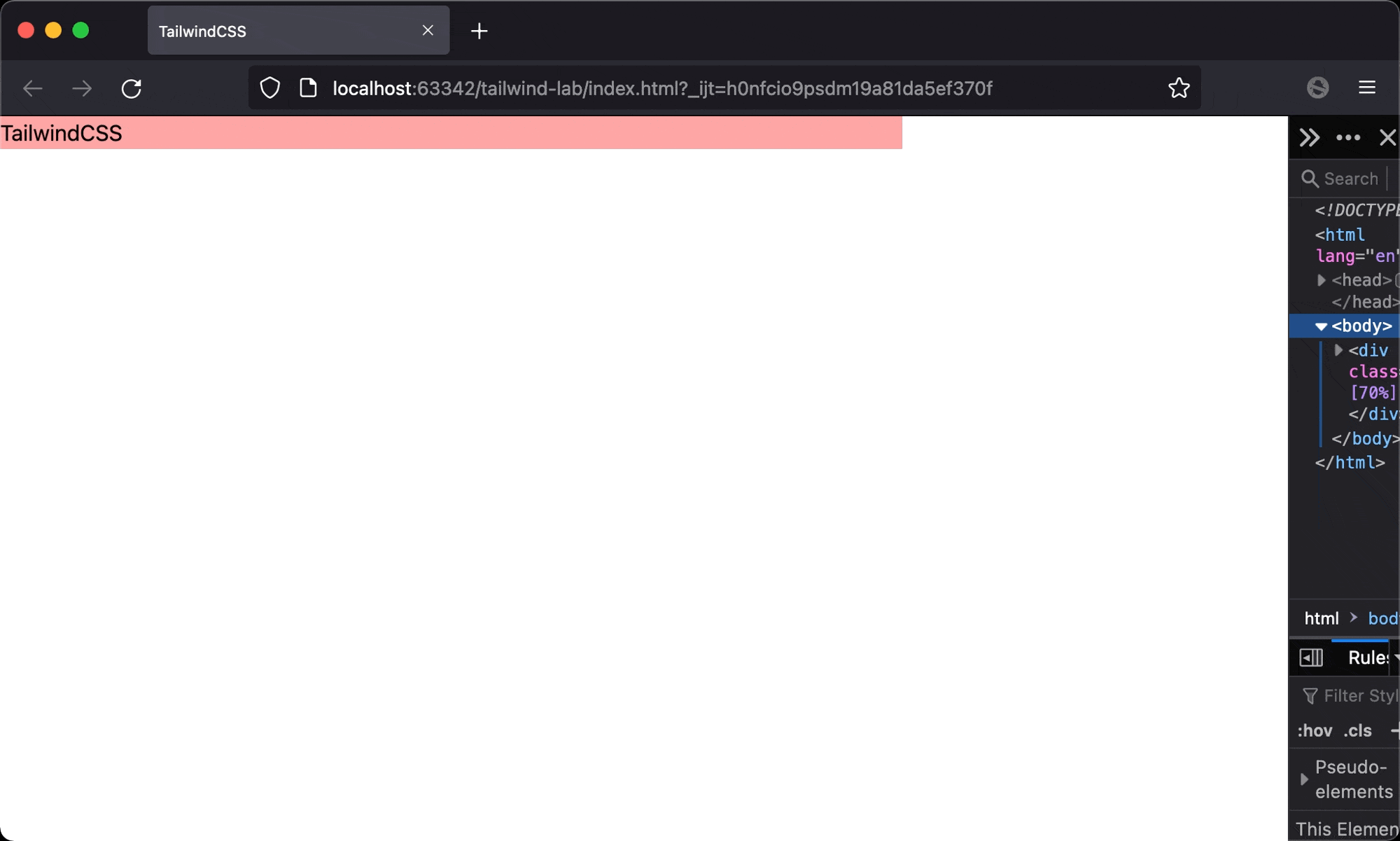
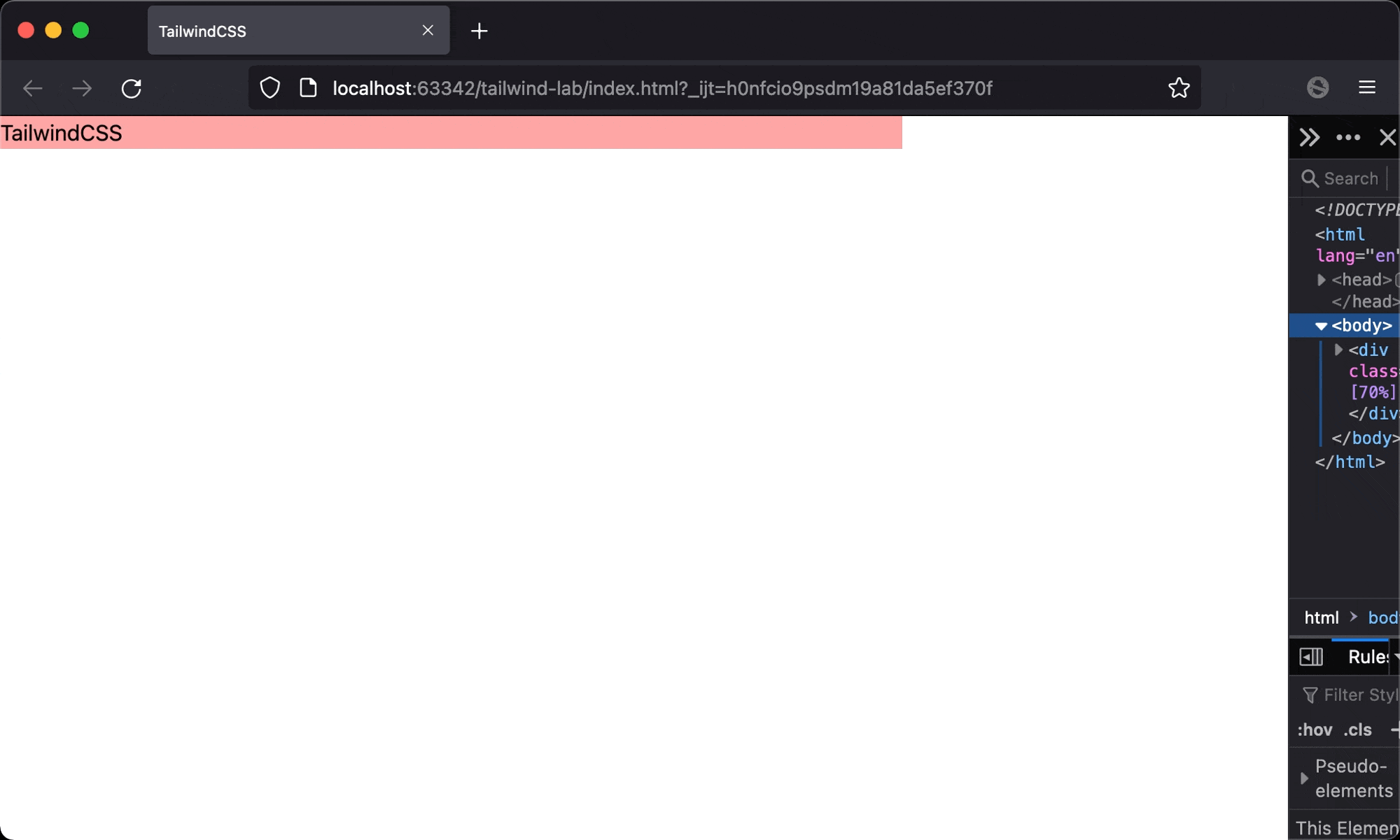
<div class="w-[70%]">
<div class="bg-red-300">TailwindCSS</div>
</div>
</body>
</html>
Line 10
<div class="w-[70%]">
  <div class="bg-red-300">TailwindCSS</div>
</div>
w-[70%]: the width of the parent element ofTailwindCSSis70%relative to<body>- No
widthis specified toTailwindCSS, so the width ofTailwindCSSis occupied by the width of the parent element - If the viewport is too narrow,
TailwindCSSwill be shrunk too much
min-width
The width of TailwindCSS is adjusted automatically by the viewport, but there is a minimum width of TailwindCSS.
<!doctype html>
<html lang="en">
<head>
  <meta charset="UTF-8">
  <meta name="viewport" content="width=device-width, initial-scale=1.0">
  <script src="https://cdn.tailwindcss.com"></script>
  <title>TailwindCSS</title>
</head>
<body>
  <div class="w-[70%]">
    <div class="min-w-[100px] bg-red-300">TailwindCSS</div>
  </div>
</body>
</html>
Line 10
<div class="w-[70%]">
  <div class="min-w-[100px] bg-red-300">TailwindCSS</div>
</div>
min-w-[100px]: set minimun width ofTailwindCSSto100px
min-w-fit
If the content is fixed, we can just specify a fixed value to min-w, but how about the content is from the database or variable?
<!doctype html>
<html lang="en">
<head>
  <meta charset="UTF-8">
  <meta name="viewport" content="width=device-width, initial-scale=1.0">
  <script src="https://cdn.tailwindcss.com"></script>
  <title>TailwindCSS</title>
</head>
<body>
  <div class="w-[70%]">
    <div class="min-w-fit bg-red-300">TailwindCSS</div>
  </div>
</body>
</html>
Line 10
<div class="w-[70%]">
  <div class="min-w-fit bg-red-300">TailwindCSS</div>
</div>
min-w-fit: set minimum width to fit content, we don’t have to specifiy a fixed value to minimun width
Conclusion
- We won’t use
w-andmin-wat the same time. Since whenw-is applied, the width of the element is fixed and can’t be changed by the content or viewport - If the content is fixed, we can just specify a fixed value for
min-w, but usingmin-w-fitis a better way for any content