Since relative is offset by the original element, it may overlap other elements. We have to consider overlap priority to determine the final HTML result.
Version
TailwindCSS 3.0
flex
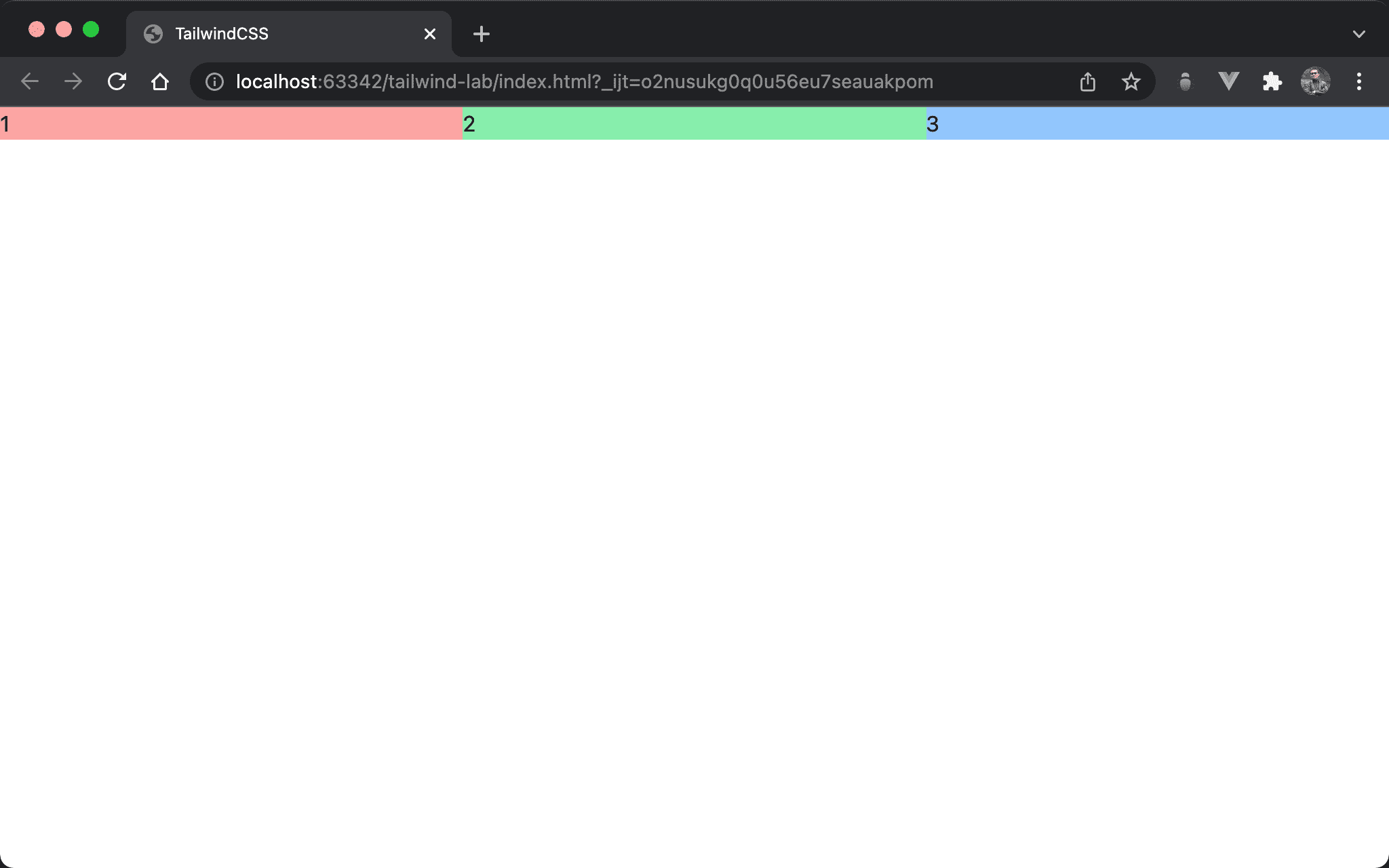
3 columns are divided equally in the horizontal direction.
<!doctype html>
<html lang="en">
<head>
  <meta charset="UTF-8">
  <meta name="viewport" content="width=device-width, initial-scale=1.0">
  <script src="https://cdn.tailwindcss.com"></script>
  <title>TailwindCSS</title>
</head>
<body>
  <div class="flex">
    <div class="w-1/3 bg-red-300">1</div>
    <div class="w-1/3 bg-green-300">2</div>
    <div class="w-1/3 bg-blue-300">3</div>
  </div>
</body>
</html>
Line 10
<div class="flex">
  <div class="w-1/3 bg-red-300">1</div>
  <div class="w-1/3 bg-green-300">2</div>
  <div class="w-1/3 bg-blue-300">3</div>
</div>
flex: use flex on the sub-layer elementw-1/3: set column widthbg-red-300: set background color
Overlap
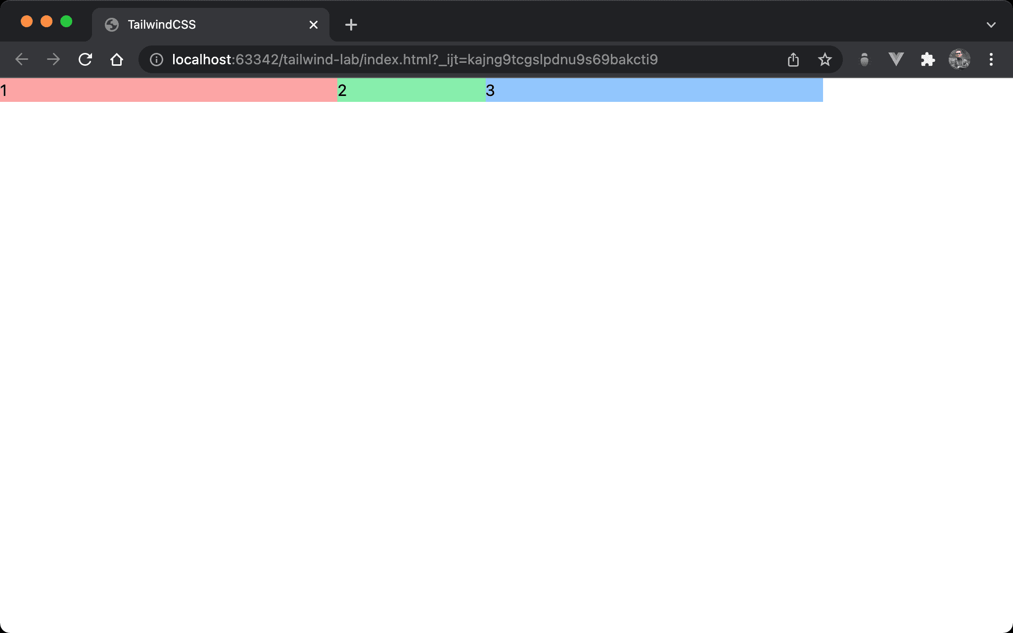
The blue box of item 3 overlaps the green box of item 2.
<!doctype html>
<html lang="en">
<head>
  <meta charset="UTF-8">
  <meta name="viewport" content="width=device-width, initial-scale=1.0">
  <script src="https://cdn.tailwindcss.com"></script>
  <title>TailwindCSS</title>
</head>
<body>
  <div class="flex">
    <div class="w-1/3 bg-red-300">1</div>
    <div class="w-1/3 bg-green-300 -mr-48">2</div>
    <div class="w-1/3 bg-blue-300">3</div>
  </div>
</body>
</html>
Line 12
<div class="w-1/3 bg-green-300 -mr-48">2</div>
w-1/3: set column widthbg-green-300: set background color-mr-48: since themargin-rightof item 2 is minus, the blue box of item 3 overlaps the green box of item 2
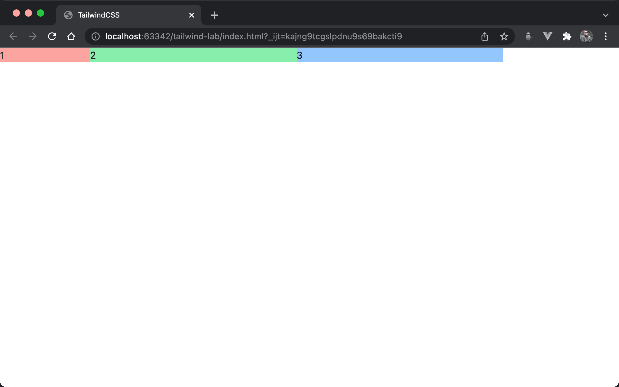
The green box of item 2 overlaps the red box of item 1.
<!doctype html>
<html lang="en">
<head>
  <meta charset="UTF-8">
  <meta name="viewport" content="width=device-width, initial-scale=1.0">
  <script src="https://cdn.tailwindcss.com"></script>
  <title>TailwindCSS</title>
</head>
<body>
  <div class="flex">
    <div class="w-1/3 bg-red-300">1</div>
    <div class="w-1/3 bg-green-300 -ml-48">2</div>
    <div class="w-1/3 bg-blue-300">3</div>
  </div>
</body>
</html>
Line 12
<div class="w-1/3 bg-green-300 -ml-48">2</div>
w-1/3: set column widthbg-green-300: set background color-ml-48: since themargin-leftof item 2 is minus, the green box of item 2 overlaps the red box of item 1
It can be found that under the flow layout, the later HTML will overlap the front. That is, the HTML position determines the final result.
Overlap with relative

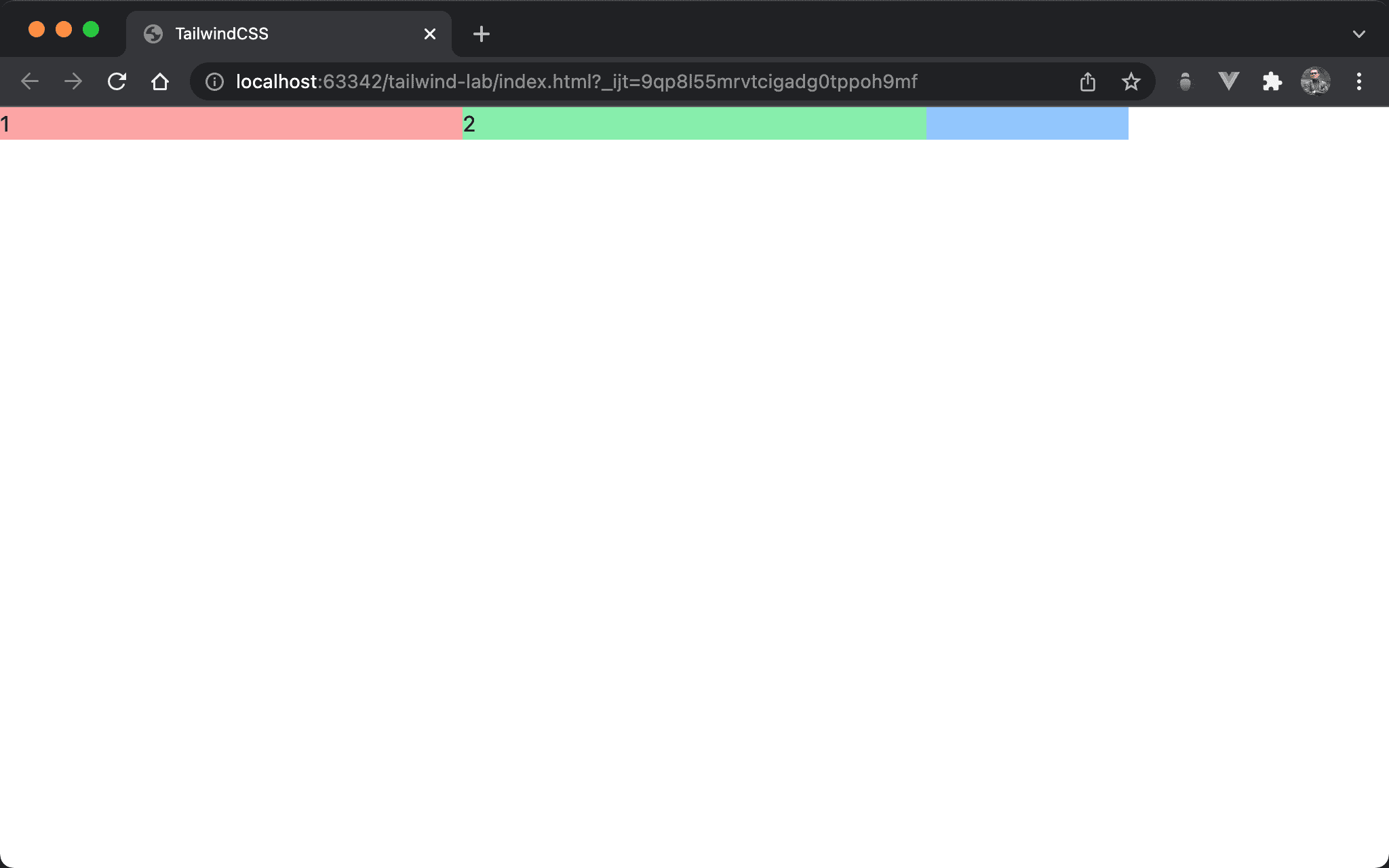
The green box of item 2 overlaps the blue box of item 2.
<!doctype html>
<html lang="en">
<head>
  <meta charset="UTF-8">
  <meta name="viewport" content="width=device-width, initial-scale=1.0">
  <script src="https://cdn.tailwindcss.com"></script>
  <title>TailwindCSS</title>
</head>
<body>
  <div class="flex">
    <div class="w-1/3 bg-red-300">1</div>
    <div class="w-1/3 bg-green-300 relative -mr-48">2</div>
    <div class="w-1/3 bg-blue-300">3</div>
  </div>
</body>
</html>
Line 12
<div class="w-1/3 bg-green-300 relative -mr-48">2</div>
w-1/3: set column widthbg-green-300: set background colorrelative: use relative position on item 2-mr-48:margin-rightof item 2 is still minus, but item 2 isrelativenow, the overlap priority is increased. That’s why the green box of item 2 overlaps the blue box of item 3
relativeincreases the overlap priority of original HTML.

The blue box of item 2 overlaps the green box of item 2.
<!doctype html>
<html lang="en">
<head>
  <meta charset="UTF-8">
  <meta name="viewport" content="width=device-width, initial-scale=1.0">
  <script src="https://cdn.tailwindcss.com"></script>
  <title>TailwindCSS</title>
</head>
<body>
  <div class="flex">
    <div class="w-1/3 bg-red-300">1</div>
    <div class="w-1/3 bg-green-300 relative -mr-48">2</div>
    <div class="w-1/3 bg-blue-300 relative">3</div>
  </div>
</body>
</html>
Line 12
<div class="w-1/3 bg-green-300 relative -mr-48">2</div>
<div class="w-1/3 bg-blue-300 relative">3</div>
w-1/3: set column widthbg-green-300: set background colorrelative: both item 2 and item 3 userelative-mr-48:margin-rightof item 2 is minus. Since both item 2 and item 3 arerelative, The overlap priorities are the same, so the HTML position determines the final result. The blue box of item 3 overlaps the greed box of item 2
z-Index
The green box of item 2 overlaps the blue box of item 3 again.
<!doctype html>
<html lang="en">
<head>
  <meta charset="UTF-8">
  <meta name="viewport" content="width=device-width, initial-scale=1.0">
  <script src="https://cdn.tailwindcss.com"></script>
  <title>TailwindCSS</title>
</head>
<body>
  <div class="flex">
    <div class="w-1/3 bg-red-300">1</div>
    <div class="w-1/3 bg-green-300 relative -mr-48 z-10">2</div>
    <div class="w-1/3 bg-blue-300 relative">3</div>
  </div>
</body>
</html>
Line 12
<div class="w-1/3 bg-green-300 relative -mr-48 z-10">2</div>
<div class="w-1/3 bg-blue-300 relative">3</div>
w-1/3: set column widthbg-green-300: set background colorrelative: both item 2 and item 3 userelative-mr-48:margin-rightof item 2 is minusz-10: item 2 withz-indexto10, butz-indexof item 3 is default to0. The overlap priority of item 2 is higher than item 3 again
Conclusion
- Under flow layout, HTML position determines the final result
- When element uses
relative, overlap priority is higher than HTML position - When element uses
z-10, overlap priority is higher thanrelative z-index>relative> HTML position