By fixed with top, bottom, left, right, and m-auto, we can implement some special layout.
Version
TailwindCSS 3.0
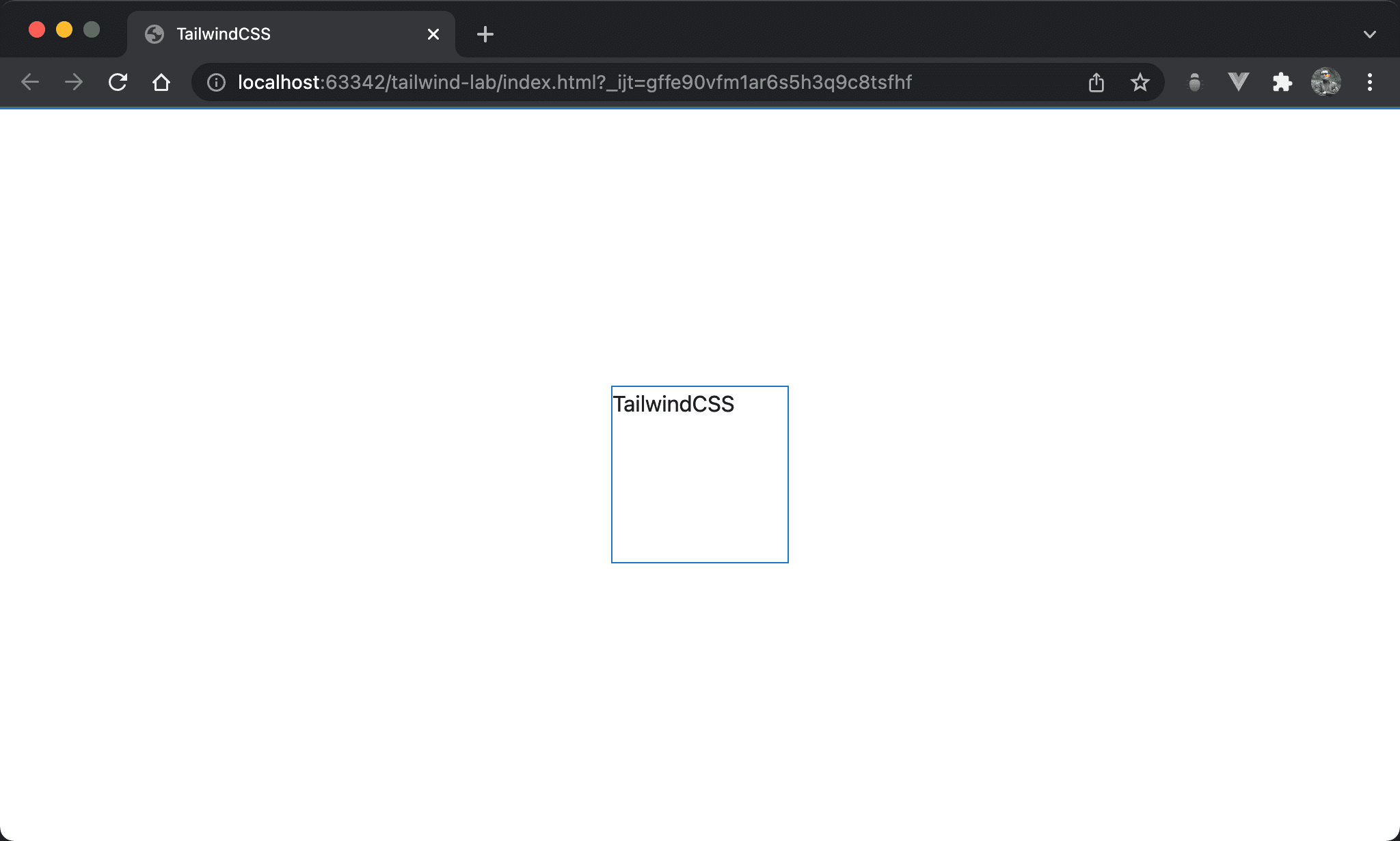
Top / Right
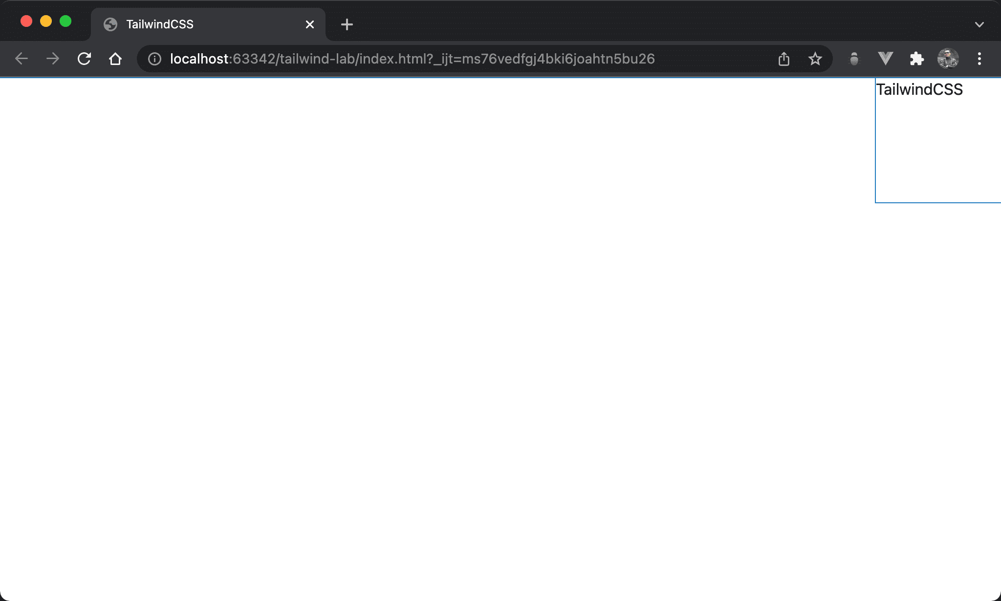
The red box is located in the top right corner.
<!doctype html>
<html lang="en">
<head>
  <meta charset="UTF-8">
  <meta name="viewport" content="width=device-width, initial-scale=1.0">
  <script src="https://cdn.tailwindcss.com"></script>
  <title>TailwindCSS</title>
</head>
<body>
  <div class="fixed top-0 right-0 w-32 h-32">TailwindCSS</div>
</body>
</html>
fixed: use fixed positiontop-0: set coordinate from topright-0: set coordinate from rightw-32: set block widthh-32: set block height
Browser will determine the final result by the most strict condition from
width,height,top,bottom,height,right, andleft
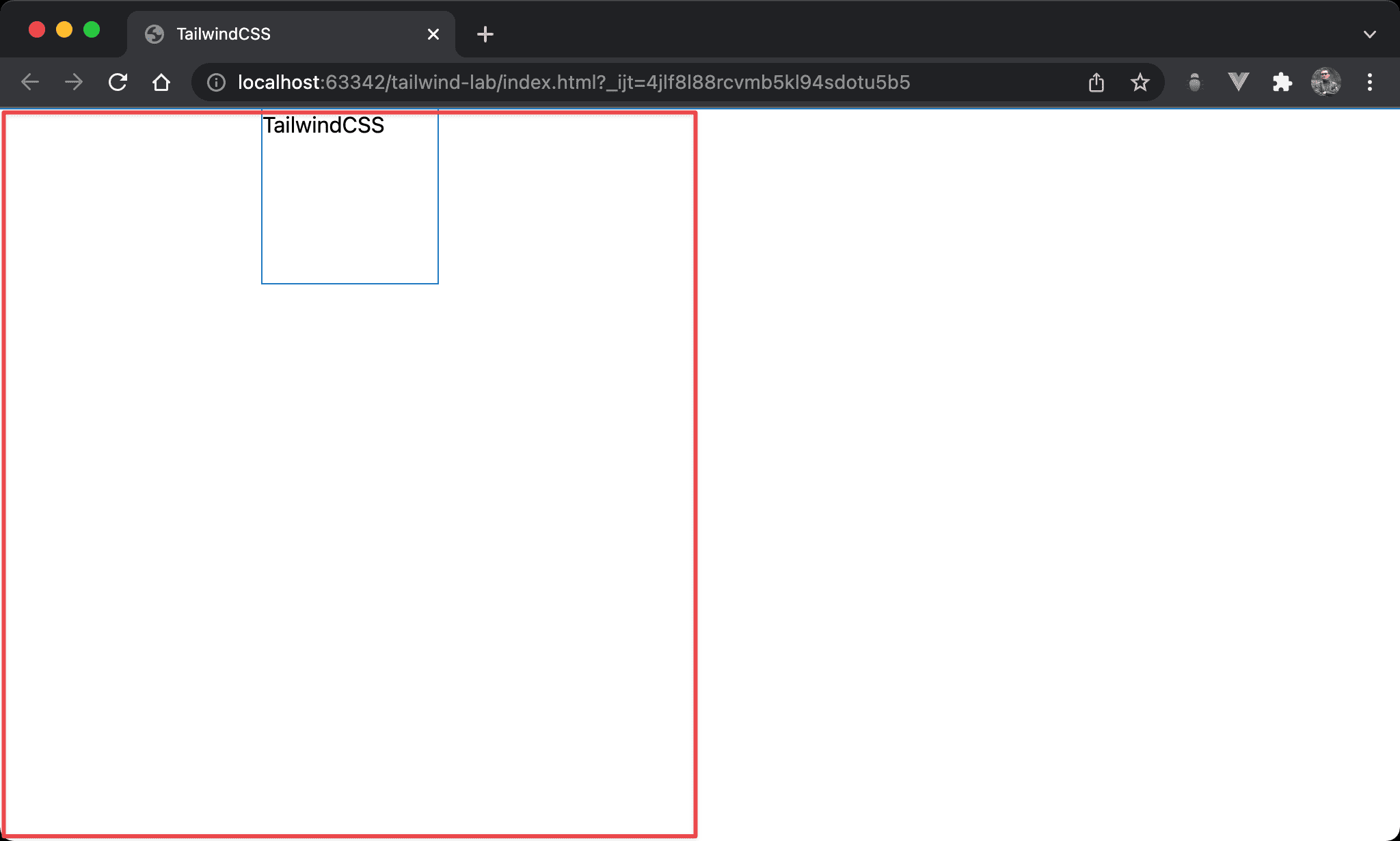
All Zero
The coordinates of top, bottom, left, and right conflict. Browser determines the final result is top left.
<!doctype html>
<html lang="en">
<head>
  <meta charset="UTF-8">
  <meta name="viewport" content="width=device-width, initial-scale=1.0">
  <script src="https://cdn.tailwindcss.com"></script>
  <title>TailwindCSS</title>
</head>
<body>
  <div class="fixed left-0 right-0 top-0 bottom-0 w-32 h-32">TailwindCSS</div>
</body>
</html>
fixed: use fixed positiontop-0 bottom-0 left-0 right-0: becausetop,bottom,leftandrightare both0, the space is full of browser. Browser determines the final result is top left by defaultw-32: set block widthh-32: set block height
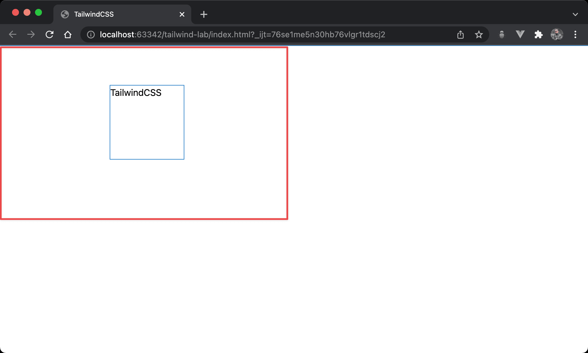
Horizontal Center
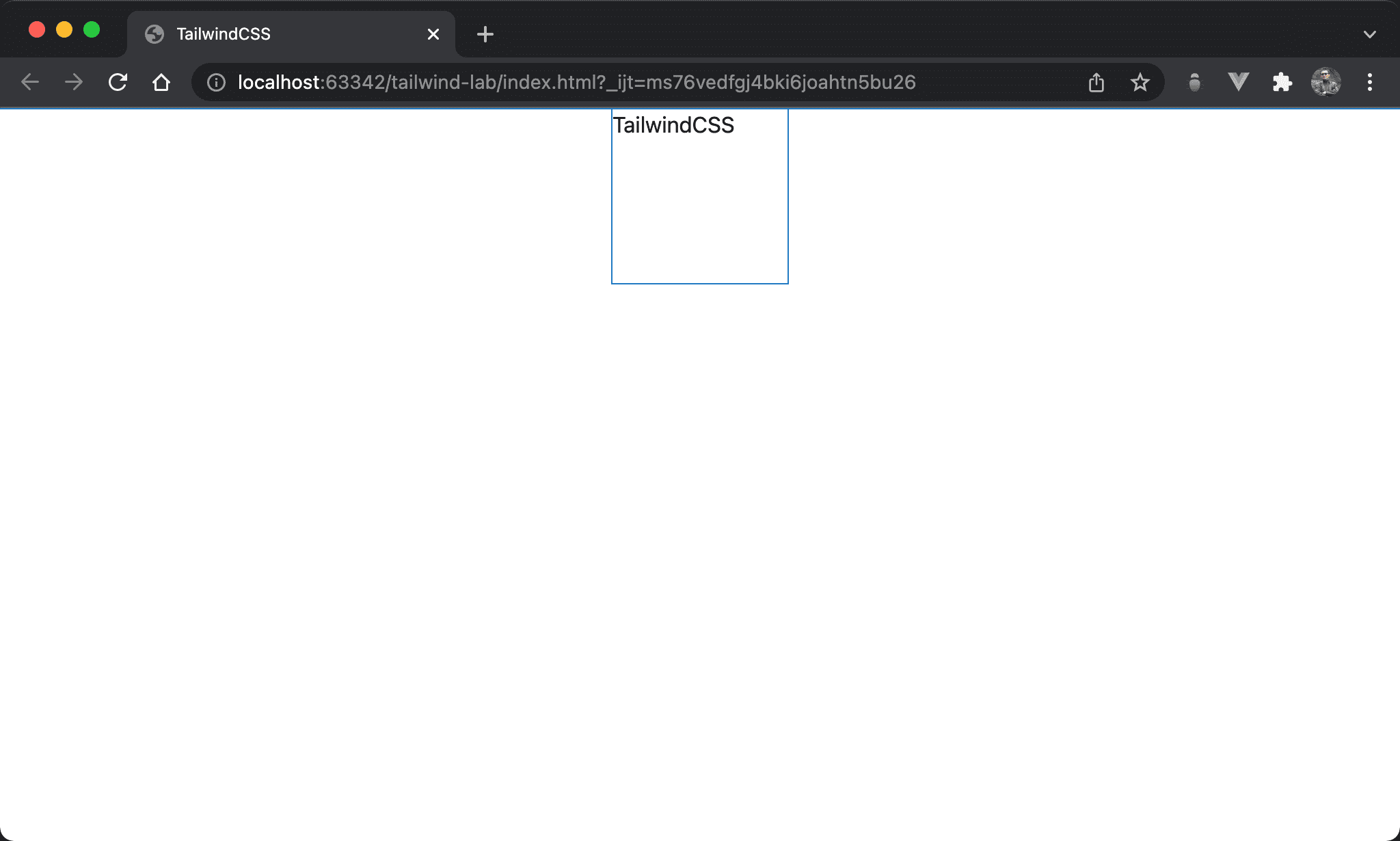
We can also use fixed and m-auto to implement horizontal center.
<!doctype html>
<html lang="en">
<head>
  <meta charset="UTF-8">
  <meta name="viewport" content="width=device-width, initial-scale=1.0">
  <script src="https://cdn.tailwindcss.com"></script>
  <title>TailwindCSS</title>
</head>
<body>
  <div class="fixed left-0 right-0 w-32 h-32 m-auto">TailwindCSS</div>
</body>
</html>
fixed: use fixed positionleft-0 right-0: since we want to usem-autofor horizontal center, we have to adjust horizontal space form-auto.left-0 right-0makes entire horizontal space for browserw-32: set block widthh-32: set block heightm-auto: make block horizontal center
Vertical Center
We can also use fixed and m-auto to implement vertical center.
<!doctype html>
<html lang="en">
<head>
  <meta charset="UTF-8">
  <meta name="viewport" content="width=device-width, initial-scale=1.0">
  <script src="https://cdn.tailwindcss.com"></script>
  <title>TailwindCSS</title>
</head>

<body>
  <div class="fixed top-0 bottom-0 w-32 h-32 m-auto">TailwindCSS</div>
</body>
</html>
fixed: use fixed positiontop-0 bottom-0: since we want to usem-autofor vertical center, we have to adjust vertical space form-auto.top-0 bottom-0makes entire vertical space for browserw-32: set block widthh-32: set block heightm-auto: make block vertical center
Vertical / Horizontal Center
We can also use fixed and m-auto to implement vertical and horizontal center.
<!doctype html>
<html lang="en">
<head>
  <meta charset="UTF-8">
  <meta name="viewport" content="width=device-width, initial-scale=1.0">
  <script src="https://cdn.tailwindcss.com"></script>
  <title>TailwindCSS</title>
</head>

<body>
  <div class="fixed top-0 bottom-0 left-0 right-0 w-32 h-32 m-auto">TailwindCSS</div>
</body>
</html>
fixed: use fixed positiontop-0 bottom-0 left-0 right-0: since we want to usem-autofor horizontal and vertical center, we have to adjust horizontal and vertical space form-auto.top-0 bottom-0 left-0 right-0makes entire space for browserw-32: set block widthh-32: set block heightm-auto: make block vertical and horizontal center
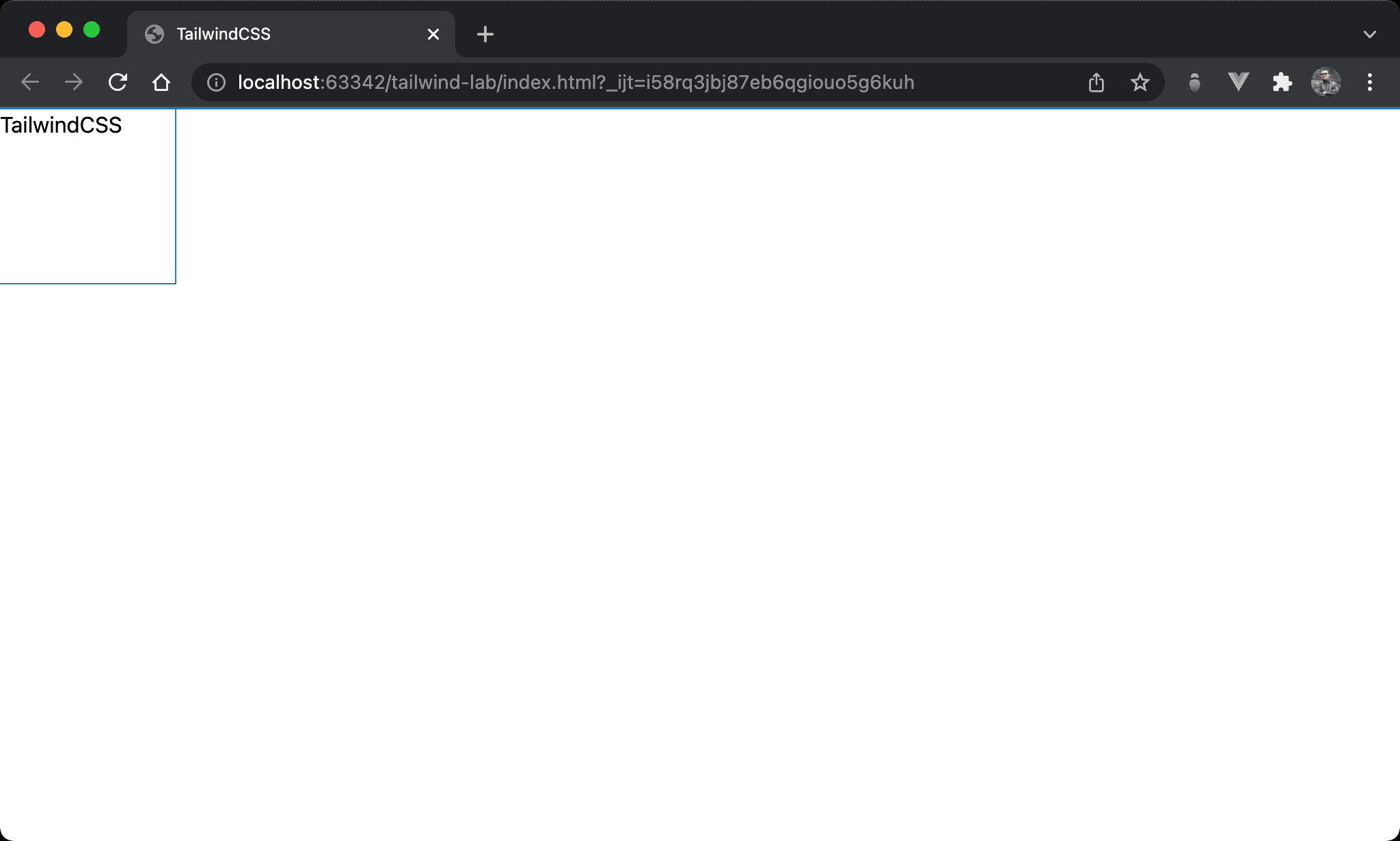
Horizontal 1/4 and Vertical Top
We can also use fixed and m-auto to implement horizontal 1/4 and vertical top.
<!doctype html>
<html lang="en">
<head>
  <meta charset="UTF-8">
  <meta name="viewport" content="width=device-width, initial-scale=1.0">
  <script src="https://cdn.tailwindcss.com"></script>
  <title>TailwindCSS</title>
</head>
<body>
  <div class="fixed top-0 bottom-0 left-0 right-1/2 w-32 h-32 my-0 mx-auto">TailWindCSS</div>
</body>
</html>
fixed: use fixed positiontop-0 bottom-0: make entire vertical spaceleft-0 right-1/2: make 1/2 horizontal spacew-32: set block widthh-32: set block heightmy-0: make block vertical topmx-auto: make block horizontal center
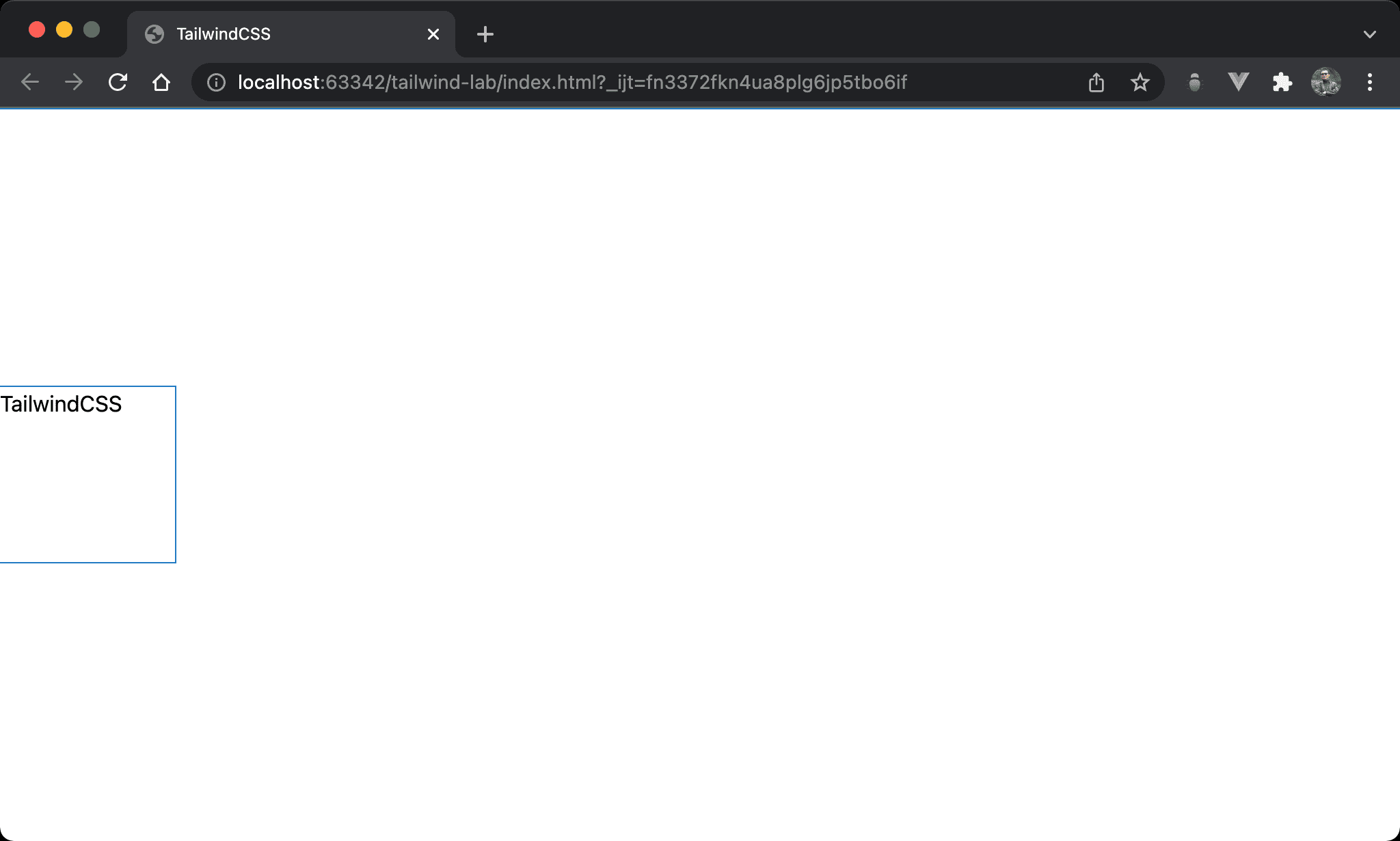
Horizontal 1/4 and Vertical 1/4
We can also use fixed and m-auto to implement horizontal 1/4 and vertical 1/4.
<!doctype html>
<html lang="en">
<head>
  <meta charset="UTF-8">
  <meta name="viewport" content="width=device-width, initial-scale=1.0">
  <script src="https://cdn.tailwindcss.com"></script>
  <title>TailwindCSS</title>
</head>
<body>
  <div class="fixed top-0 bottom-1/2 left-0 right-1/2 w-32 h-32 m-auto">TailwindCSS</div>
</body>
</html>
fixed: use fixed positiontop-0 bottom-1/2: make 1/2 vertical spaceleft-0 right-1/2: make 1/2 horizontal spacew-32: set block widthh-32: set block heightm-auto: make horizontal 1/4 and vertical 1/4 center
Conclusion
top,bottom,left, andleftis not only for position. We can also use them to make space form-auto- As for layout,
fixedandabsoluteare identical