By absolute with top, bottom, left, right, and m-auto, we can implement some special layout.
Version
TailwindCSS 3.0
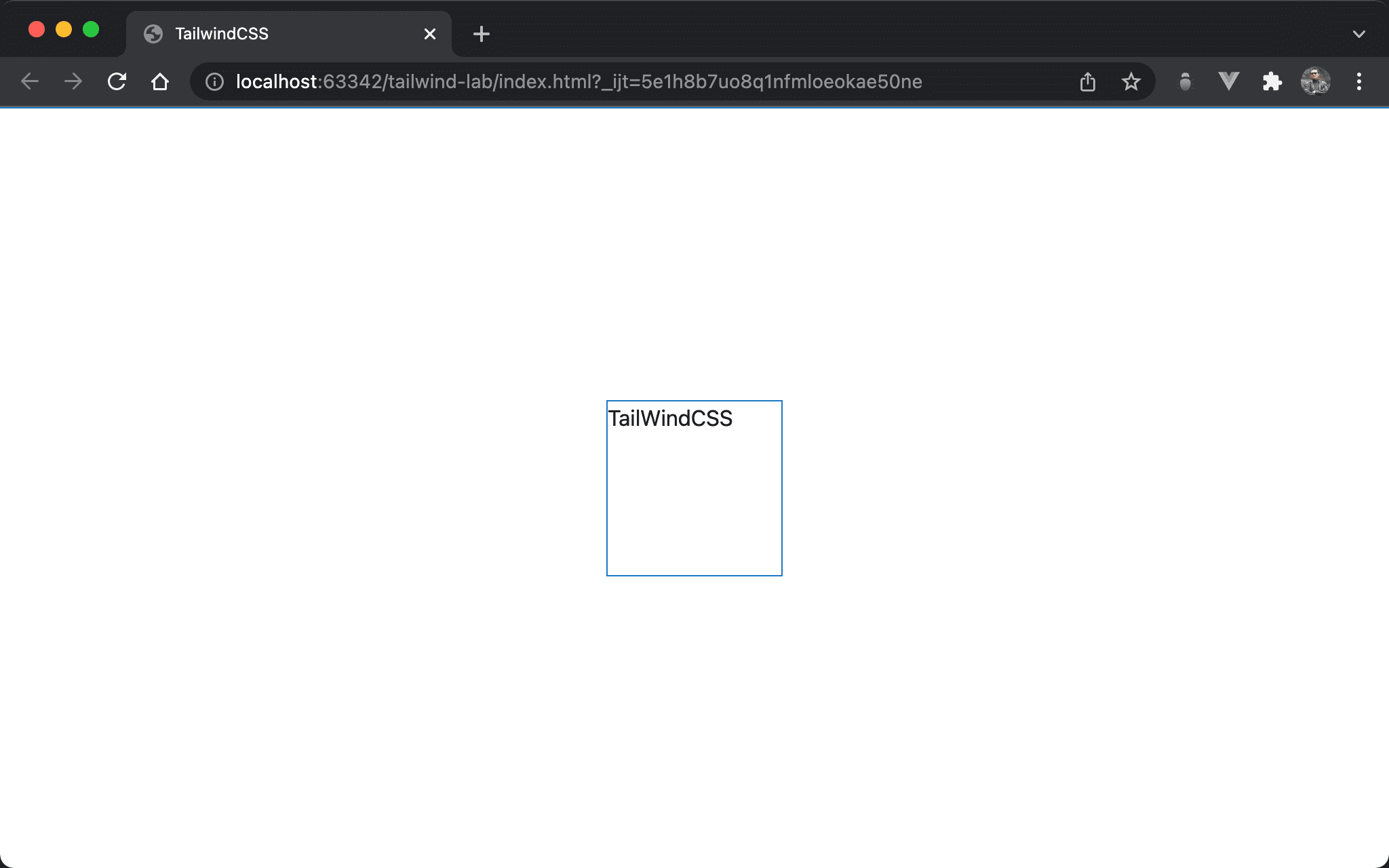
Top / Right
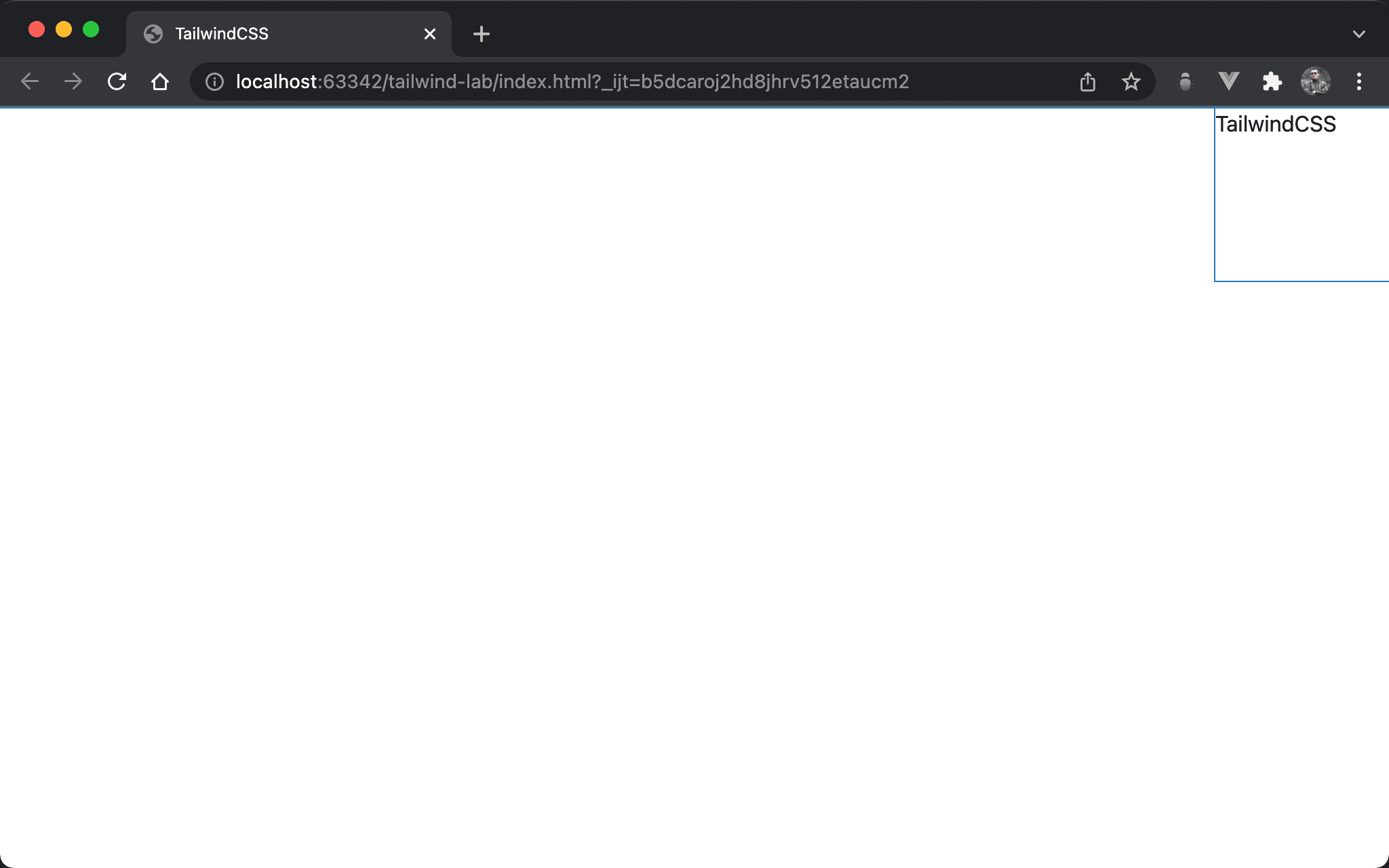
The red box is located in the top right corner.
<!doctype html>
<html lang="en">
<head>
  <meta charset="UTF-8">
  <meta name="viewport" content="width=device-width, initial-scale=1.0">
  <script src="https://cdn.tailwindcss.com"></script>
  <title>TailwindCSS</title>
</head>
<body>
  <div class="absolute top-0 right-0 w-32 h-32">TailwindCSS</div>
</body>
</html>
absolute: use absolute positiontop-0: set coordinate from topright-0: set coordinate from rightw-32: set block widthh-32: set block height
Browser adjusts the strictest condition from
width,height,top,bottom,rightandleftto display.
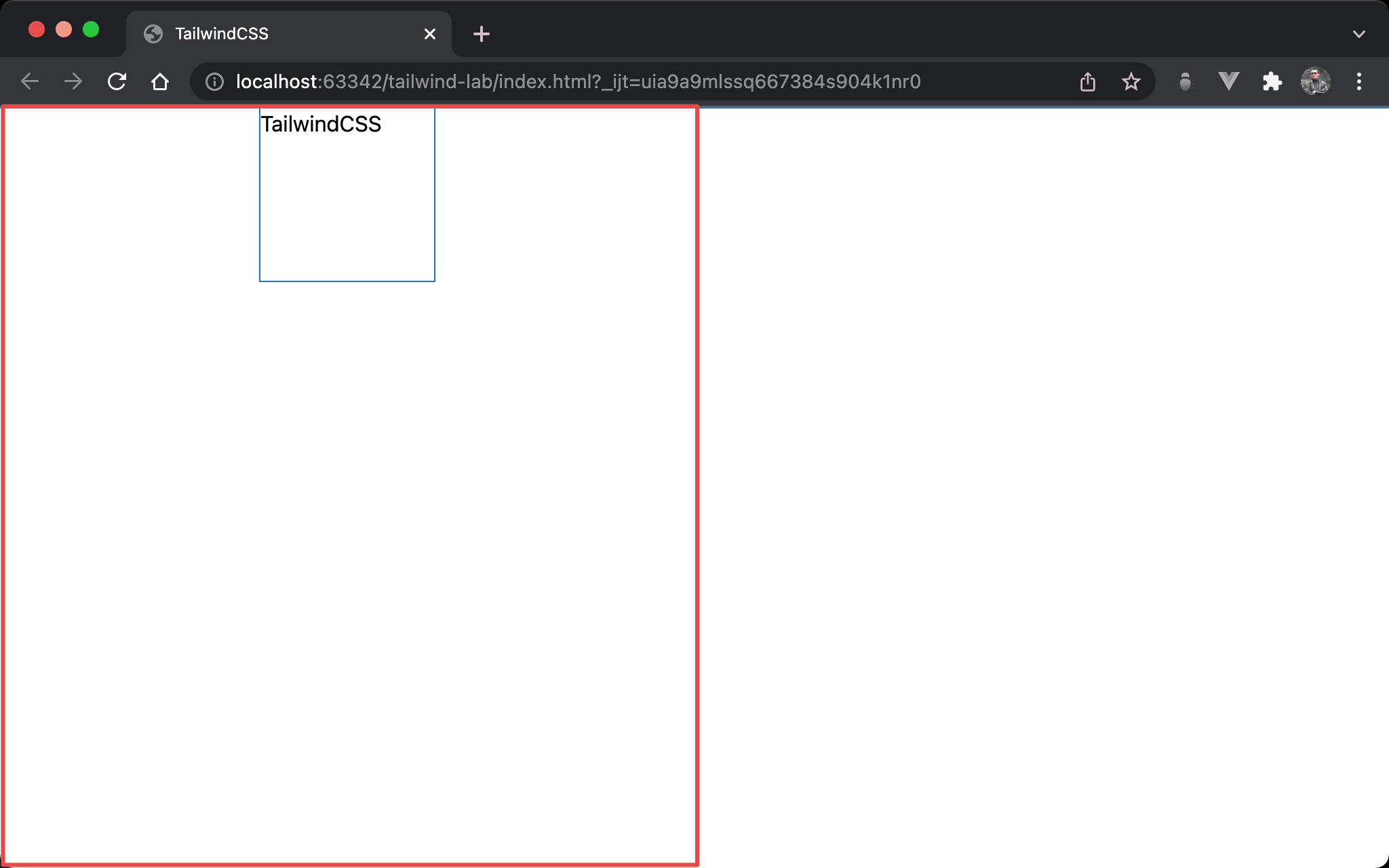
All Zero
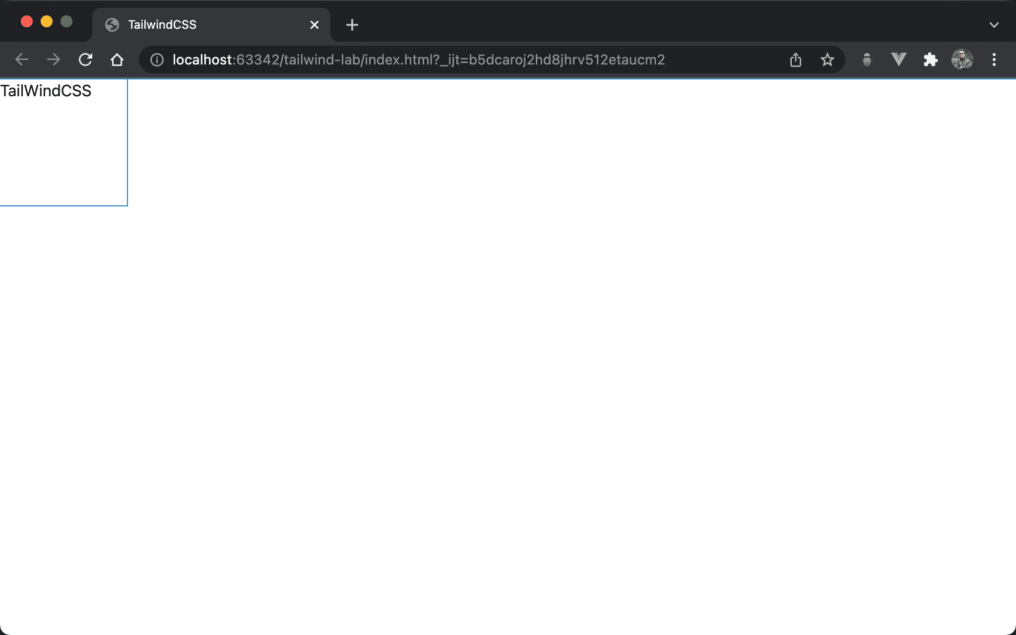
The coordinates of top, bottom, left, and right conflict. Browser determines the final result is top left.
<!doctype html>
<html lang="en">
<head>
  <meta charset="UTF-8">
  <meta name="viewport" content="width=device-width, initial-scale=1.0">
  <script src="https://cdn.tailwindcss.com"></script>
  <title>TailwindCSS</title>
</head>
<body>
  <div class="absolute top-0 bottom-0 left-0 right-0 w-32 h-32">TailWindCSS</div>
</body>
</html>
absolute: use absolute positiontop-0 bottom-0 left-0 right-0: becausetop,bottom,leftandrightare both0, the space is full of browser. Browser determines the final result is top left by defaultw-32: set block widthh-32: set box height
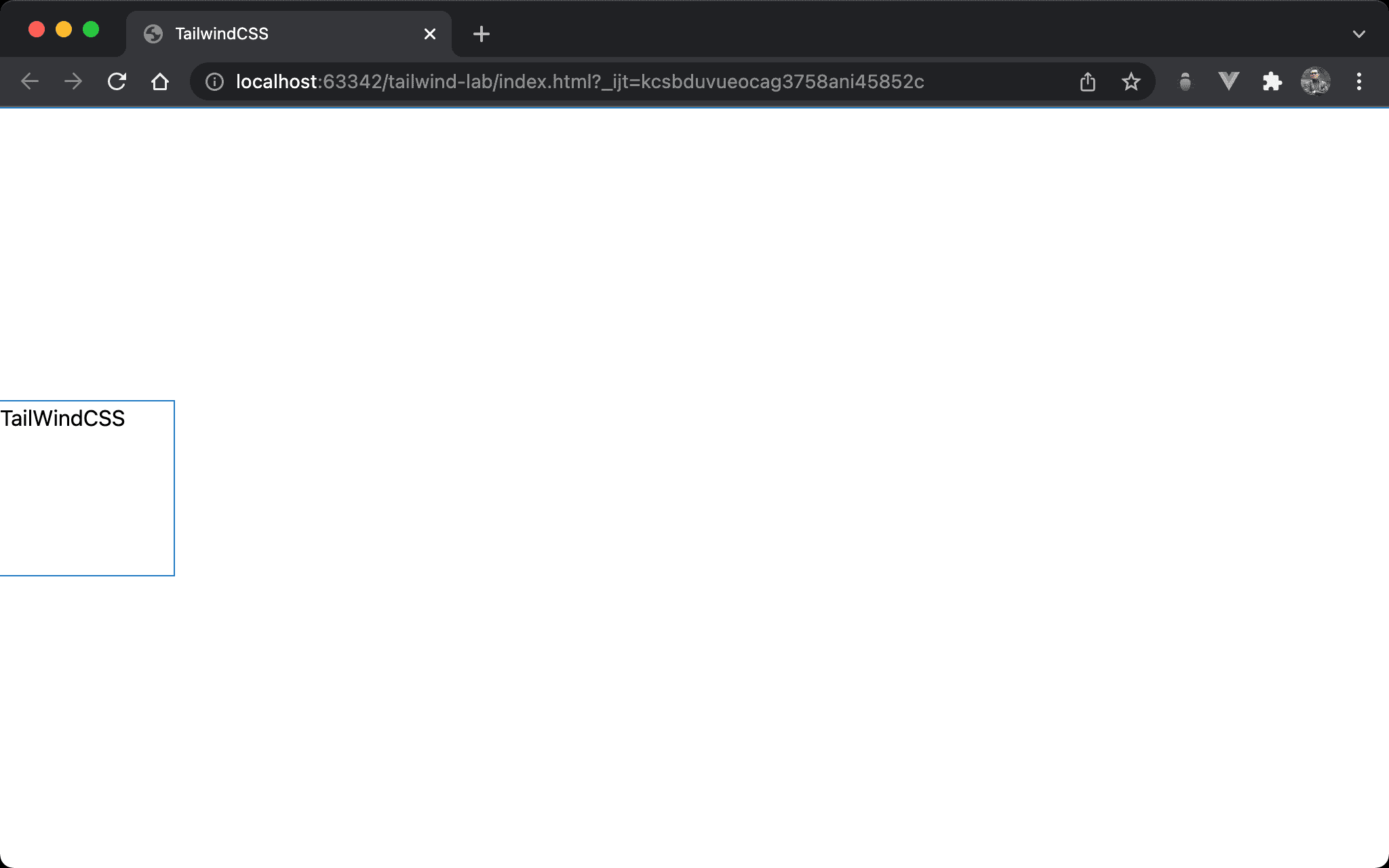
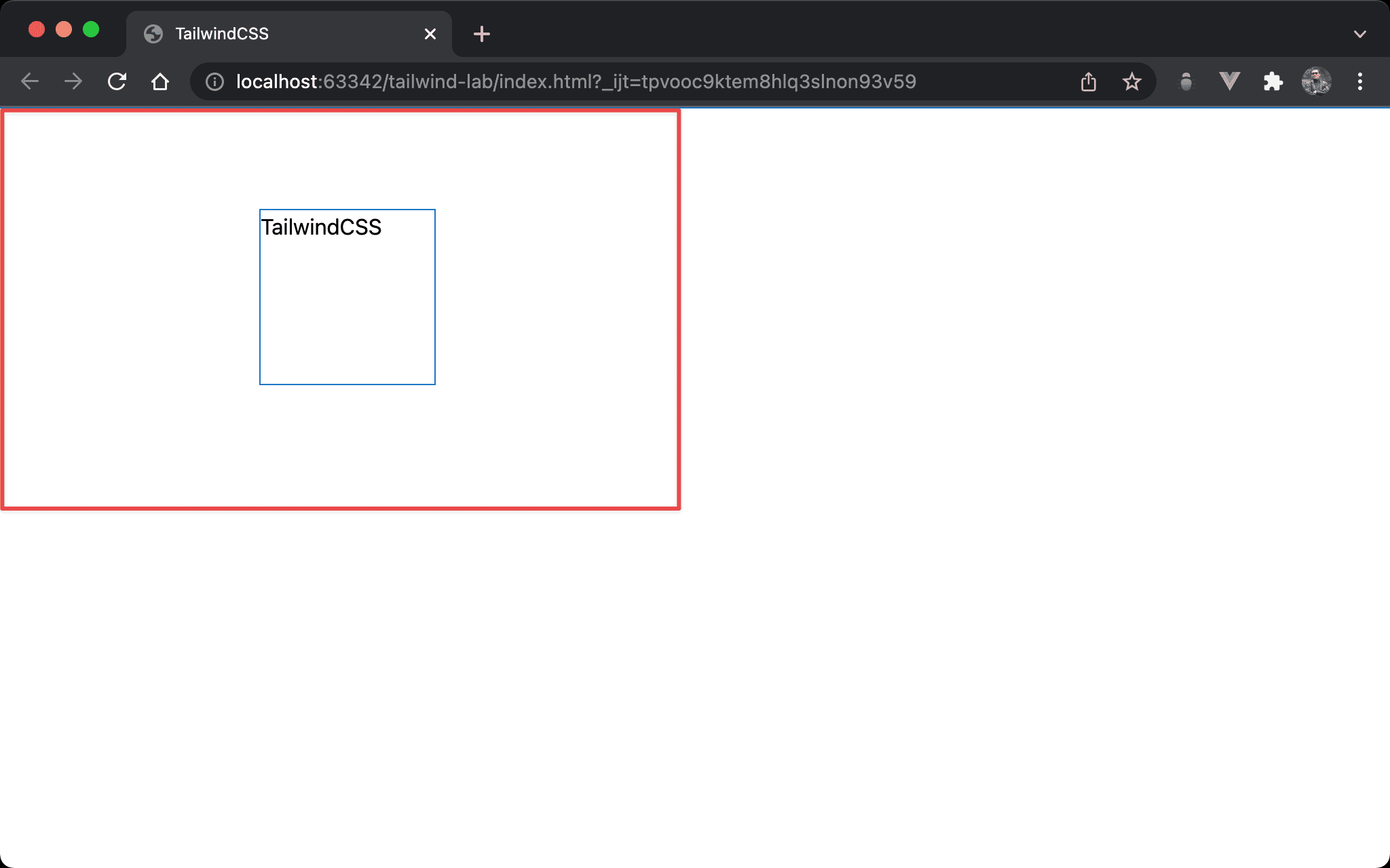
Horizontal Center
We can also use absolute and m-auto to implement horizontal center.
<!doctype html>
<html lang="en">
<head>
  <meta charset="UTF-8">
  <meta name="viewport" content="width=device-width, initial-scale=1.0">
  <script src="https://cdn.tailwindcss.com"></script>
  <title>TailwindCSS</title>
</head>
<body>
  <div class="absolute left-0 right-0 w-32 h-32 m-auto ">TailwindCSS</div>
</body>
</html>
absolute: use absolute positionleft-0 right-0: since we want to usem-autofor horizontal center, we have to adjust horizontal space form-auto.left-0 right-0makes entire horizontal space for browserw-32: 設定 box widthh-32: 設定 box heightm-auto: make block horizontal center
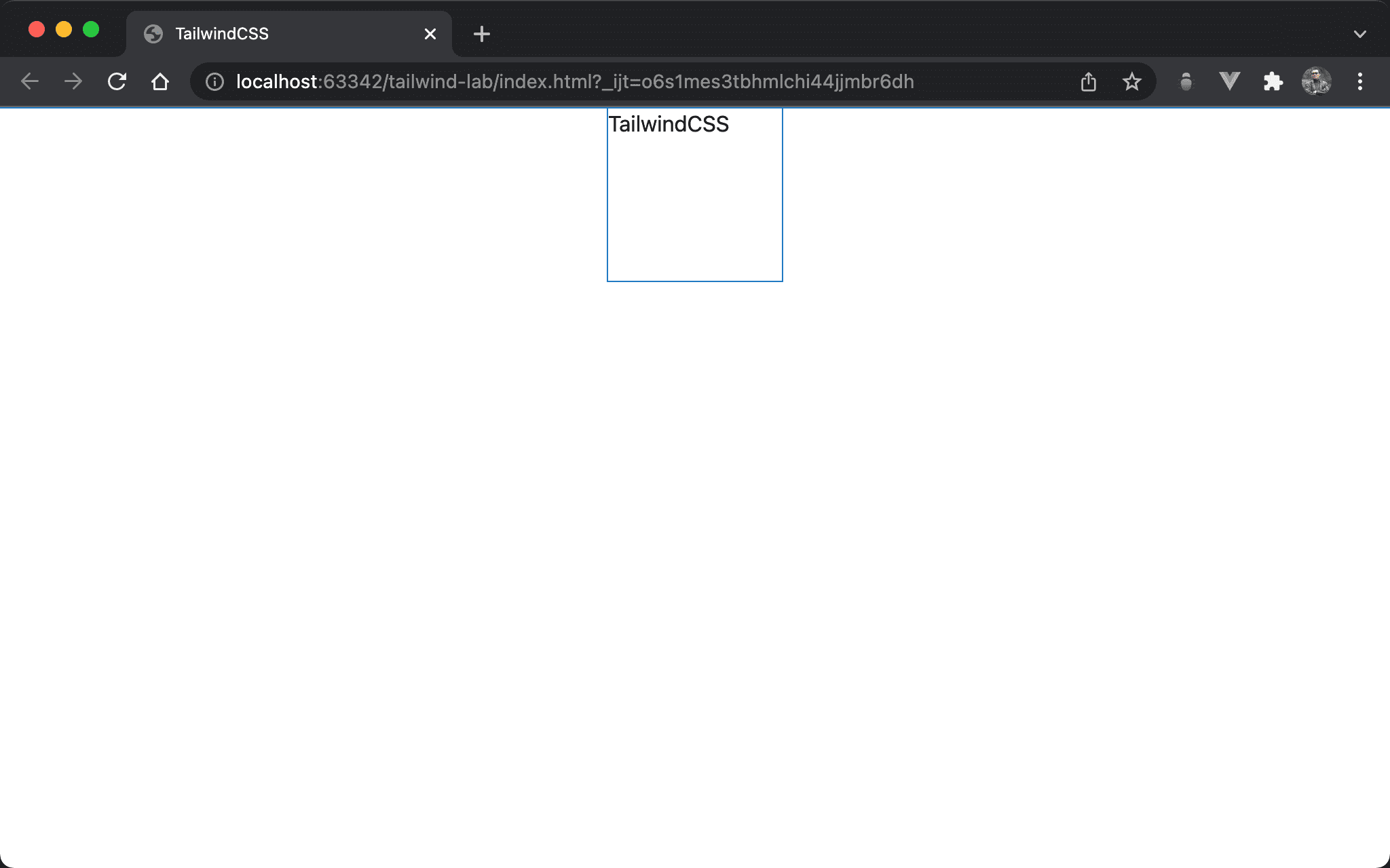
Vertical Center
We can also use absolute and m-auto to implement vertical and horizontal center.
<!doctype html>
<html lang="en">
<head>
  <meta charset="UTF-8">
  <meta name="viewport" content="width=device-width, initial-scale=1.0">
  <script src="https://cdn.tailwindcss.com"></script>
  <title>TailwindCSS</title>
</head>
<body>
  <div class="absolute top-0 bottom-0 w-32 h-32 m-auto">TailWindCSS</div>
</body>
</html>
absolute: use absolute positiontop-0 bottom-0: since we want to usem-autofor vertical center, we have to adjust vertical space form-auto.top-0 bottom-0makes entire vertical space for browserw-32: set box widthh-32: set box heightm-auto: make block vertical center
Vertical / Horizontal Center
We can also use absolute and m-auto to implement vertical and horizontal center.
<!doctype html>
<html lang="en">
<head>
  <meta charset="UTF-8">
  <meta name="viewport" content="width=device-width, initial-scale=1.0">
  <script src="https://cdn.tailwindcss.com"></script>
  <title>TailwindCSS</title>
</head>
<body>
  <div class="absolute top-0 bottom-0 left-0 right-0 m-auto w-32 h-32">TailWindCSS</div>
</body>
</html>
absolute: use absolute positiontop-0 bottom-0 left-0 right-0: since we want to usem-autofor horizontal and vertical center, we have to adjust horizontal and vertical space form-auto.top-0 bottom-0 left-0 right-0makes entire space for browserw-32: set block widthh-32: set block heightm-auto: make block vertical and horizontal center
Horizontal 1/4 and Vertical Top
We can also use absolute and m-auto to implement horizontal 1/4 and vertical top.
<!doctype html>
<html lang="en">
<head>
  <meta charset="UTF-8">
  <meta name="viewport" content="width=device-width, initial-scale=1.0">
  <script src="https://cdn.tailwindcss.com"></script>
  <title>TailwindCSS</title>
</head>
<body>
  <div class="absolute top-0 bottom-0 left-0 right-1/2 my-0 mx-auto w-32 h-32">TailwindCSS</div>
</body>
</html>
absolute: use absolute positiontop-0 bottom-0: make entire vertical spaceleft-0 right-1/2: make 1/2 horizontal spacew-32: set block widthh-32: set block heightmy-0: make block vertical topmx-auto: make block horizontal center
Horizontal 1/4 and Vertical 1/4
We can also use fixed and m-auto to implement horizontal 1/4 and vertical 1/4.
<!doctype html>
<html lang="en">
<head>
  <meta charset="UTF-8">
  <meta name="viewport" content="width=device-width, initial-scale=1.0">
  <script src="https://cdn.tailwindcss.com"></script>
  <title>TailwindCSS</title>
</head>
<body>
  <div class="absolute top-0 bottom-1/2 left-0 right-1/2 w-32 h-32 m-auto">TailwindCSS</div>
</body>
</html>
absolute: use absolute positiontop-0 bottom-1/2: make 1/2 vertical spaceleft-0 right-1/2: make 1/2 horizontal spacew-32: set block widthh-32: set block heightm-auto: make horizontal 1/4 and vertical 1/4 center
Conclusion
top,bottom,left, andleftis not only for position. We can also use them to make space form-auto
- As for layout,
fixedandabsoluteare identical