When the width of all Flex items is larger than the parent element, we can use shrink to control how Flex items shrink.
Version
TailwindCSS 3.0
Exceed Width
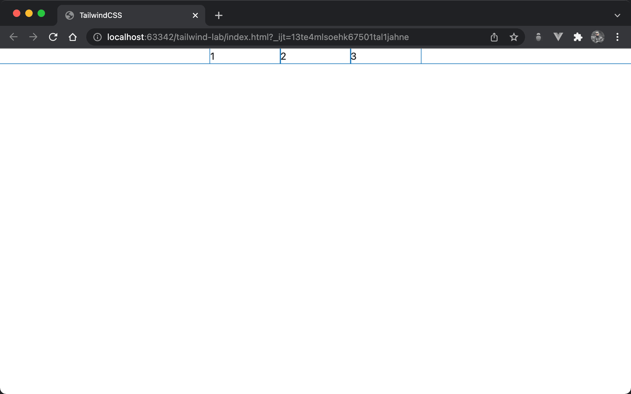
Although the width of all Flex items is larger than the parent element, because flex-nowrap is the default utility for flex, all flex items will shrink automatically to divide equally by the parent element.
<!doctype html>
<html lang="en">
<head>
  <meta charset="UTF-8">
  <meta name="viewport" content="width=device-width, initial-scale=1.0">
  <script src="https://cdn.tailwindcss.com"></script>
  <title>TailwindCSS</title>
</head>
<body>
  <div class="flex w-1/3 m-auto">
    <div class="w-1/2">1</div>
    <div class="w-1/2">2</div>
    <div class="w-1/2">3</div>
  </div>
</body>
</html>
Line 10
<div class="flex w-1/3 m-auto">
flex: all child items use Flexbox layoutw-1/3: set width of the parent elementm-auto: adjust margin automatically to make horizontal center
Line 11
<div class="w-1/2">1</div>
<div class="w-1/2">2</div>
<div class="w-1/2">3</div>
w-1/2: every flex item’s width isw-1/2, so the total width isw-3/2which is larger than the width of the parent element. Butflex-nowrapis the default utility forflex, every flex item shrinks automatically to divide equally by the parent element
shrink
Why does every flex item shrink automatically?
<!doctype html>
<html lang="en">
<head>
  <meta charset="UTF-8">
  <meta name="viewport" content="width=device-width, initial-scale=1.0">
  <script src="https://cdn.tailwindcss.com"></script>
  <title>TailwindCSS</title>
</head>
<body>
  <div class="flex w-1/3 m-auto">
    <div class="w-1/2 shrink">1</div>
    <div class="w-1/2 shrink">2</div>
    <div class="w-1/2 shrink">3</div>
  </div>
</body>
</html>
Line 10
<div class="flex w-1/3 m-auto">
  <div class="w-1/2 shrink">1</div>
  <div class="w-1/2 shrink">2</div>
  <div class="w-1/2 shrink">3</div>
</div>
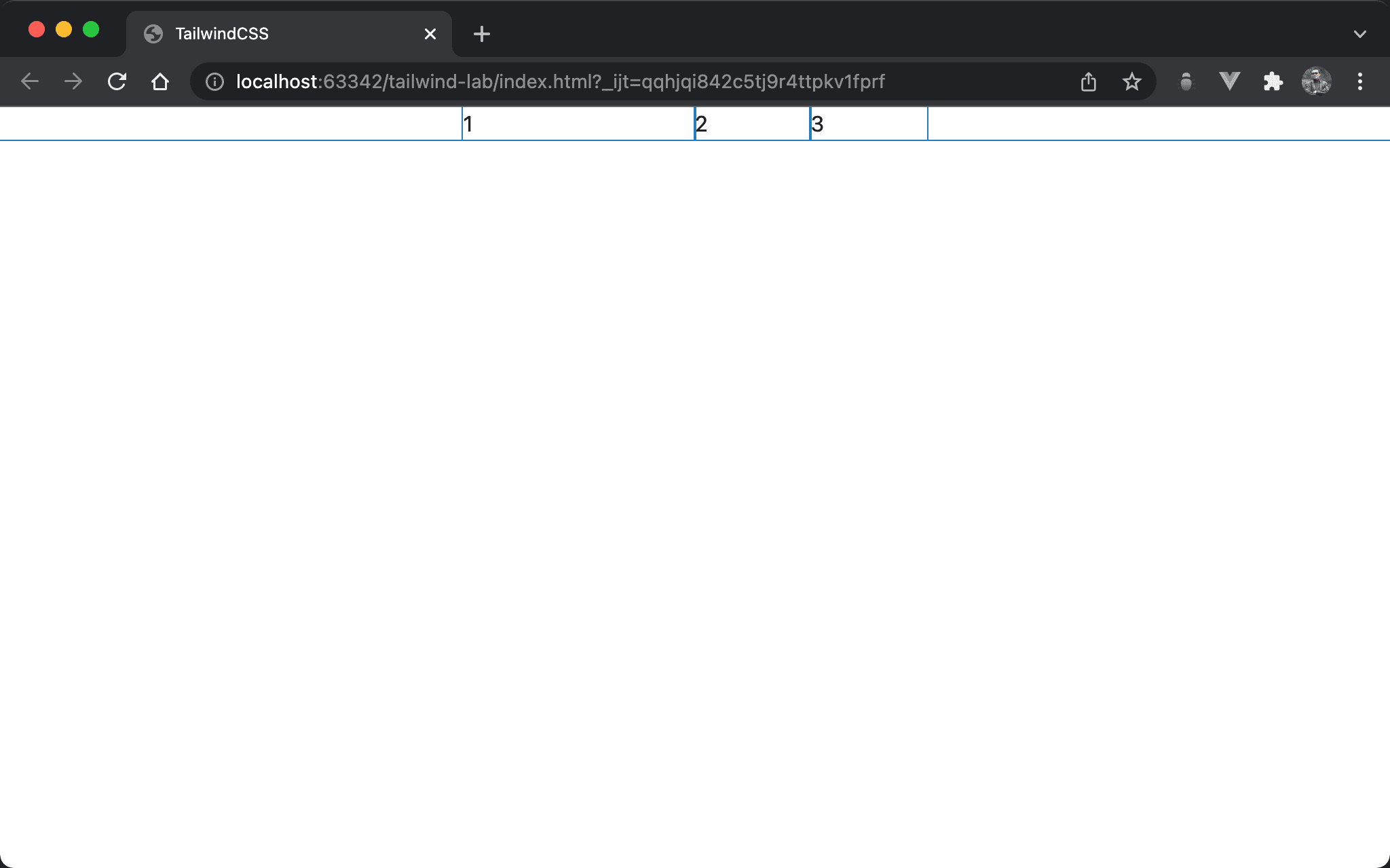
shrink: the default utility for flex items. That’s why every flex item shrinks automatically
shrink-0
Item 1 doesn’t shrink, but item 2 and item 3 shrink automatically.
<!doctype html>
<html lang="en">
<head>
  <meta charset="UTF-8">
  <meta name="viewport" content="width=device-width, initial-scale=1.0">
  <script src="https://cdn.tailwindcss.com"></script>
  <title>TailwindCSS</title>
</head>
<body>
  <div class="flex w-1/3 m-auto">
    <div class="w-1/2 shrink-0">1</div>
    <div class="w-1/2">2</div>
    <div class="w-1/2">3</div>
  </div>
</body>
</html>
Line 11
<div class="w-1/2 shrink-0">1</div>
shrink-0:shrinkis the default utility for every flex item. If we want the specific item doesn’t shrink automatically, we have to useshrink-0
Conclusion
shrinkis the default utility for Flex items. That’s why flex items shrink automaticallyshrinkandshrink-0are often usedflex-nowrap, which is also the default utility forflex- Use
shrink-0to prevent a flex item from shrinking