若要在 Flexbox 內實現 Cross Axis 置中,直覺會使用 items-center,事實上也可巧妙地使用 m-auto 實現。
Version
Tailwind CSS 2.0.3
m-auto
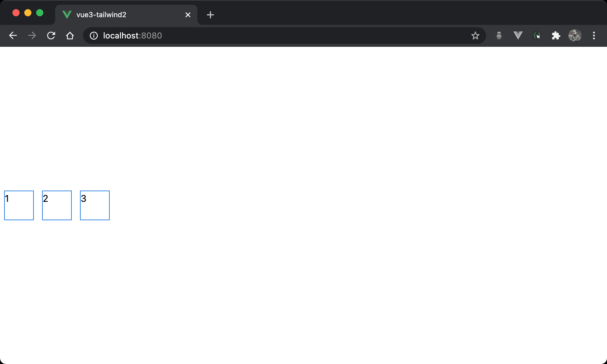
各 item 在 cross axis 置中。
<template>
  <div class="flex h-screen">
    <div class="w-12 h-12 mx-2 my-auto">1</div>
    <div class="w-12 h-12 mx-2 my-auto">2</div>
    <div class="w-12 h-12 mx-2 my-auto">3</div>
  </div>
</template>
flex:使用 Flexboxh-screen:設定 box 的 height 為100vhw-12:設定 item 的 widthh-12:設定 item 的 heightmx-2:設定 item 的 horizontal marginmy-auto:設定 item 的 vertical margin 為auto
因為 Flexbox 使用
h-screen設定出 box 的 height,因此my-auto可自動調整 vertical margin 而達成垂直置中
<template>
  <div class="flex h-screen">
    <div class="item">1</div>
    <div class="item">2</div>
    <div class="item">3</div>
  </div>
</template>

<style scoped>
.item {
  @apply w-12 h-12 mx-2 my-auto
}
</style>
10 行
.item {
  @apply w-12 h-12 mx-2 my-auto
}
若覺得各 item 所使用的 utility 都相同,可使用 @apply 抽出 item class。
Conclusion
- 之所以能夠使用
my-auto實現items-center,主要原因是flex下的 box 已經設定 height 為h-screen,因此對於 item 而言有上下 margin,才可使用my-auto垂直置中,但一般 box 沒有 height 而是由 item 撐開,此時並沒有上下 margin 可言,因此m-auto也無濟於事