一般使用 Flexbox 都只會使用其相關 Property,事實上搭配 m-auto 可實現各種不規則 Layout。
Version
Tailwind CSS 2.0.3
m-auto
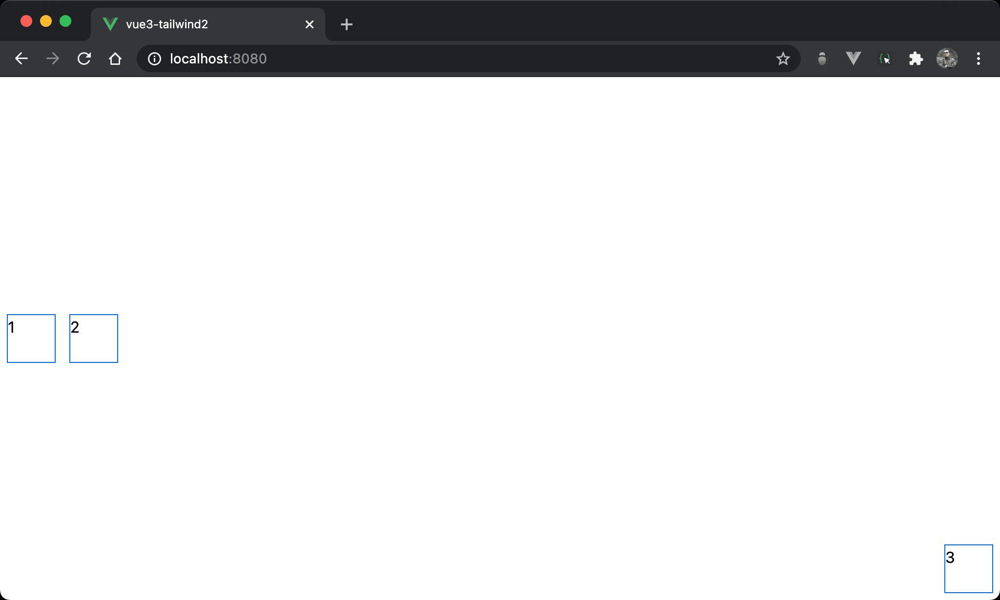
1 與 2 垂直置中並水平靠右,但 3 卻垂直靠下並水平靠右。
<template>
  <div class="flex h-screen">
    <div class="w-12 h-12 mx-2 my-auto">1</div>
    <div class="w-12 h-12 mx-2 my-auto">2</div>
    <div class="w-12 h-12 mr-2 ml-auto mt-auto mb-2">3</div>
  </div>
</template>
flex:使用 Flexboxh-screen:設定 box 的 height 為100vhw-12:設定 item 的 widthh-12:設定 item 的 widthmx-2:設定1與2的 horizontal marginmy-auto:設定1與2的 vertical margin 為automr-2:設定3的 right marginml-auto:設定3的 left margin 為automt-auto:設定3的 top margin 為automb-2:設定3的 bottom margin
因為
1與2都設定為my-auto,故能垂直置中;而3的ml-auto為水平靠右,mt-top為垂直靠下,因此造就了不規則 layout
<template>
  <div class="flex h-screen">
    <div class="item mx-2 my-auto">1</div>
    <div class="item mx-2 my-auto">2</div>
    <div class="item mr-2 ml-auto mt-auto mb-2">3</div>
  </div>
</template>

<style scoped>
.item {
  @apply w-12 h-12
}
</style>
10 行
.item {
  @apply w-12 h-12
}
可將各 item 相同部分抽成 item class。
Conclusion
- 由於 Flexbox 會設定 height,這使得
margin: auto有用武之地,在使用 Flexbox 時別忘了使用margin: auto實現不規則 layout