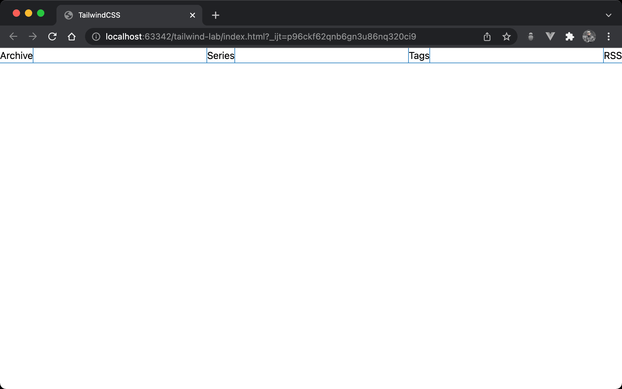
justify-between makes all Flex Items spaced out evenly, but the first item is on the extreme left and the last item is on the extreme right.
Version
TailwindCSS 3.0
justify-between

- The first item is on the extreme left
- The last item is on the extreme right
- The middle ones spaced out evenly
<!doctype html>
<html lang="en">
<head>
  <meta charset="UTF-8">
  <meta name="viewport" content="width=device-width, initial-scale=1.0">
  <script src="https://cdn.tailwindcss.com"></script>
  <title>TailwindCSS</title>
</head>
<body>
  <div class="flex justify-between">
    <div>Archive</div>
    <div>Series</div>
    <div>Tags</div>
    <div>RSS</div>
  </div>
</body>
</html>
Line 10
<div class="flex justify-between">
  <div>Archive</div>
  <div>Series</div>
  <div>Tags</div>
  <div>RSS</div>
</div>
flex: make parent element as Flex Container and child element as Flex Itemjustify-between: all Flex Items are spaced out as much as possible with the first item at the beginning and the last item at the end
Conclusion
justify-betweenmakes all Flex Items space out the horizontal space