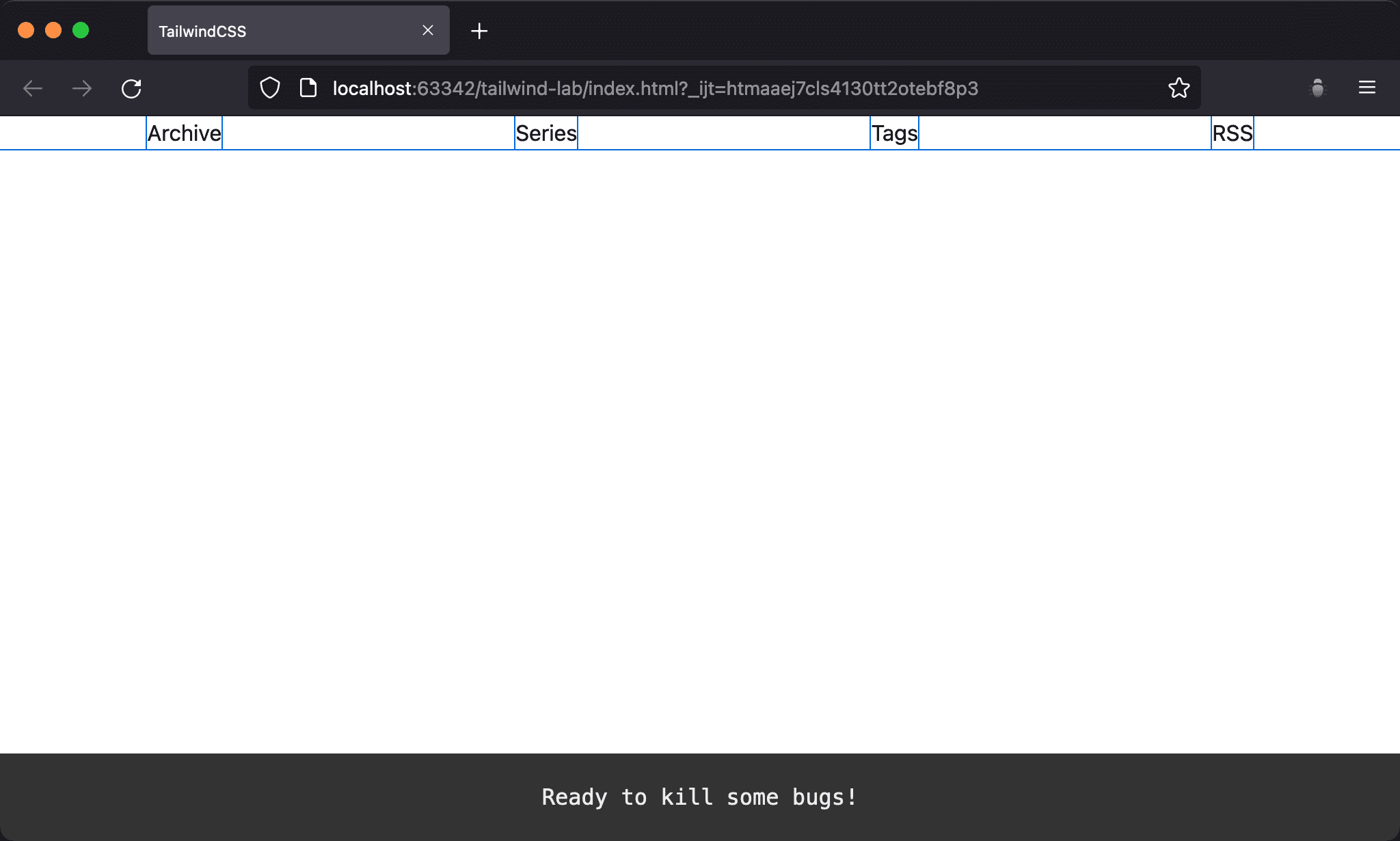
justify-around makes all Flex Items spaced out evenly, but space before the first item and after the last item are half as much as space between the items.
Version
TailwindCSS 3.0
justify-around

Space
beforethe first item and spaceafterthe last item is half as much as space between the itemsThe middle ones spaced out evenly
<!doctype html>
<html lang="en">
<head>
  <meta charset="UTF-8">
  <meta name="viewport" content="width=device-width, initial-scale=1.0">
  <script src="https://cdn.tailwindcss.com"></script>
  <title>TailwindCSS</title>
</head>
<body>
  <div class="flex justify-around">
    <div>Archive</div>
    <div>Series</div>
    <div>Tags</div>
    <div>RSS</div>
  </div>
</body>
</html>
Line 10
<div class="flex justify-around">
  <div>Archive</div>
  <div>Series</div>
  <div>Tags</div>
  <div>RSS</div>
</div>
flex: make parent element as Flex Container and child element as Flex Itemjustify-around: spacebeforethe first Item andafterthe last item is half as much as space between the items
Conclusion
justify-aroundmakes all Flex Items space out the horizontal space, but there is a subtle difference betweenjustify-betweenandjustify-evenly