Flexbox 預設為 items-stretch,這也使得 Flexbox 可自動 stretch 子層 item 使其等高。
Version
Tailwind CSS 2.0.3
No Wrap
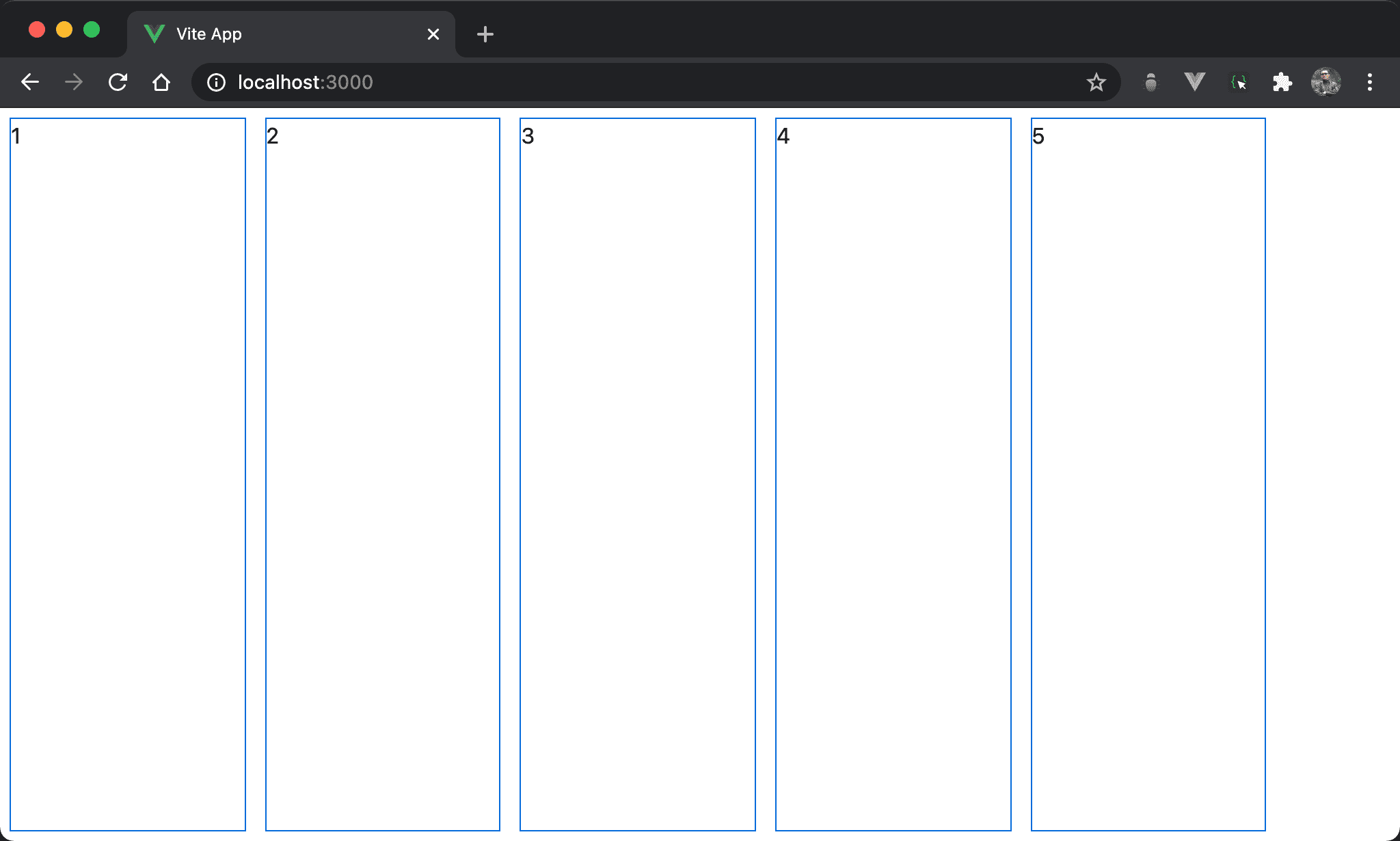
在沒有換列下,儘管子層 item 都沒有定義 height,但 Flexbox 會使每個子層 item 自動等高。
<template>
  <div class="flex w-full h-screen">
    <div class="w-1/6 m-2">1</div>
    <div class="w-1/6 m-2">2</div>
    <div class="w-1/6 m-2">3</div>
    <div class="w-1/6 m-2">4</div>
    <div class="w-1/6 m-2">5</div>
  </div>
</template>
第 2 行
<div class="flex w-full h-screen">
設定父層 box 的 style:
flex:設定子層使用 Flexboxw-full:設定父層 box 寬度h-screen:設定父層 box 高度
第 3 行
<div class="w-1/6 m-2">1</div>
設定子層 item 的 style:
w-1/6:設定子層 item widthm-2:設定子層 item margin
重點在於子層 item 沒有設定 height
若父層 box 設定 height,而子層 item 不設定 height,且沒有設定 wrap,因為預設為 items-stretch,所以各 item height 會自動 stretch 成與父層等高,這是改用 Flexbox 後的一大特性。
Wrap
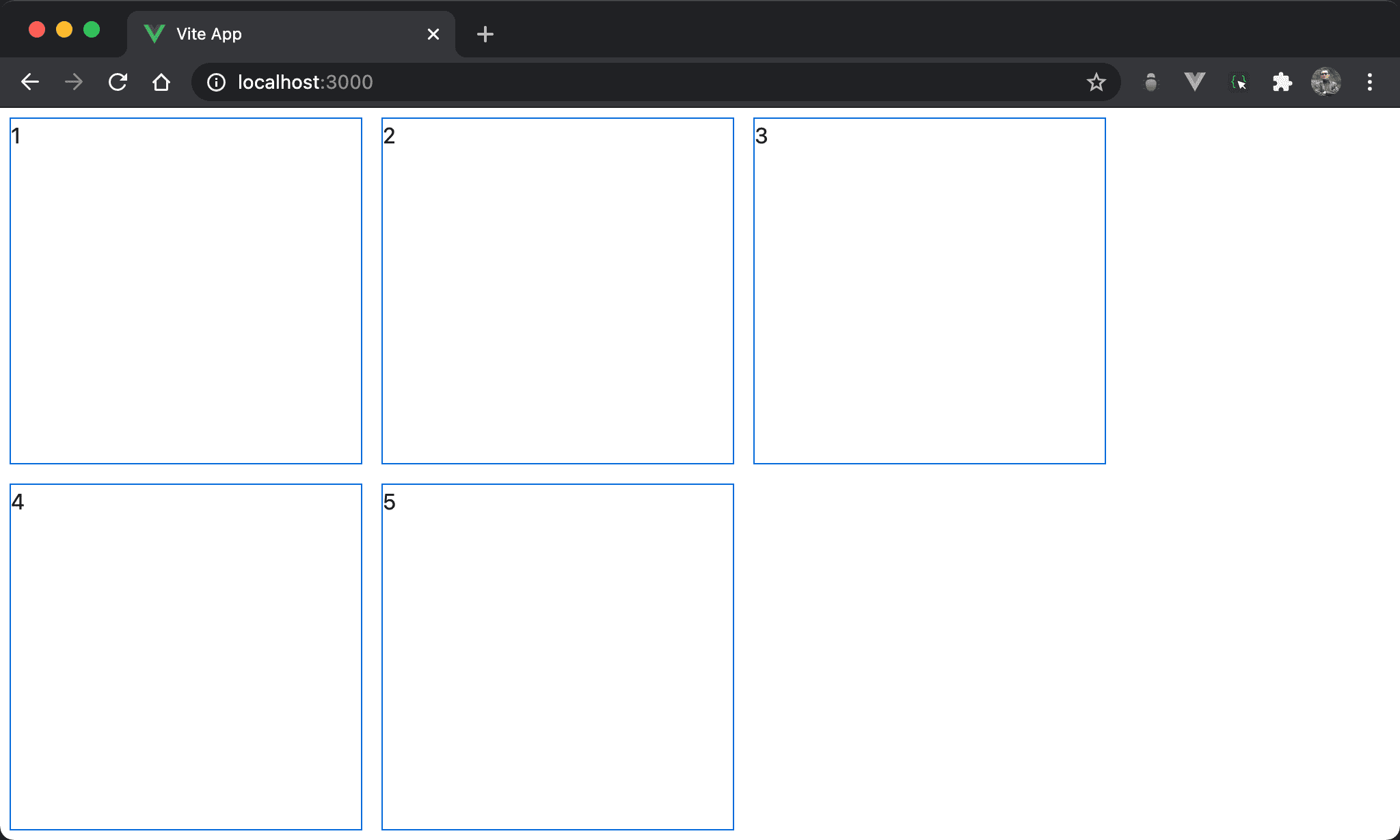
在自動換列下,儘管子層 item 都沒有定義 height,但 Flexbox 會使每個 item 自動等高。
<template>
  <div class="flex flex-wrap w-full h-screen">
    <div class="w-1/4 m-2">1</div>
    <div class="w-1/4 m-2">2</div>
    <div class="w-1/4 m-2">3</div>
    <div class="w-1/4 m-2">4</div>
    <div class="w-1/4 m-2">5</div>
  </div>
</template>
第 2 列
<div class="flex flex-wrap w-full h-screen">
設定父層 box 的 style:
flex:設定子層使用 Flexboxflex-wrap:當各子層 item 總 width 超越父層 box width 時自動換列,也是啟動 flex line 的開關w-full:設定父層 box 的 widthh-screen:設定父層 box 的 height
Same Height
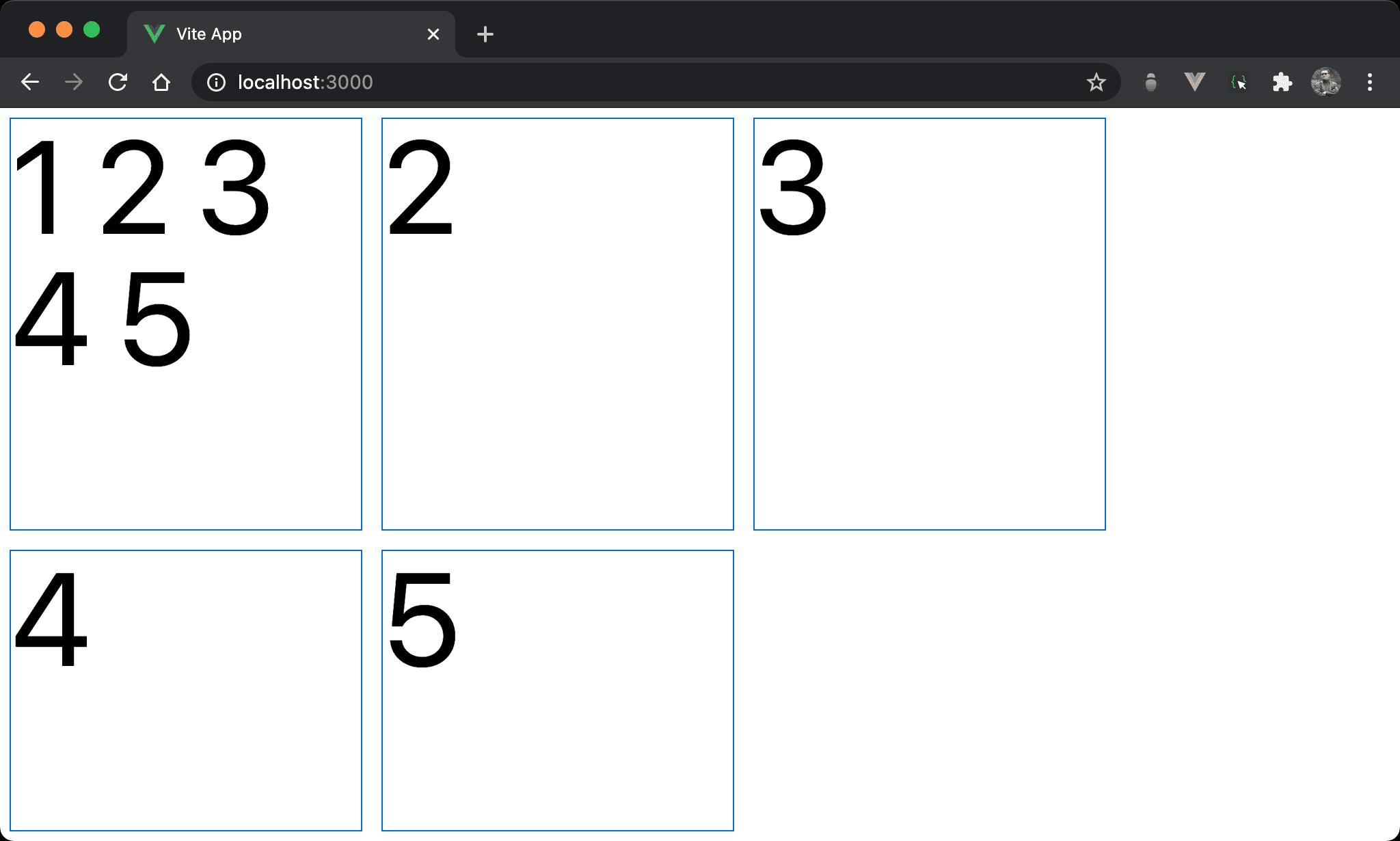
子層 item 一樣沒有設定 height,且 item 1 因為 content 較多而撐出較高的 height,會發現 item2 與 item 3 會自動與 item 1 等高。
<template>
  <div class="flex flex-wrap w-full h-screen">
    <div class="w-1/4 text-8xl m-2">1 2 3 4 5</div>
    <div class="w-1/4 text-8xl m-2">2</div>
    <div class="w-1/4 text-8xl m-2">3</div>
    <div class="w-1/4 text-8xl m-2">4</div>
    <div class="w-1/4 text-8xl m-2">5</div>
  </div>
</template>
第 3 行
<div class="w-1/4 text-8xl m-2">1 2 3 4 5</div>
設定子層 item 的 style:
text-8xl:為了讓 content 撐起 height 效果明顯,特別將 font size 變大
若其中有一列因為 content 而改變 height,則一整列都會自動等高
items-center
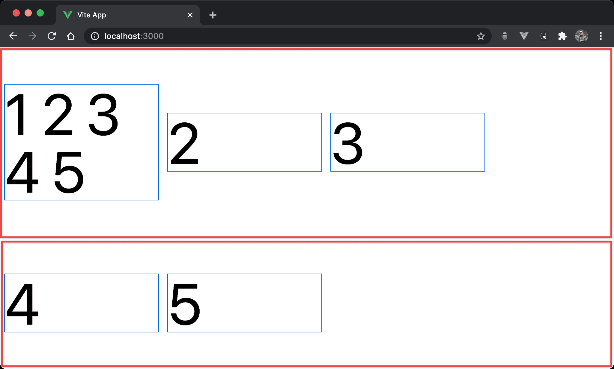
父層 box 使用 items-center 後,子層 item 不再自動 stretch 與 flex line 等高,而是根據 content 自動調整 height。
紅色部分為 flex line,可明顯看出 items-center 使得子層 item 自動垂直置中於 flex line。
<template>
  <div class="flex flex-wrap items-center w-full h-screen">
    <div class="w-1/4 text-8xl m-2">1 2 3 4 5</div>
    <div class="w-1/4 text-8xl m-2">2</div>
    <div class="w-1/4 text-8xl m-2">3</div>
    <div class="w-1/4 text-8xl m-2">4</div>
    <div class="w-1/4 text-8xl m-2">5</div>
  </div>
</template>
第 2 行
<div class="flex flex-wrap items-center w-full h-screen">
設定父層 box 的 style:
flex-wrap:使用換列啟動 flex lineitems-center:由於明確指定items-center,因此子層 item 喪失了items-stretch,子層 item 不再自動 stretch 成 flex line 高度,而是由 content 決定,也因為子層 item 與 flex line 高度不同,因此items-center有其用武之地而垂直置中
Conclusion
- Flexbox 只所以會讓子層 item 自動 stretch 等高,關鍵在於預設為
items-stretch,但只要將其改成其它值,就會立即喪失等高功能 flex-wrap為啟動 flex line 關鍵,若為 nowrap 則自動 stretch 成外層 box 等高;若為 wrap 則自動 stretch 成 flex line 等高