Flexbox 的 items-start 與 content-start 非常類似,都是在處理 Cross Axis 對齊,事實上兩者並不違背,還可一起使用。
Version
Tailwind CSS 2.0.3
items-start
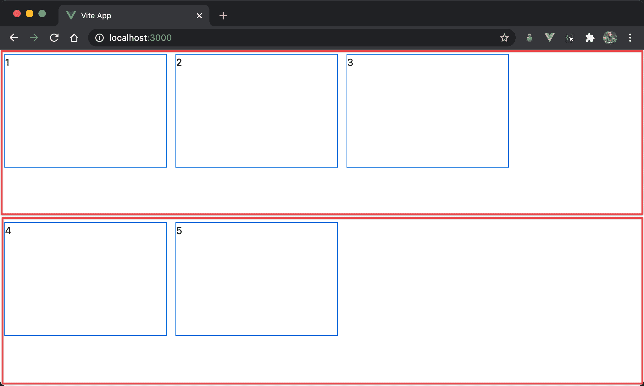
各 item 在 cross axis 針對 flex line 的開始處對齊,看起來像各 item 對 flex line 垂直靠上。
<template>
  <div class="flex flex-wrap items-start w-full h-screen">
    <div class="w-3/12 h-1/3 m-2">1</div>
    <div class="w-3/12 h-1/3 m-2">2</div>
    <div class="w-3/12 h-1/3 m-2">3</div>
    <div class="w-3/12 h-1/3 m-2">4</div>
    <div class="w-3/12 h-1/3 m-2">5</div>
  </div>
</template>
第 2 行
<div class="flex flex-wrap items-start w-full h-screen">
設定 box 的 style:
flex:使用 Flexboxflex-wrap:當各 item 總 width 超越 box width 時自動換列items-start:各 item 在 flex line 的 cross axis 從起始處對齊,看起來像垂直靠上w-full:設定 box 的 widthh-screen:設定 box 的 height
第 3 行
<div class="w-3/12 h-1/3 m-2">1</div>
設定 item 的 style:
w-3/12:設定各 item 的 widthh-1/3:設定各 item 的 heightm-2:設定各 item 的 margin
content-start
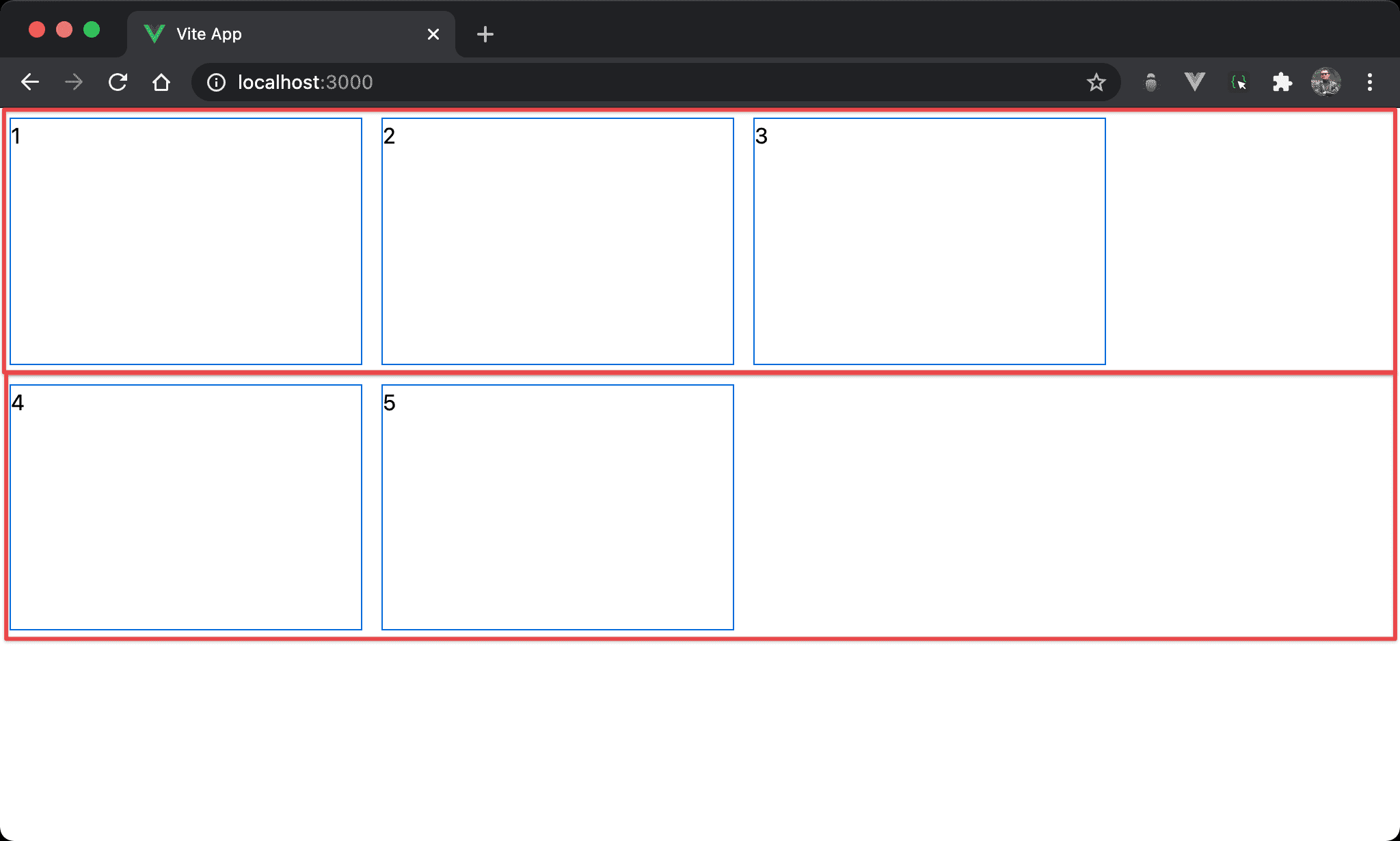
Flex line 在 cross axis 針對 box 的開始處對齊,看起來像 flex line 對 box 垂直靠上。
<template>
  <div class="flex flex-wrap content-start w-full h-screen">
    <div class="w-3/12 h-1/3 m-2">1</div>
    <div class="w-3/12 h-1/3 m-2">2</div>
    <div class="w-3/12 h-1/3 m-2">3</div>
    <div class="w-3/12 h-1/3 m-2">4</div>
    <div class="w-3/12 h-1/3 m-2">5</div>
  </div>
</template>
第 2 行
<div class="flex flex-wrap content-start w-full h-screen">
設定 box 的 style:
content-start:各 flex line 在 box 的 cross axis 從起始處對齊,看起來像垂直靠上
雖然看起來都是
垂直靠上,但items-start是各 item 針對 flex line 垂直靠上;而content-start是 flex line 針對 box 垂直靠上,因此content-start的各 item 換列時並沒有空隙
items-start vs. contend-start
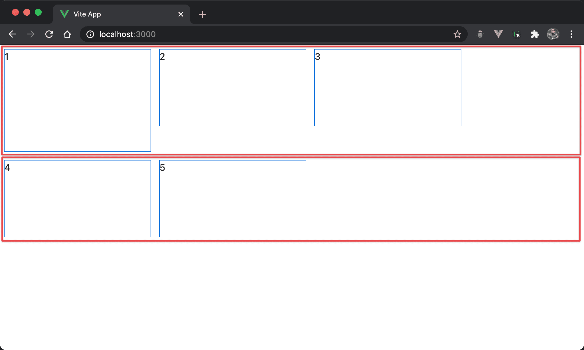
items-start 與 content-start 並非互斥,事實上還可以搭配一起使用。
可發現 item 1 高度特別高,因此其 flex line 高度被撐開,flex line 對於 box 整體是 content-start,但 item 1 卻是 items-start。
<template>
  <div class="flex flex-wrap content-start items-start w-full h-screen">
    <div class="w-3/12 h-1/3 m-2">1</div>
    <div class="w-3/12 h-1/4 m-2">2</div>
    <div class="w-3/12 h-1/4 m-2">3</div>
    <div class="w-3/12 h-1/4 m-2">4</div>
    <div class="w-3/12 h-1/4 m-2">5</div>
  </div>
</template>
第 2 行
<div class="flex flex-wrap content-start items-start w-full h-screen">
設定 box 的 style:
content-start:Flex line 對 box 垂直靠上
items-start:各 item 對 flex line 垂直靠上
若各 item 都一樣高,則看不出
items-start效果
第 4 行
<div class="w-3/12 h-1/4 m-2">2</div>
設定各 item 共用 style:
h-1/4:設定各 item 高度都是h-1/4
第 3 行
<div class="w-3/12 h-1/3 m-2">1</div>
設定 item 1 的 style:
h-1/3:設定 item 1 的高度為h-1/3,由於 item 1 的高度特別高,撐出其 flex line 也特別高,造成items-start有特殊效果
Conclusion
items-start與content-start是 Flexbox 很容易搞混的概念,items-start是 item 對於 flex line;而content-start是 flex line 對於 boxitems-start與content-start並非互斥,還可一起使用