實務上除了在 Main Axis 方向對齊外,若外層 <div> 有高度且 Item 有換列,若也需同時對 Cross Axis 從 Content 上沿對齊,可使用 items-baseline 達成。
Version
Tailwind CSS 2.0.3
items-baseline
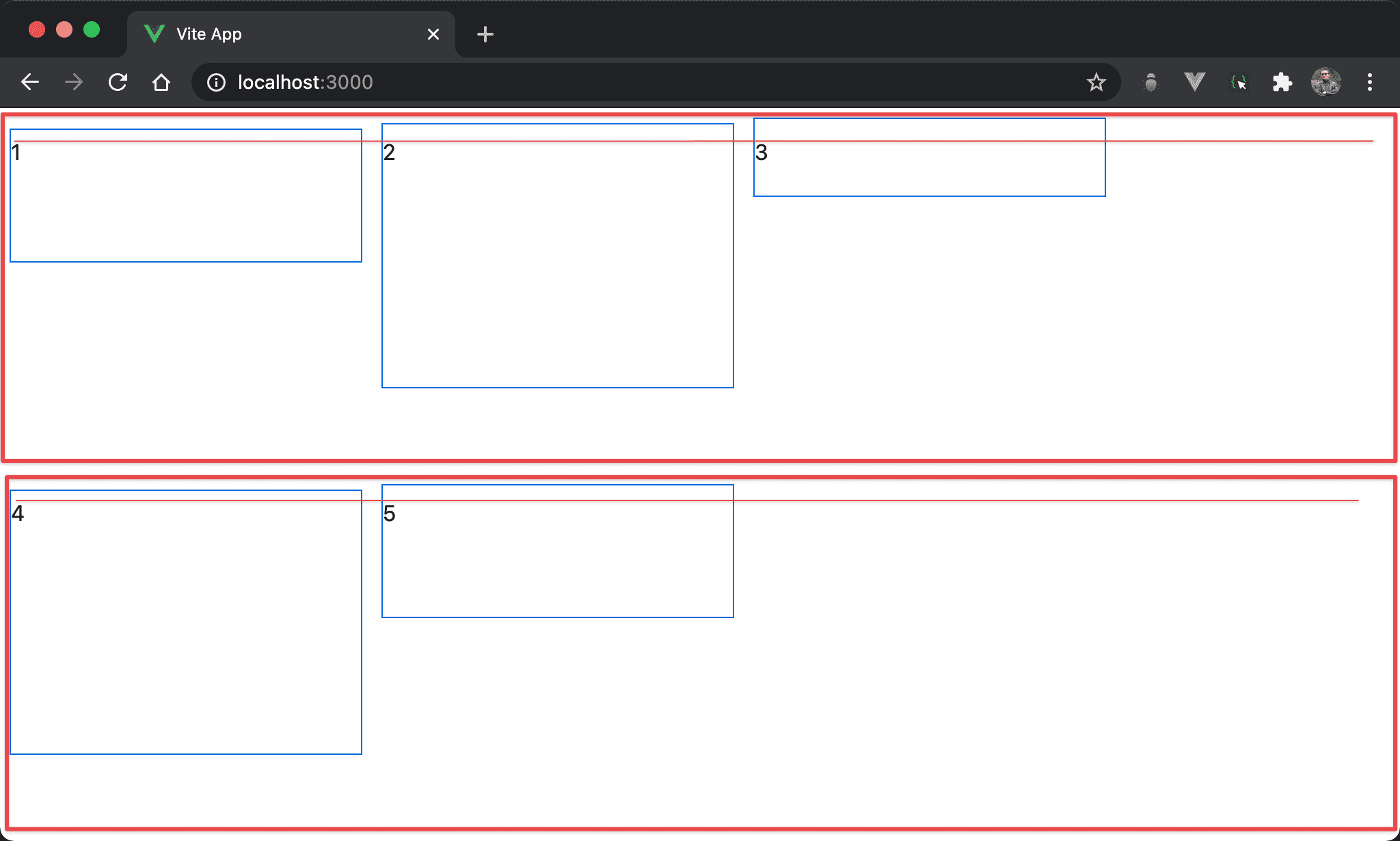
- Baseline 與 flex-start 表現很類似,只有在 padding 不同時才有差異
- 注意其是與 content 在 cross axis 靠上對齊,而非與 item 在 cross axis 靠上對齊
<template>
  <div class="flex flex-wrap items-baseline w-full h-screen">
    <div class="w-3/12 h-12 pt-1 m-2">1</div>
    <div class="w-3/12 h-8 pt-2 m-2">2</div>
    <div class="w-3/12 h-14 pt-3 m-2">3</div>
    <div class="w-3/12 h-12 pt-1 m-2">4</div>
    <div class="w-3/12 h-8 pt-2 m-2">5</div>
  </div>
</template>
第 2 行
<div class="flex flex-wrap items-baseline w-full h-screen">
設定 box 的 style:
flex:使用 Flexboxflex-wrap:當各 item 總 width 超越 box width 時自動換列items-baseline:各 item 的 content 在 flex line 的 cross axis 從起始處對齊,看起來與flex-start很類似w-full:設定 box 的 widthh-screen:設定 box 的 height
第 3 行
<div class="w-3/12 h-12 pt-1 m-2">1</div>
<div class="w-3/12 h-8 pt-2 m-2">2</div>
<div class="w-3/12 h-14 pt-3 m-2">3</div>
<div class="w-3/12 h-12 pt-1 m-2">4</div>
<div class="w-3/12 h-8 pt-2 m-2">5</div>
設定各 item 的 style:
w-3/12:設定各 item 的 widthm-2:設定各 item 的 margin
各 item 的
height與padding-top都不一樣,故意展示 baseline 特性
Conclusion
- 當
items-baseline在沒有換列時,其 flex line 只有一列,且 height 剛好等於 box height,因此看不出 flex line 概念;但若牽涉換列時,就可明顯看出items-baseline是根據 flex line 的 cross axis 對齊