實務上若想 Item 在 Main Axis 方向總寬度大於外層時仍不換列,可使用 flex-nowrap 達成。
Version
Tailwind CSS 2.0.2
flex-nowrap
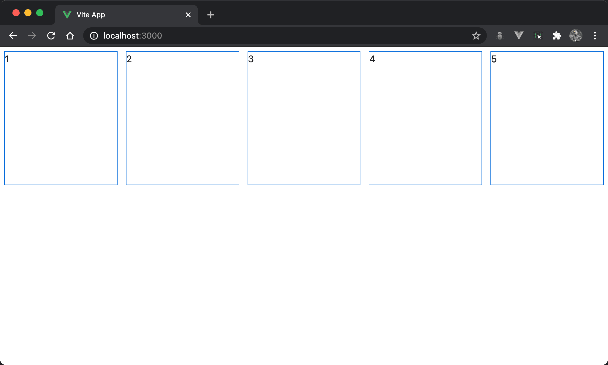
Item 總寬度雖然大於 box,但因為使用 Flexbox 且不換列,會自動 shrink 在一列顯示。
<template>
  <div class="flex flex-nowrap w-full h-screen">
    <div class="w-72 h-56 m-2">1</div>
    <div class="w-72 h-56 m-2">2</div>
    <div class="w-72 h-56 m-2">3</div>
    <div class="w-72 h-56 m-2">4</div>
    <div class="w-72 h-56 m-2">5</div>
  </div>
</template>
flex:使用 Flexboxflex-nowrap:設定不自動換列,這也是預設值,可省略不寫- 各 item 總寬度大於外層,但由於
flex-nowrap,因此所有 item 仍在自動 shrink 在同一列顯示
Conclusion
- 由於
flex-nowrap是預設值,一般省略不寫,除非在 RWD 下搭配sm、md… 等 variant 時才會使用flex-nowrap