很多人對於 Tailwind CSS 誤解在於 Utility 都寫在 HTML,很難重複使用 Style,Tailwind CSS 另外提供了 @apply directive 專門處理此問題。
Version
Tailwind CSS 2.1.1
Button
<template>
  <button>
    Submit
  </button>
</template>
在沒有使用 Tailwind CSS 下,在 HTML 僅使用簡單 <button> 就可建立 button。
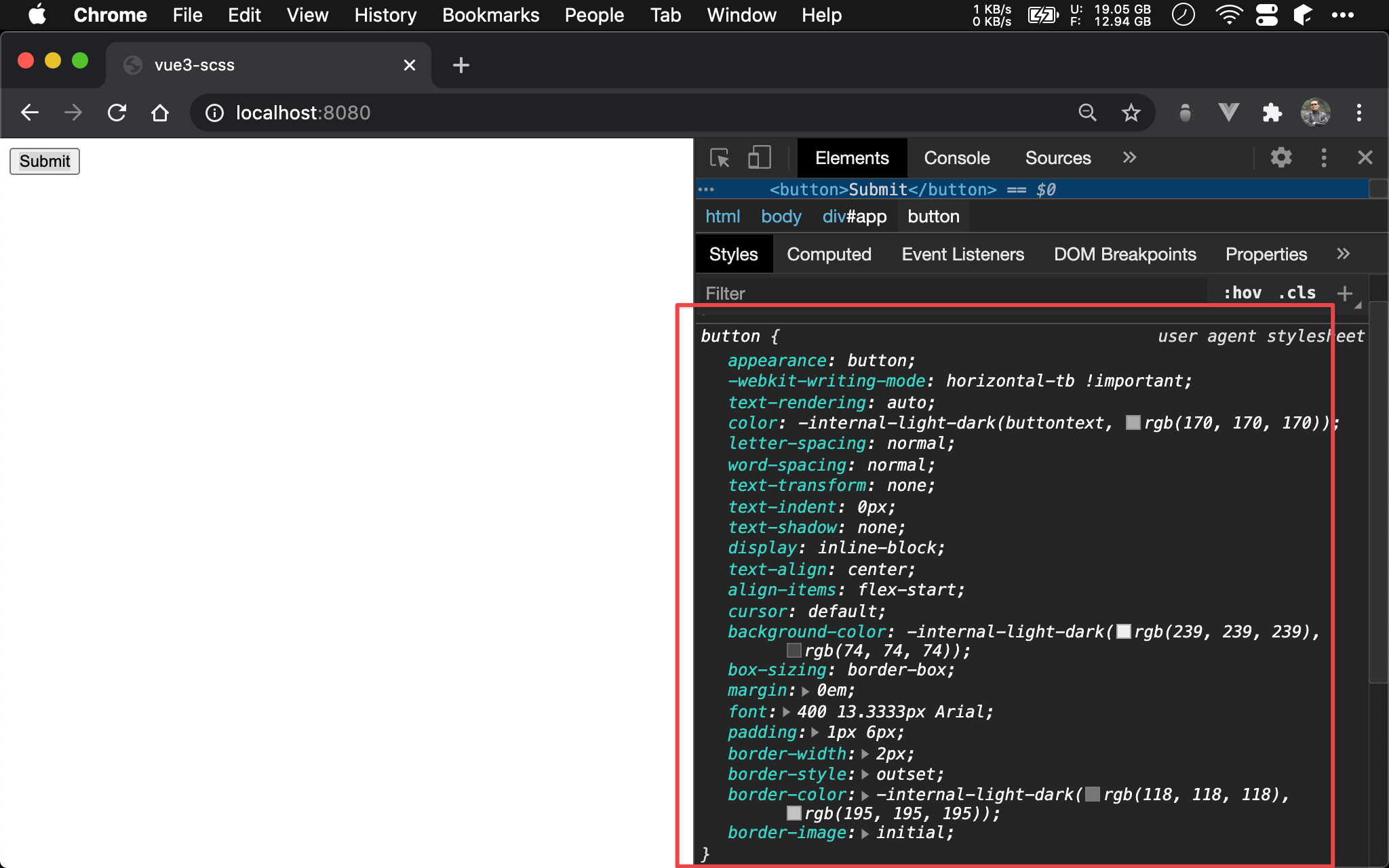
因為 browser 已經為 <button> 提供很多預設 property。
Tailwind Button
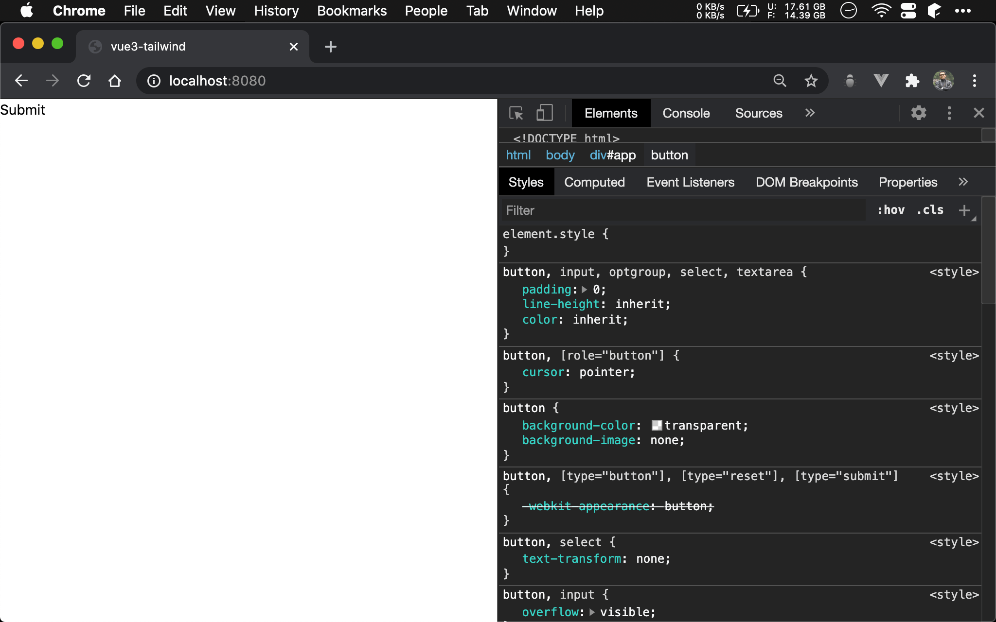
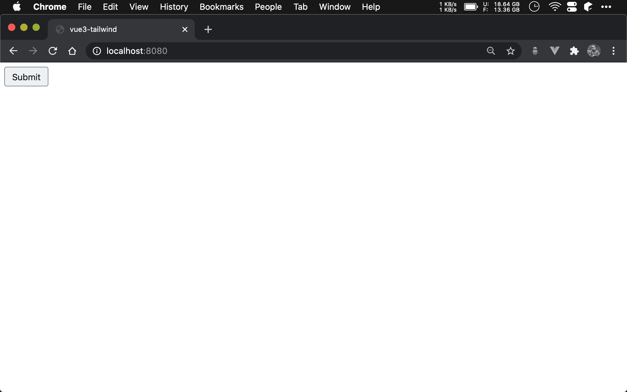
在 Tailwind 下若使用簡單 <button>,會發現 browser 下已經不像 button,因為 Tailwind 內建 CSS Reset 了,<button> 已經不具備預設 property。
<template>
  <button class="bg-gray-200 hover:bg-gray-300 border-2 rounded border-solid border-gray-600 px-3 py-1 m-2">
    Submit
  </button>
</template>
若要做出與 browser 預設 button 相同外觀,可自行加入適當 utility:
bg-gray-200: 設定 button 背景顏色hover: bg-gray-300:當 hover 時的 button 背景顏色border-2: 設定 border widthrounded:設定 border 具有圓角border-solid:設定 border 有實體線border-gray-600:設定 border 顏色px-3 py-1:設定 paddingm-2:設定 margin
Real World Button
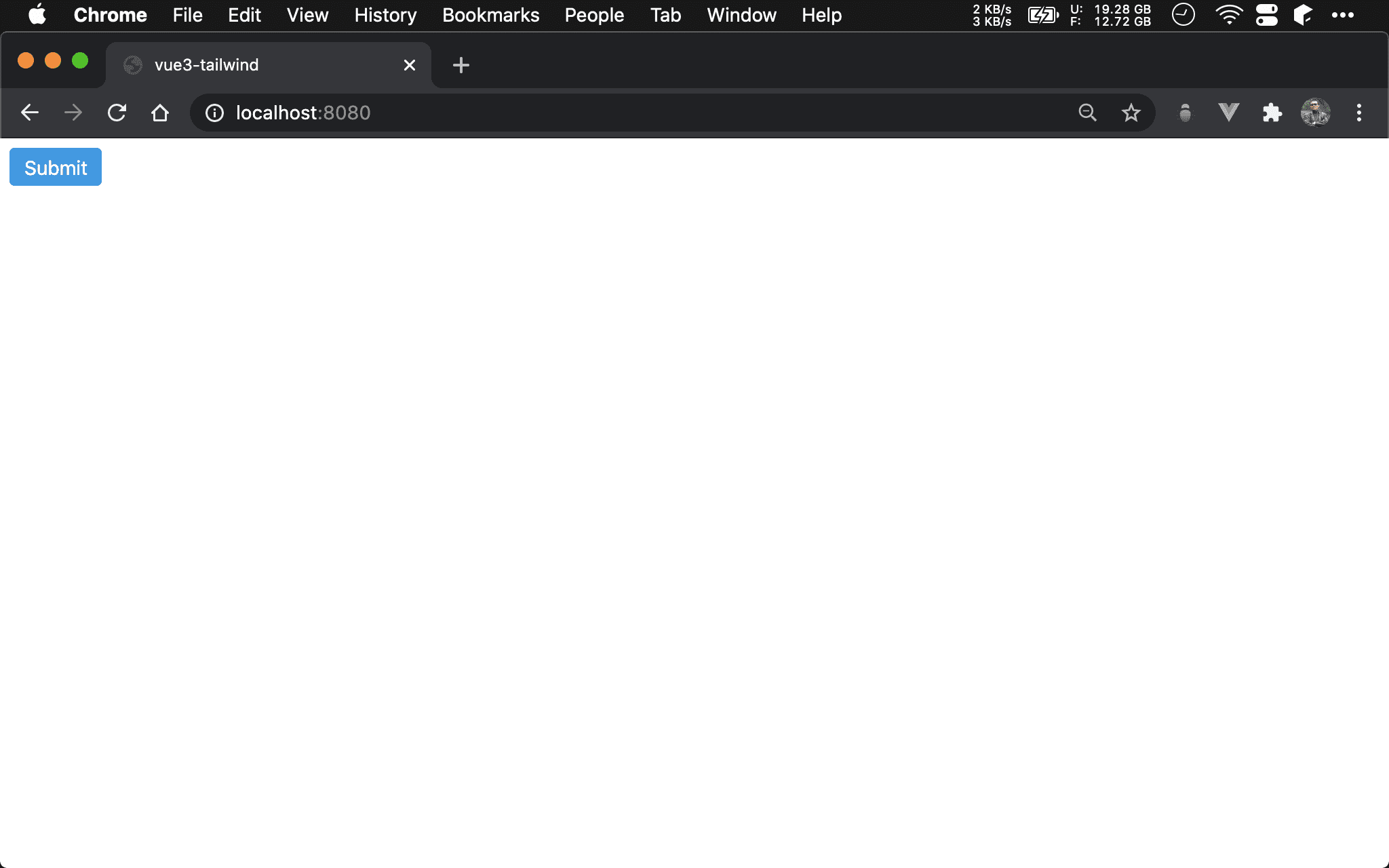
實務上幾乎不會使用 browser 的預設 button,而會自行採用 CSS 加以 style。
<template>
  <button class="bg-blue-500 hover:bg-blue-700 text-white rounded px-3 py-1 m-2">
    Submit
  </button>
</template>
bg-blue-500:設定背景顏色hover: bg-blue-700:當 hover 時的背景顏色text-white:設定文字顏色rounded:設定 border 具有圓角px-3 py-1:設定 paddingm-2:設定 margin
Local Component
<template>
  <button class="btn">
    Submit
  </button>
</template>

<style scoped>
.btn {
  @apply bg-blue-500 hover:bg-blue-700 text-white rounded px-3 py-1 m-2
}
</style>
若 style 在 component 內多處使用,也可抽成 local component。
第 8 行
.btn {
  @apply bg-blue-500 hover:bg-blue-700 text-white rounded px-3 py-1 m-2
}
使用 @apply directive 將原本在 HTML 的 class 全部搬到 btn class。
第 2 行
<button class="btn">
  Submit
</button>
如此 <button> 只要套用 btn class 即可。
Global Component
assets/css/tailwind.css
@tailwind base;
@tailwind components;
@tailwind utilities;

@layer components {
  .btn {
    @apply bg-blue-500 hover:bg-blue-700 text-white rounded px-3 py-1 m-2
  }
}
若 style 在多處都使用,也可抽成 global component。
在
tailwind.css建立btnglobal component,如此所有 HTML 都可直接使用。由於
btn屬於 component,所以寫在@layer components下。
App.vue
<template>
  <button class="btn">
    Submit
  </button>
</template>
如此 HTML 可直接使用 btn class。
Component Plugin
tailwind.config.js
let plugin = require('tailwindcss/plugin')

let buttonPlugin = ({ addComponents }) => {
  let style = {
    '.btn': {
      borderRadius: '0.25rem',
      paddingTop: '0.5rem',
      paddingBottom: '0.5rem',
      paddingLeft: '1rem',
      paddingRight: '1rem',
      backgroundColor: '#4299c1',
      color: '#fff',
      '&:hover': {
        backgroundColor: '#2b6cb0',
      }
    },
  }

  addComponents(style)
}

module.exports = {
  purge: [
    './src/**/*.html',
    './src/**/*.vue',
  ],
  theme: {
    extend: {},
  },
  plugins: [
    plugin(buttonPlugin)
  ],
}
若 style 在多 project 都使用,也可抽成 component plugin。
第 1 行
let plugin = require('tailwindcss/plugin')
引用 Tailwind 所提供的 plugin()。
第 3 行
let buttonPlugin = ({ addComponents }) => {
建立 buttonPlugin(),從 argument destructure 出 addComponents(),將用此 function 建立 component。
第 4 行
let style = {
  '.btn': {
    borderRadius: '0.25rem',
    paddingTop: '0.5rem',
    paddingBottom: '0.5rem',
    paddingLeft: '1rem',
    paddingRight: '1rem',
    backgroundColor: '#4299c1',
    color: '#fff',
    '&:hover': {
      backgroundColor: '#2b6cb0',
    }
  },
}
將 btn utility 以 CSS-in-JS 形式寫在 style object 內。
目前 plugin 不能使用
@apply,因此只能寫 pure CSS
19 行
addComponents(style)
使用 addComponents() 寫入新 style。
30 行
plugins: [
  plugin(buttonPlugin)
],
在 plugins 內使用 plugin() 掛入 buttonPlugin()。
Conclusion
使用 Tailwind 時甚少在
<style>定義 class,除非在 component 內共用 style,此時會使用@apply將共用 utility 抽出 local component若要在各 component 共用 style,可在
tailwind.css使用@apply抽成 global component若要在各 project 共用 style,可抽成 component plugin,但目前在 plugin 內只能搭配 pure CSS,而不能使用
@apply,最後以 NPM package 形式共用在抽成 component 時,也必須遵守 Functional CSS 精神,將 CSS 拆成最小單位,以利 Function Composition