The hover variant is only for light mode. We can compose dark and hover to take effect.
Version
TailwindCSS 3.0
dark:hover
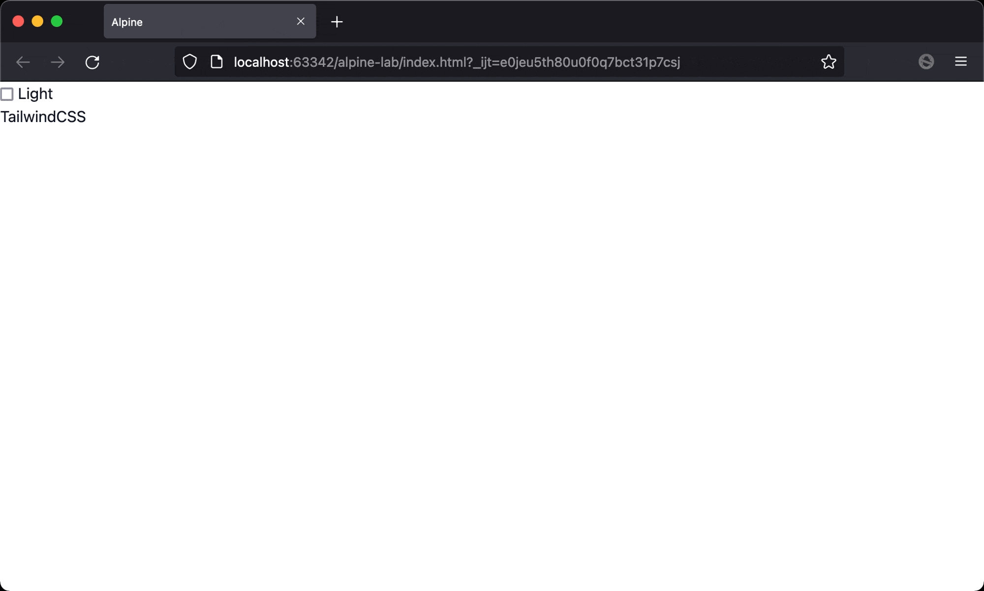
- On light mode, hovering
TailwindCSSwill change the color to red - On dark mode, hovering
TailwindCSSwill change the color to green
<!doctype html>
<html lang="en">
<head>
  <meta charset="UTF-8">
  <meta name="viewport" content="width=device-width, initial-scale=1.0">
  <script src="https://unpkg.com/alpinejs" defer></script>
  <script src="https://cdn.tailwindcss.com"></script>
  <title>Alpine</title>
</head>
<script>
tailwind.config = {
  darkMode: 'class'
}
</script>
<body x-data="{ isDark: false }" :class="{ dark: isDark }">
  <div class="min-h-screen bg-white dark:bg-gray-800 text-gray-900 dark:text-white">
    <input type="checkbox" x-model="isDark">
    <span x-text="isDark ? 'Dark' : 'Light'"></span>
    <div class="hover:text-red-500 dark:hover:text-green-500">TailwindCSS</div>
  </div>
</body>
</html>
Line 19
<div class="hover:text-red-500 dark:hover:text-green-500">TailwindCSS</div>
hover:text-red-500: set text color when hovering in light modedark:hover:text-green-500: set text color when hovering in dark mode
Conclusion
darkandhoverare both variants, and these variants can be stacked to the element