Three columns layout is a common layout for modern Web design. This can be done by float.
Version
TailwindCSS 3.0
3 float-left
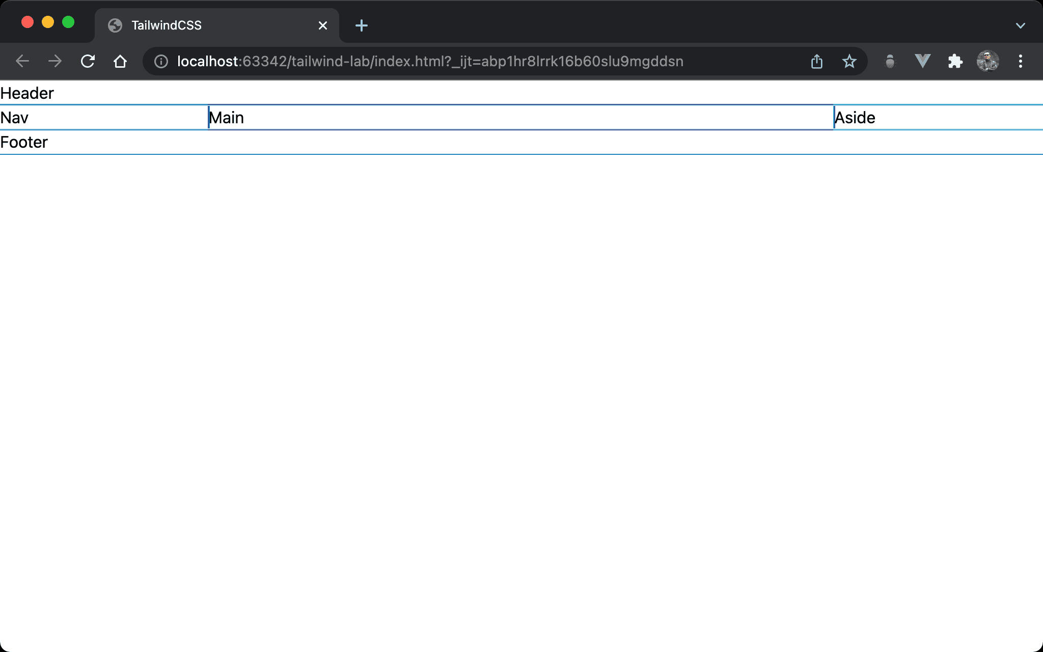
Three columns form <nav>, <main> and <aside>.
<!doctype html>
<html lang="en">
<head>
  <meta charset="UTF-8">
  <meta name="viewport" content="width=device-width, initial-scale=1.0">
  <script src="https://cdn.tailwindcss.com"></script>
  <title>TailwindCSS</title>
</head>
<body>
  <header>Header</header>
  <nav class="float-left w-1/5">Nav</nav>
  <main class="float-left w-3/5">Main</main>
  <aside class="float-left w-1/5">Aside</aside>
  <footer class="clear-left">Footer</footer>
</body>
</html>
float-left: float the element to the leftclear-left: clearfloat-left
2 float-left, 1 float-right
Three columns are implemented by another method.
<!doctype html>
<html lang="en">
<head>
  <meta charset="UTF-8">
  <meta name="viewport" content="width=device-width, initial-scale=1.0">
  <script src="https://cdn.tailwindcss.com"></script>
  <title>TailwindCSS</title>
</head>
<body>
  <header>Header</header>
  <nav class="float-left w-1/5">Nav</nav>
  <main class="float-left w-3/5">Main</main>
  <aside class="float-right w-1/5">Aside</aside>
  <footer class="clear-both">Footer</footer>
</body>
</html>
float-left: float the element to the leftfloat-right: float the element to the rightclear-both: clear bothfloat-leftandfloat-right
Conclusion
- When using
floatfor 3 columns layout, remember to useclear-leftorclear-bothto clearfloat