For Card layout, we often add 2 buttons at the bottom. One is on the extreme left, and the other is on the extreme right.
Version
TailwindCSS 3.0
justify-center
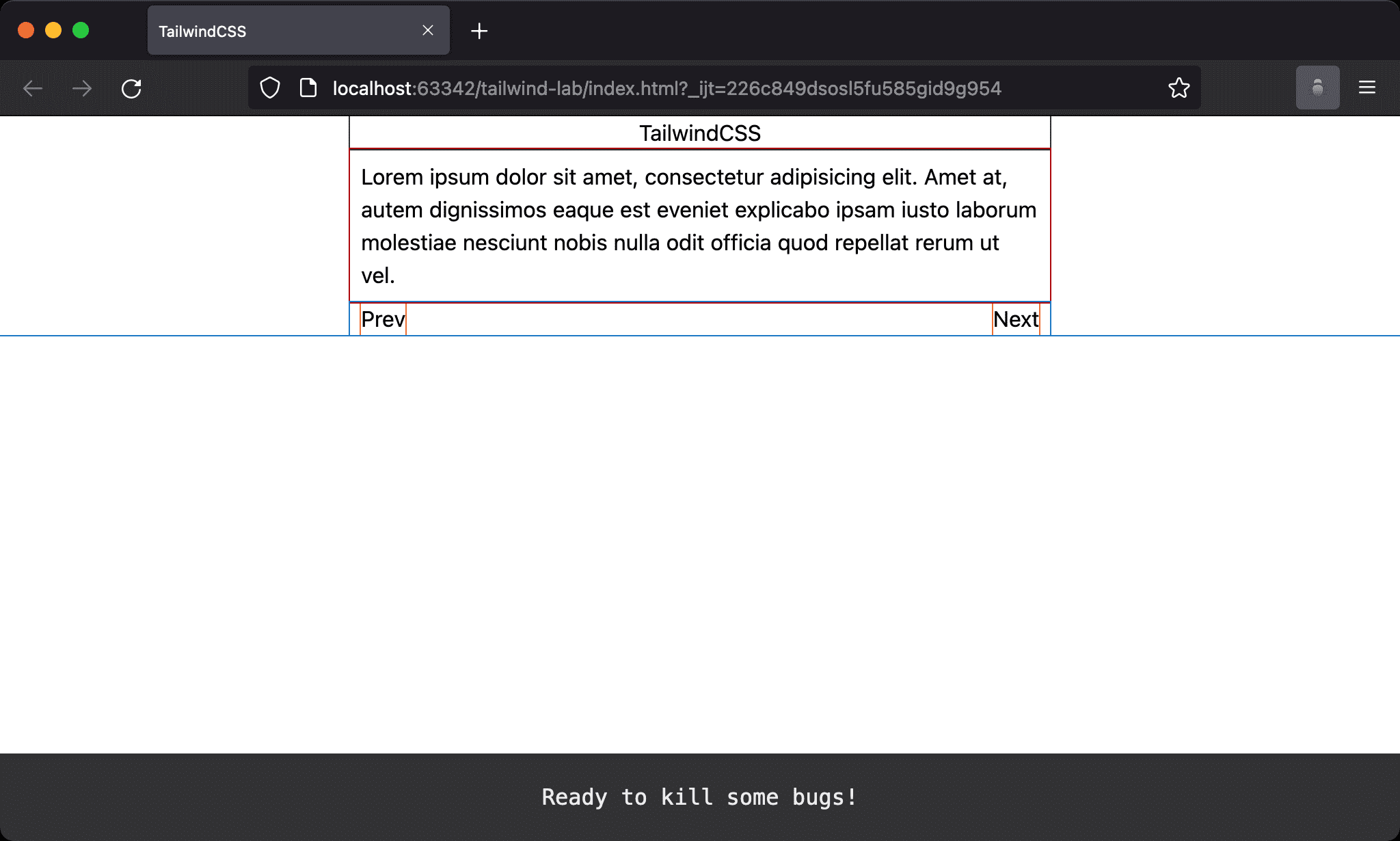
Card with extreme left Prev button and extreme right Next button.
<!doctype html>
<html lang="en">
<head>
  <meta charset="UTF-8">
  <meta name="viewport" content="width=device-width, initial-scale=1.0">
  <script src="https://cdn.tailwindcss.com"></script>
  <title>TailwindCSS</title>
</head>
<body class="flex justify-center">
  <div class="w-1/2">
    <h1 class="text-center">TailwindCSS</h1>
    <p class="p-2">Lorem ipsum dolor sit amet, consectetur adipisicing elit. Amet at, autem dignissimos eaque est eveniet explicabo ipsam iusto laborum molestiae nesciunt nobis nulla odit officia quod repellat rerum ut vel.</p>
    <div class="flex justify-between">
      <button class="ml-2">Prev</button>
      <button class="mr-2">Next</button>
    </div>
  </div>
</body>
</html>
Line 13
<div class="flex justify-between">
  <button class="ml-2">Prev</button>
  <button class="mr-2">Next</button>
</div>
flex: make parent element as Flex Container and child element as Flex Itemjustify-between: since there are only two buttons, all remaining space will be allocated between the two buttonsml-2: left margin for the first buttonmr-2: right margin for the last button
flex-grow
The same layout is implemented by flex-grow.
<!doctype html>
<html lang="en">
<head>
  <meta charset="UTF-8">
  <meta name="viewport" content="width=device-width, initial-scale=1.0">
  <script src="https://cdn.tailwindcss.com"></script>
  <title>TailwindCSS</title>
</head>
<body class="flex justify-center">
  <div class="w-1/2">
    <h1 class="text-center">TailwindCSS</h1>
    <p class="p-2">Lorem ipsum dolor sit amet, consectetur adipisicing elit. Amet at, autem dignissimos eaque est eveniet explicabo ipsam iusto laborum molestiae nesciunt nobis nulla odit officia quod repellat rerum ut vel.</p>
    <div class="flex">
      <button class="ml-2">Prev</button>
      <div class="flex-grow"></div>
      <button class="mr-2">Next</button>
    </div>
  </div>
</body>
</html>
Line 13
<div class="flex">
  <button class="ml-2">Prev</button>
  <div class="flex-grow"></div>
  <button class="mr-2">Next</button>
</div>
flex: make parent element as Flex Container and child element as Flex Itemflex-grow: the middle item uses all the remaining spaceml-2: left margin for the first buttonmr-2: right margin for the last button
flex-growmakesPrevis on the extreme left andNextis on the extreme right
m-auto
The same layout is implemented by m-auto.
<!doctype html>
<html lang="en">
<head>
  <meta charset="UTF-8">
  <meta name="viewport" content="width=device-width, initial-scale=1.0">
  <script src="https://cdn.tailwindcss.com"></script>
  <title>TailwindCSS</title>
</head>
<body class="flex justify-center">
  <div class="w-1/2">
    <h1 class="text-center">TailwindCSS</h1>
    <p class="p-2">Lorem ipsum dolor sit amet, consectetur adipisicing elit. Amet at, autem dignissimos eaque est eveniet explicabo ipsam iusto laborum molestiae nesciunt nobis nulla odit officia quod repellat rerum ut vel.</p>
    <div class="flex">
      <button class="ml-2 mr-auto">Prev</button>
      <button class="mr-2 ml-auto">Next</button>
    </div>
  </div>
</body>
</html>
Line 13
<div class="flex">
  <button class="ml-2 mr-auto">Prev</button>
  <button class="mr-2 ml-auto">Next</button>
</div>
flex : make parent element as Flex Container and child element as Flex Item
mr-auto : automatically adjust right margin of the first button
ml-auto : automatically adjust left margin of the last button
ml-2 : left margin for the first button
mr-2 : right margin for the last button
mr-autoandml-automakePrevis on the extreme left andNextis on the extreme right
Conclusion
flex justify-betweenis the simplest way to implement