若要對影像實作灰階效果,可使用 <div> 搭配 mix-blend-color 實現。
Version
Tailwind CSS 2.1.1
Image Effect
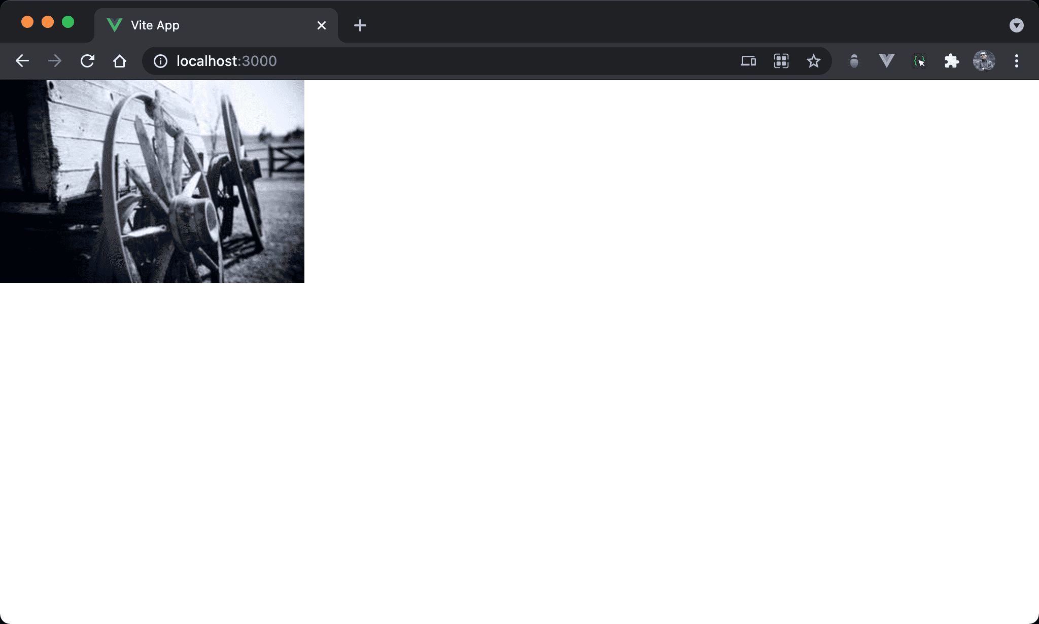
彩色圖片改以灰階顯示。
<template>
  <figure class="relative inline-block">
    <img src="https://picsum.photos/300/200/?random=10" alt="scenery">
    <div class="absolute w-full h-full top-0 left-0 bg-gray-500 mix-blend-color" />
  </figure>
</template>
第 2 行
<figure>
  <img>
  <div/>
</figure>
由於要使用另外一個 <div> 使用 absolute,因此 <img> 外需有一個 container 可用 relative。
雖然也可使用
<div>,但由於是<img>,使用 HTML 5 的<figure>語意更佳
第 2 行
<figure class="relative inline-block">
設定父層 box style:
relative:即將使用另一個<div>為absolute,在父層設定成relative使之以此為定位基準inline-block:使<figure>內縮成與子層<img>同寬高
第 4 行
<div class="absolute w-full h-full top-0 left-0 bg-gray-500 mix-blend-color" />
新增 <div> 對圖片進行灰階效果:
absolute:設定使用 absolute positionw-full:設定寬度與<figure>同寬h-full:設定高度與<figure>同高top-0:設定上緣與<figure>對齊left-0:設定左側與<figure>對齊bg-gray-500:設定背景顏色為灰色mix-blend-color:設定背景顏色與<img>混色產生灰階效果
Conclusion
- 傳統會使用
:before或:after處理圖片灰階,但由於:before或:after都在 CSS selector 內處理,這明顯與 Tailwind CSS 都在 HTML 處理風格不符 - Tailwind CSS 會將
:before明確寫在 element 之前,而:after則明確寫在 element 之後,這也是為什麼 Tailwind CSS 為什麼沒有:before與:after相對應 utility 主因