使用 Tailwind UI 的 Modal Dialog,我們只需使用 v-if 控制顯示的 State 即可。
Version
Tailwind CSS 2.1.1
Modal Dialog with Dismiss Button
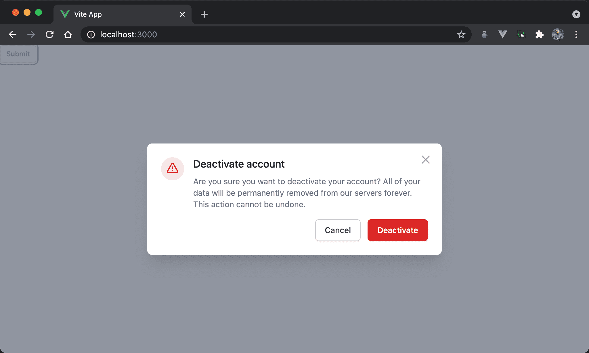
按下 Submit 後顯示 modal dialog,且右上角有 X dismiss button。
<template>
<button @click="onShow" type="button" class="px-2.5 py-1.5 border border-gray-300 shadow-sm text-xs font-medium text-gray-700 rounded bg-white hover:bg-gray-50 focus:outline-none focus:ring-2 focus:ring-offset-2 focus:ring-indigo-500">
    Submit
</button>
<transition
  enter-from-class="opacity-0"
  enter-active-class="transition duration-500"
  enter-to-class="opacity-100"
  leave-from-class="opacity-100"
  leave-active-class="transition duration-500"
  leave-to-class="opacity-0"
>
<div v-if="isShowModal" class="fixed z-10 inset-0 overflow-y-auto" aria-labelledby="modal-title" role="dialog" aria-modal="true">
<div class="flex items-end justify-center min-h-screen pt-4 px-4 pb-20 text-center sm:block sm:p-0">
<div class="fixed inset-0 bg-gray-500 bg-opacity-75 transition-opacity" aria-hidden="true"/>
<span class="hidden sm:inline-block sm:align-middle sm:h-screen" aria-hidden="true">​</span>
<div class="inline-block align-bottom bg-white rounded-lg px-4 pt-5 pb-4 text-left overflow-hidden shadow-xl transform transition-all sm:my-8 sm:align-middle sm:max-w-lg sm:w-full sm:p-6">
<div class="hidden sm:block absolute top-0 right-0 pt-4 pr-4">
<button @click="onHide" type="button" class="bg-white rounded-md text-gray-400 hover:text-gray-500 focus:outline-none focus:ring-2 focus:ring-offset-2 focus:ring-indigo-500">
<span class="sr-only">Close</span>
<svg class="h-6 w-6" xmlns="http://www.w3.org/2000/svg" fill="none" viewBox="0 0 24 24" stroke="currentColor" aria-hidden="true">
<path stroke-linecap="round" stroke-linejoin="round" stroke-width="2" d="M6 18L18 6M6 6l12 12"/>
</svg>
</button>
</div>
<div class="sm:flex sm:items-start">
<div class="mx-auto flex-shrink-0 flex items-center justify-center h-12 w-12 rounded-full bg-red-100 sm:mx-0 sm:h-10 sm:w-10">
<svg class="h-6 w-6 text-red-600" xmlns="http://www.w3.org/2000/svg" fill="none" viewBox="0 0 24 24" stroke="currentColor" aria-hidden="true">
<path stroke-linecap="round" stroke-linejoin="round" stroke-width="2" d="M12 9v2m0 4h.01m-6.938 4h13.856c1.54 0 2.502-1.667 1.732-3L13.732 4c-.77-1.333-2.694-1.333-3.464 0L3.34 16c-.77 1.333.192 3 1.732 3z"/>
</svg>
</div>
<div class="mt-3 text-center sm:mt-0 sm:ml-4 sm:text-left">
<h3 class="text-lg leading-6 font-medium text-gray-900" id="modal-title">
Deactivate account
</h3>
<div class="mt-2">
<p class="text-sm text-gray-500">
Are you sure you want to deactivate your account? All of your data will be permanently removed from
our servers forever. This action cannot be undone.
</p>
</div>
</div>
</div>
<div class="mt-5 sm:mt-4 sm:flex sm:flex-row-reverse">
<button @click="onHide" type="button" class="w-full inline-flex justify-center rounded-md border border-transparent shadow-sm px-4 py-2 bg-red-600 text-base font-medium text-white hover:bg-red-700 focus:outline-none focus:ring-2 focus:ring-offset-2 focus:ring-red-500 sm:ml-3 sm:w-auto sm:text-sm">
Deactivate
</button>
<button @click="onHide" type="button" class="mt-3 w-full inline-flex justify-center rounded-md border border-gray-300 shadow-sm px-4 py-2 bg-white text-base font-medium text-gray-700 hover:text-gray-500 focus:outline-none focus:ring-2 focus:ring-offset-2 focus:ring-indigo-500 sm:mt-0 sm:w-auto sm:text-sm">
Cancel
</button>
</div>
</div>
</div>
</div>
</transition>
</template>
<script setup>
ref: isShowModal = false
let onShow = () => isShowModal = true
let onHide = () => isShowModal = false
</script>
第 2 行
<button @click="onShow" type="button" class="px-2.5 py-1.5 border border-gray-300 shadow-sm text-xs font-medium text-gray-700 rounded bg-white hover:bg-gray-50 focus:outline-none focus:ring-2 focus:ring-offset-2 focus:ring-indigo-500">
Submit
</button>
使用 Tailwind UI 所提供 button。
第 6 行
<transition
enter-from-class="opacity-0"
enter-active-class="transition duration-500"
enter-to-class="opacity-100"
leave-from-class="opacity-100"
leave-active-class="transition duration-500"
leave-to-class="opacity-0"
>
Modal dialog 會使用 v-if 顯示,搭配 Vue 的 <transition> 使其逐漸變化。
15 行
<div v-if="isShowModal" class="fixed z-10 inset-0 overflow-y-auto" aria-labelledby="modal-title" role="dialog" aria-modal="true">
使用 isShowModal state 控制 modal dialog 是否顯示。
61 行
ref: isShowModal = false
定義 isShowModal state 且初始值為 false。
63 行
let onShow = () => isShowModal = true
當 Submit 按下時執行 onShow(),將 isShowModal 設定為 true 顯示 modal dialog。
64 行
let onHide = () => isShowModal = false
當 modal dialog 的 Cancel、Deactivate 與 Dimiss 按下時執行 onHide(),將 isShowModal 設定為 false 隱藏 modal dialog。
Function Pipeline
功能不變,但使用 Point-free 改寫。
<template>
<button @click="onShow" type="button" class="px-2.5 py-1.5 border border-gray-300 shadow-sm text-xs font-medium text-gray-700 rounded bg-white hover:bg-gray-50 focus:outline-none focus:ring-2 focus:ring-offset-2 focus:ring-indigo-500">
Submit
</button>
<transition
enter-from-class="opacity-0"
enter-active-class="transition duration-500"
enter-to-class="opacity-100"
leave-from-class="opacity-100"
leave-active-class="transition duration-500"
leave-to-class="opacity-0"
>
<div v-if="isShowModal" class="fixed z-10 inset-0 overflow-y-auto" aria-labelledby="modal-title" role="dialog" aria-modal="true">
<div class="flex items-end justify-center min-h-screen pt-4 px-4 pb-20 text-center sm:block sm:p-0">
<div class="fixed inset-0 bg-gray-500 bg-opacity-75 transition-opacity" aria-hidden="true"/>
<span class="hidden sm:inline-block sm:align-middle sm:h-screen" aria-hidden="true">​</span>
<div class="inline-block align-bottom bg-white rounded-lg px-4 pt-5 pb-4 text-left overflow-hidden shadow-xl transform transition-all sm:my-8 sm:align-middle sm:max-w-lg sm:w-full sm:p-6">
<div class="hidden sm:block absolute top-0 right-0 pt-4 pr-4">
<button @click="onHide" type="button" class="bg-white rounded-md text-gray-400 hover:text-gray-500 focus:outline-none focus:ring-2 focus:ring-offset-2 focus:ring-indigo-500">
<span class="sr-only">Close</span>
<svg class="h-6 w-6" xmlns="http://www.w3.org/2000/svg" fill="none" viewBox="0 0 24 24" stroke="currentColor" aria-hidden="true">
<path stroke-linecap="round" stroke-linejoin="round" stroke-width="2" d="M6 18L18 6M6 6l12 12"/>
</svg>
</button>
</div>
<div class="sm:flex sm:items-start">
<div class="mx-auto flex-shrink-0 flex items-center justify-center h-12 w-12 rounded-full bg-red-100 sm:mx-0 sm:h-10 sm:w-10">
<svg class="h-6 w-6 text-red-600" xmlns="http://www.w3.org/2000/svg" fill="none" viewBox="0 0 24 24" stroke="currentColor" aria-hidden="true">
<path stroke-linecap="round" stroke-linejoin="round" stroke-width="2" d="M12 9v2m0 4h.01m-6.938 4h13.856c1.54 0 2.502-1.667 1.732-3L13.732 4c-.77-1.333-2.694-1.333-3.464 0L3.34 16c-.77 1.333.192 3 1.732 3z"/>
</svg>
</div>
<div class="mt-3 text-center sm:mt-0 sm:ml-4 sm:text-left">
<h3 class="text-lg leading-6 font-medium text-gray-900" id="modal-title">
Deactivate account
</h3>
<div class="mt-2">
<p class="text-sm text-gray-500">
Are you sure you want to deactivate your account? All of your data will be permanently removed from
our servers forever. This action cannot be undone.
</p>
</div>
</div>
</div>
<div class="mt-5 sm:mt-4 sm:flex sm:flex-row-reverse">
<button @click="onHide" type="button" class="w-full inline-flex justify-center rounded-md border border-transparent shadow-sm px-4 py-2 bg-red-600 text-base font-medium text-white hover:bg-red-700 focus:outline-none focus:ring-2 focus:ring-offset-2 focus:ring-red-500 sm:ml-3 sm:w-auto sm:text-sm">
Deactivate
</button>
<button @click="onHide" type="button" class="mt-3 w-full inline-flex justify-center rounded-md border border-gray-300 shadow-sm px-4 py-2 bg-white text-base font-medium text-gray-700 hover:text-gray-500 focus:outline-none focus:ring-2 focus:ring-offset-2 focus:ring-indigo-500 sm:mt-0 sm:w-auto sm:text-sm">
Cancel
</button>
</div>
</div>
</div>
</div>
</transition>
</template>
<script setup>
import { ref } from 'vue'
import { write } from 'vue3-fp'
import { pipe, always } from 'ramda'
let isShowModal = ref(false)
let onShow = pipe(
  always(true),
  write(isShowModal)
)
let onHide = pipe(
  always(false),
  write(isShowModal)
)
</script>
65 行
let isShowModal = ref(false)
使用 ref() 定義 isShowModal state 方便 Function Pipeline。
67 行
let onShow = pipe(
always(true),
write(isShowModal)
)
組合出 onShow():
always():準備truewrite():寫入isShowModalstate
72 行
let onHide = pipe(
always(false),
write(isShowModal)
)
組合出 onHide():
always():準備truewrite():寫入isShowModalstate
Conclusion
- Tailwind UI 已經提供 modal dialog,我們只要小心控制其 state 就可使用