若要設定圓角,可使用 Tailwind CSS 的 rounded- 系列 Utility。
Version
Tailwind 2.1.1
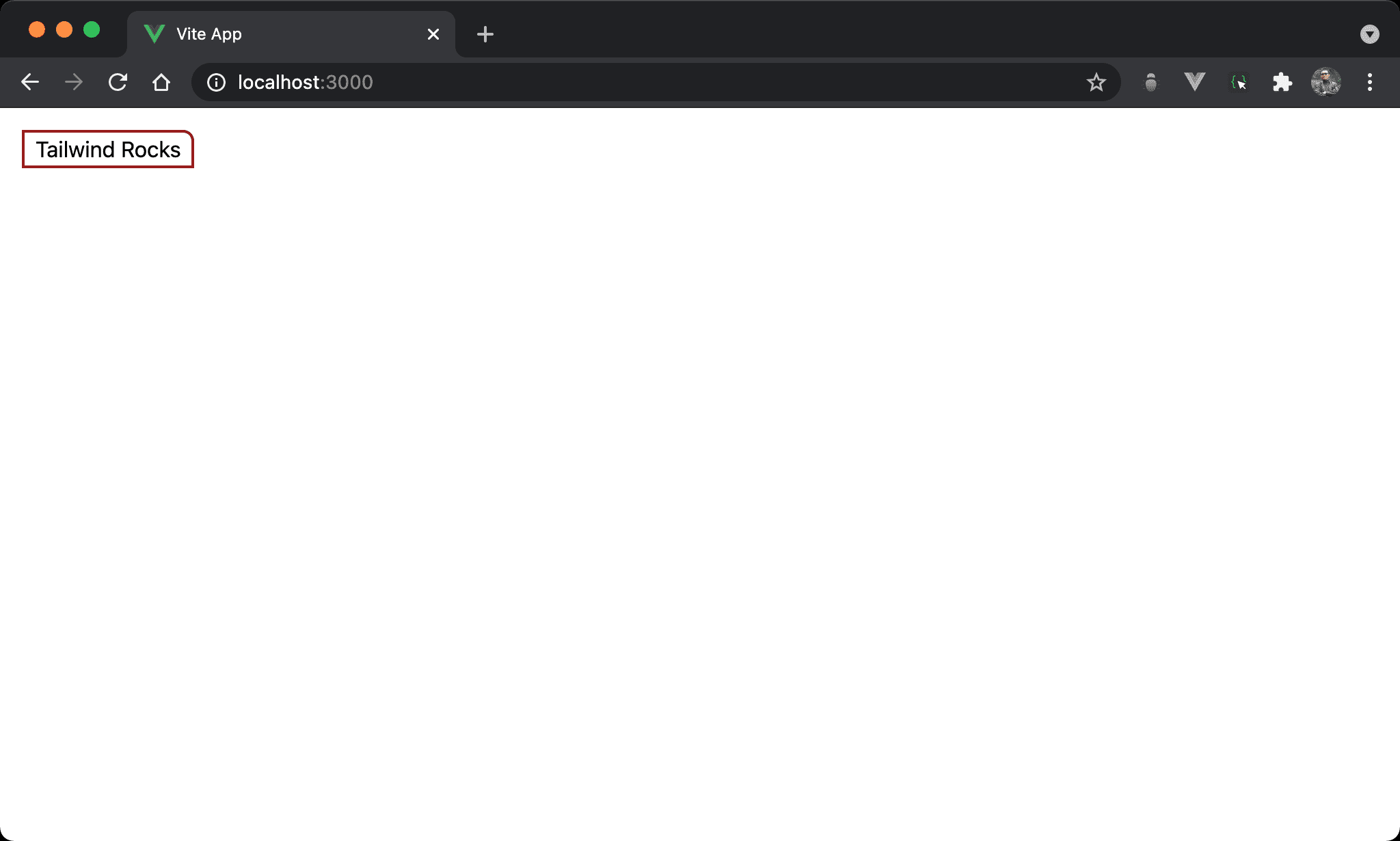
Rounded Corner
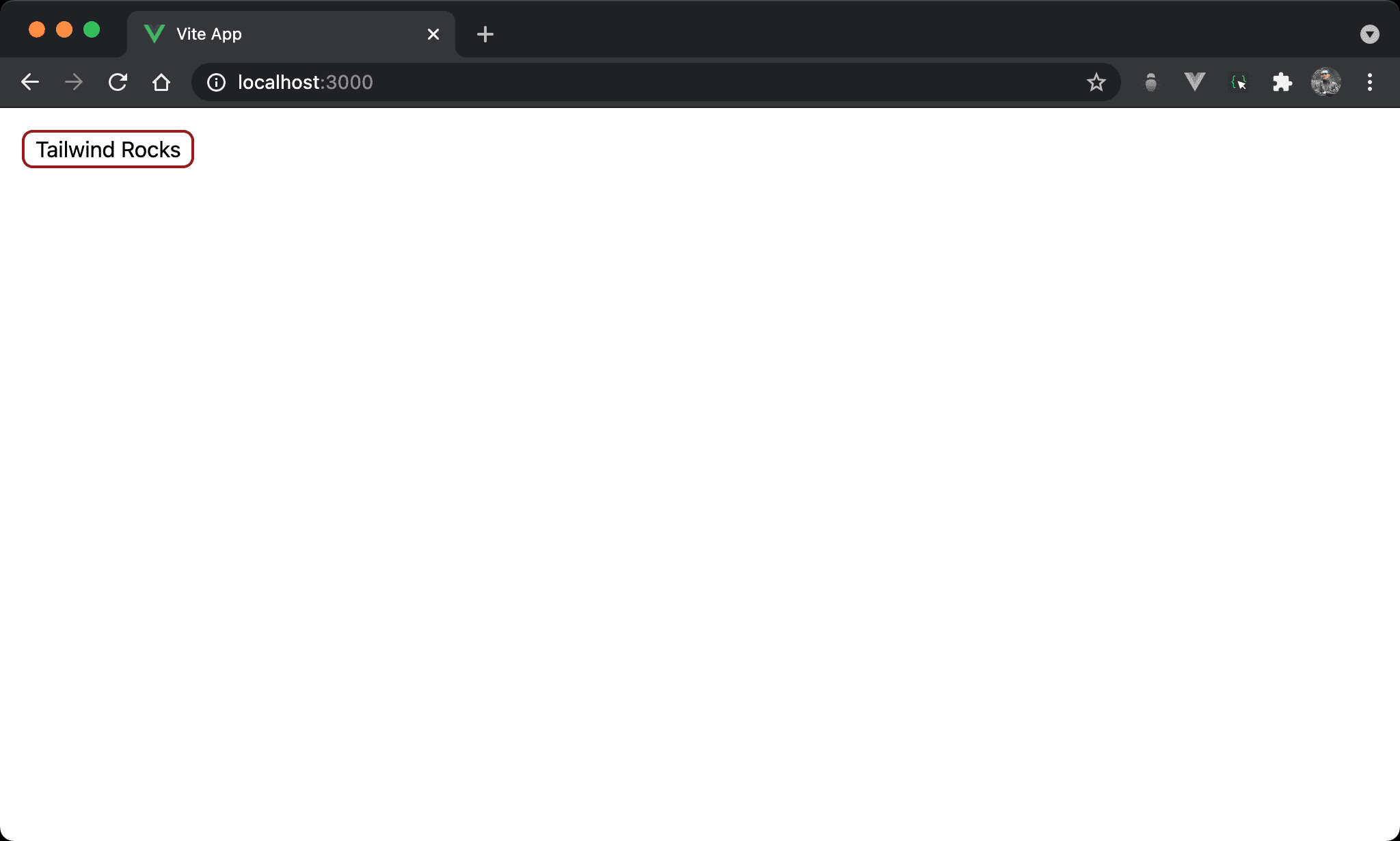
Button 以圓角顯示。
<template>
  <button class="rounded-lg px-2 m-4 border-red-800 border-2">
    Tailwind Rocks
  </button>
</template>
使用 rounded-lg 設定圓角,尚有 rounded-sm、rounded 、rounded-md 可用。
Pills
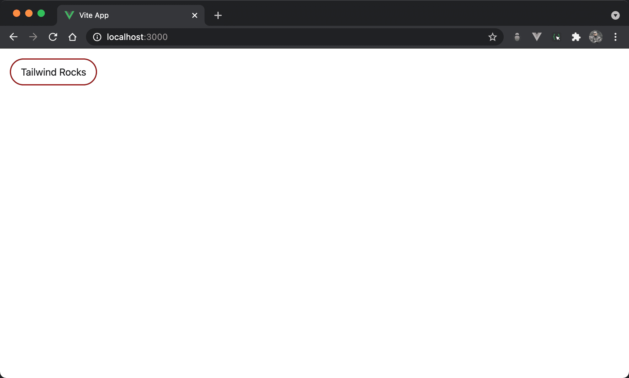
Button 以橢圓形顯示。
<template>
  <button class="rounded-full px-4 py-2 m-4 border-red-800 border-2">
    Tailwind Rocks
  </button>
</template>
使用 rounded-full 組合 px-4 (水平 padding 稍微寬點) 可設定成 pill 形狀。
Circles
Button 以圓形顯示。
<template>
  <button class="rounded-full w-32 h-32 m-4 border-red-800 border-2">
    Tailwind Rocks
  </button>
</template>
使用 rounded-full 組合 w-32 與 h-32 ( width 與 height 相等) 可設定成 circle 形狀。
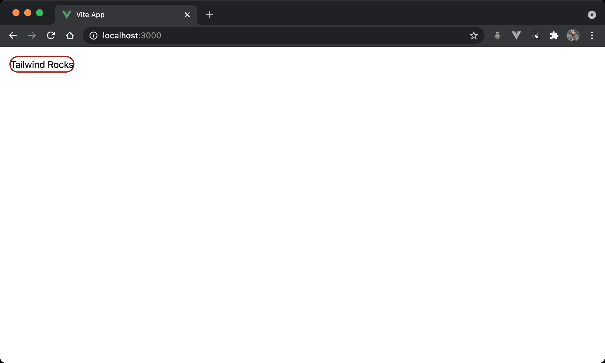
No Rounding

Button 取消圓角。
<template>
  <button class="rounded-none px-2 m-4 border-red-800 border-2">
    Tailwind Rocks
  </button>
</template>
使用 rounded-none 可取消圓角設定。
Rounding Sides Separately

Button 只有上方有圓角。
<template>
  <button class="rounded-t-lg px-2 m-4 border-red-800 border-2">
    Tailwind Rocks
  </button>
</template>
使用 rounded-t-lg 設定上方有圓角,尚有 rounded-{t|r|b|l}-{-size?} 可用,其 size 亦可省略。
Rounding Corners Separately
Button 只有右上角有圓角。
<template>
  <button class="rounded-tr-lg px-2 m-4 border-red-800 border-2">
    Tailwind Rocks
  </button>
</template>
使用 rounded-tr-lg 設定右上方有圓角,尚有 rounded-{tl|tr|br|bl}-{-size?} 可用,其 size 亦可省略。
Conclusion
rounded-系列 utility 讓我們可以直接對 HTML element 設定圓角,而不用另外撰寫 CSS