Material Design 有預定一組 顏色變數,只要提供後就可根據系統設定自動切換 Light Mode 與 Dark Mode。
Version
Material Design 3
Color
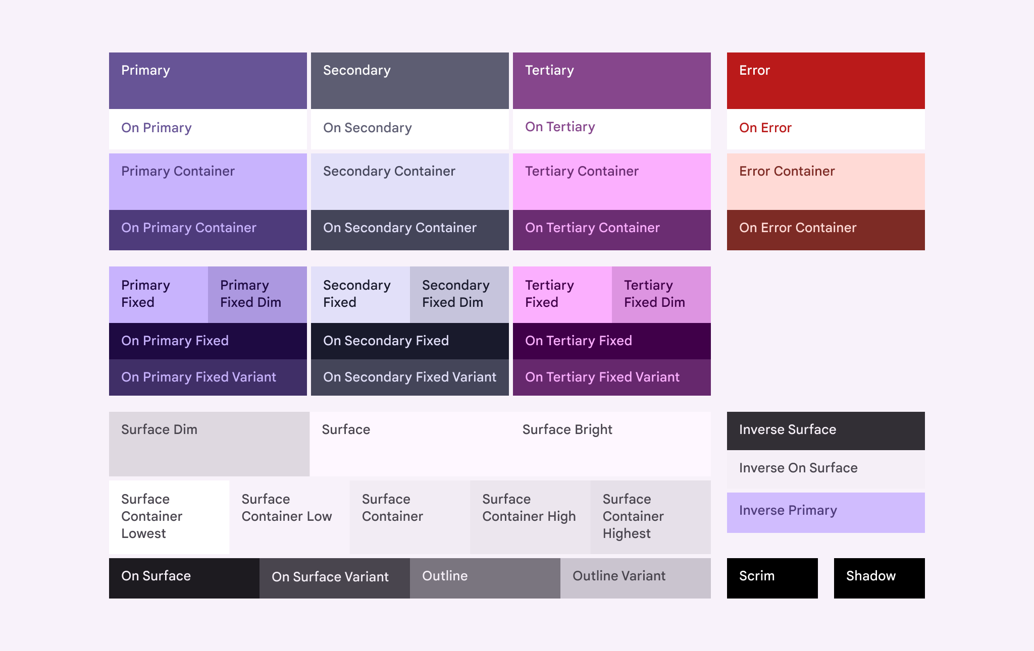
Roles
Surface:A role used forbackgroundsandlarge,low-emphasis areasof the screenPrimary, Secondary, Tertiary:Accent color roles used toemphasizeorde-emphasizeforegroundelementsContainer:Roles used as afill colorforforegroundelements like buttons. Theyshould notbe used fortextoriconsOn:Roles starting with this term indicate a color for text or iconson topof its paired parent color. For example,on Primaryis used for text and icons against theprimaryfill colorVariant:Roles ending with this term offer alower emphasisalternative to its non-variant pair. For example,outline variantis aless emphasizedversion of theoutlinecolor
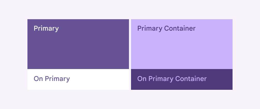
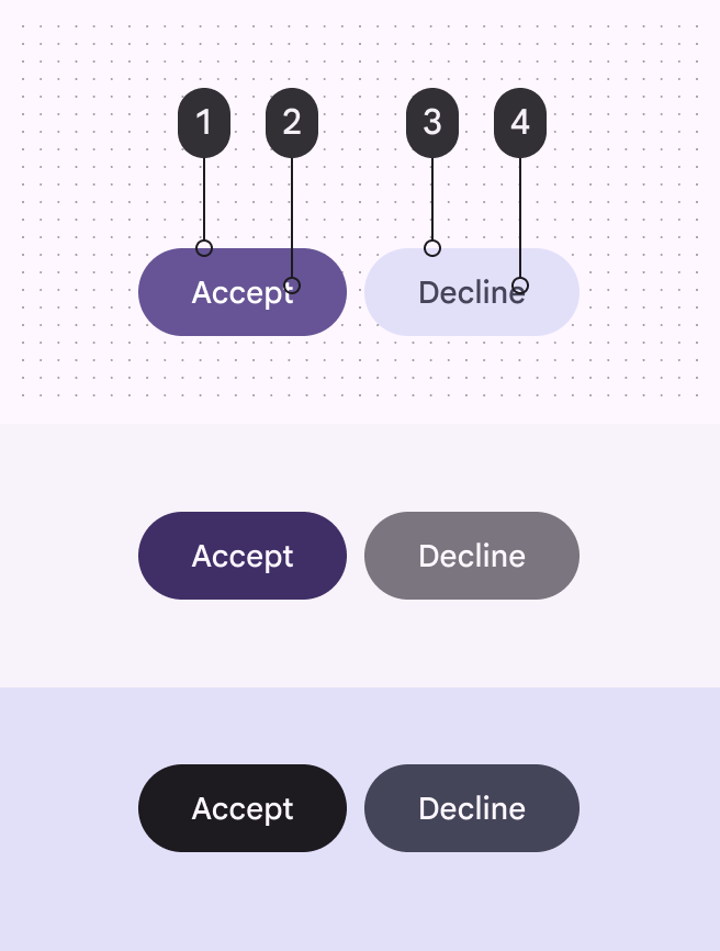
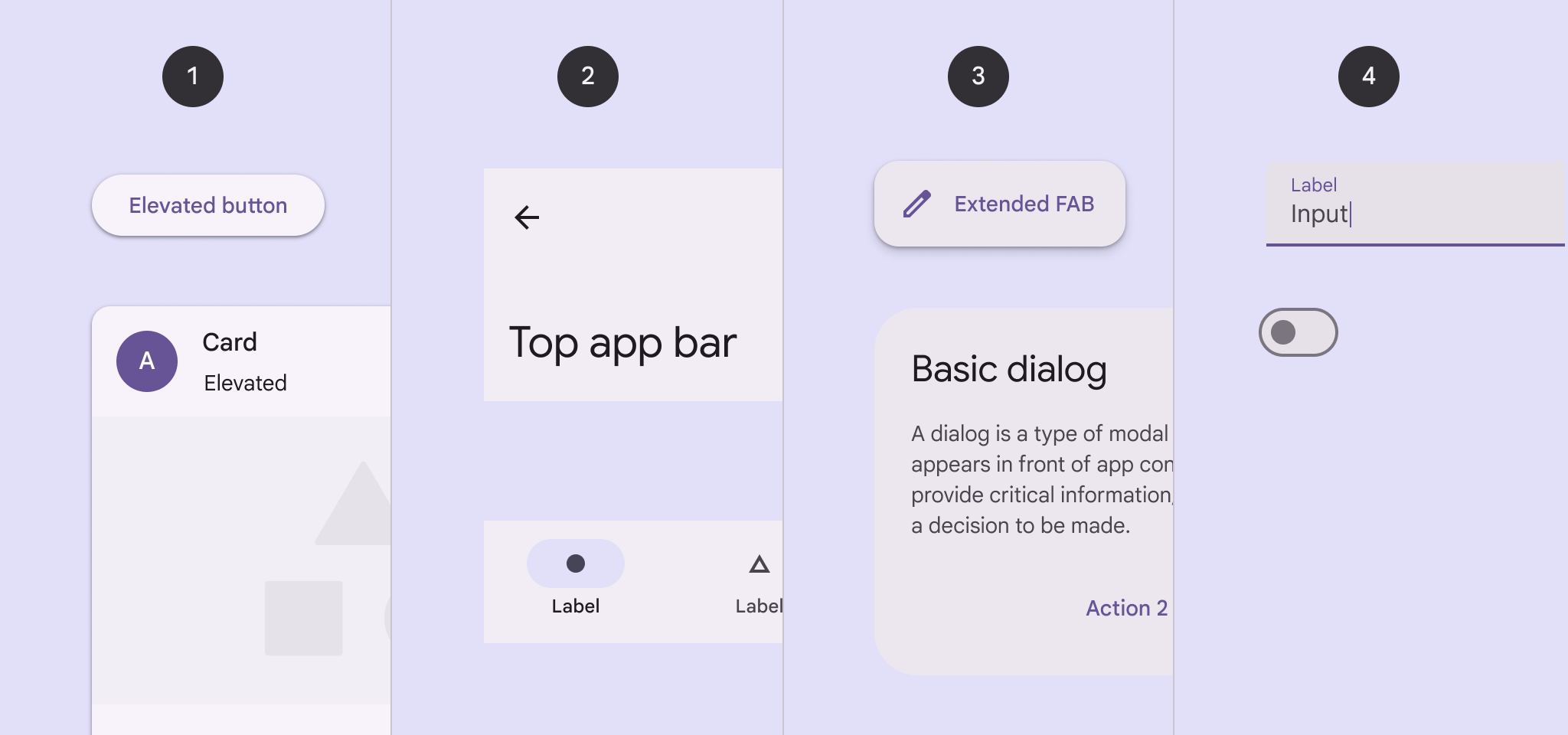
Primary
Use
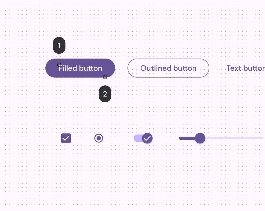
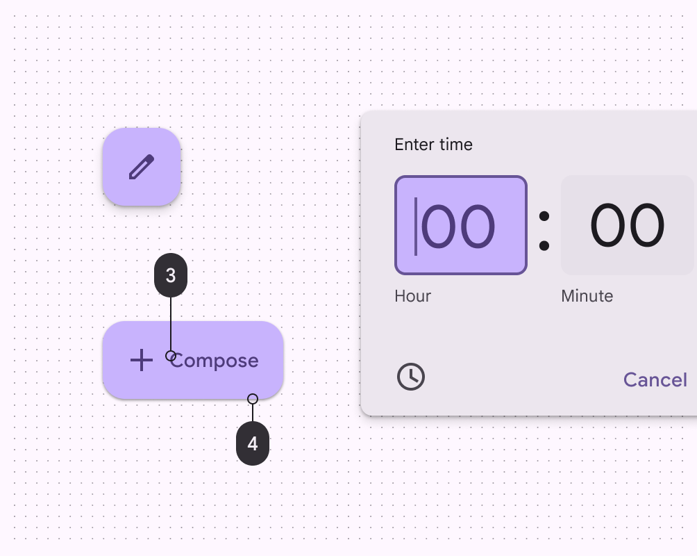
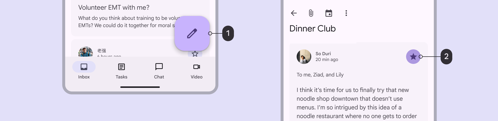
primaryroles for themost prominentcomponents across the UI, such as theFAB(FloatingActionButton),high-emphasisbuttons, andactive states
* primary:required High-emphasis fills, texts, and icons against surface
* onPrimary:required Text and icons against primary
* primaryContainer:Standout fill color against surface, for key components like FAB
* onPrimaryContainer: Text and icons against primary container
* primaryFixed
* primaryFixedDim
* onPrimaryFixed
* onPrimaryFixedVariant
onPrimaryprimary
onPrimaryContainerprimaryContainer
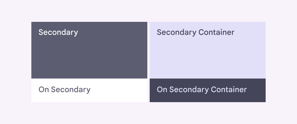
Secondary
Use
secondaryroles forless prominentcomponents in the UI such asfilter chips.
* secondary:required Less prominent fills, text, and icons against surface
* onSecondary:required Text and icons against secondary
* secondaryContainer:Less prominent fill color against surface, for recessive components like tonal buttons
* onSecondaryContainer:Text and icons against secondary container
* secondaryFixed
* secondaryFixedDim
* onSecondaryFixed
* onSecondaryFixedVariant
primaryonPrimarysecondaryonSecondary
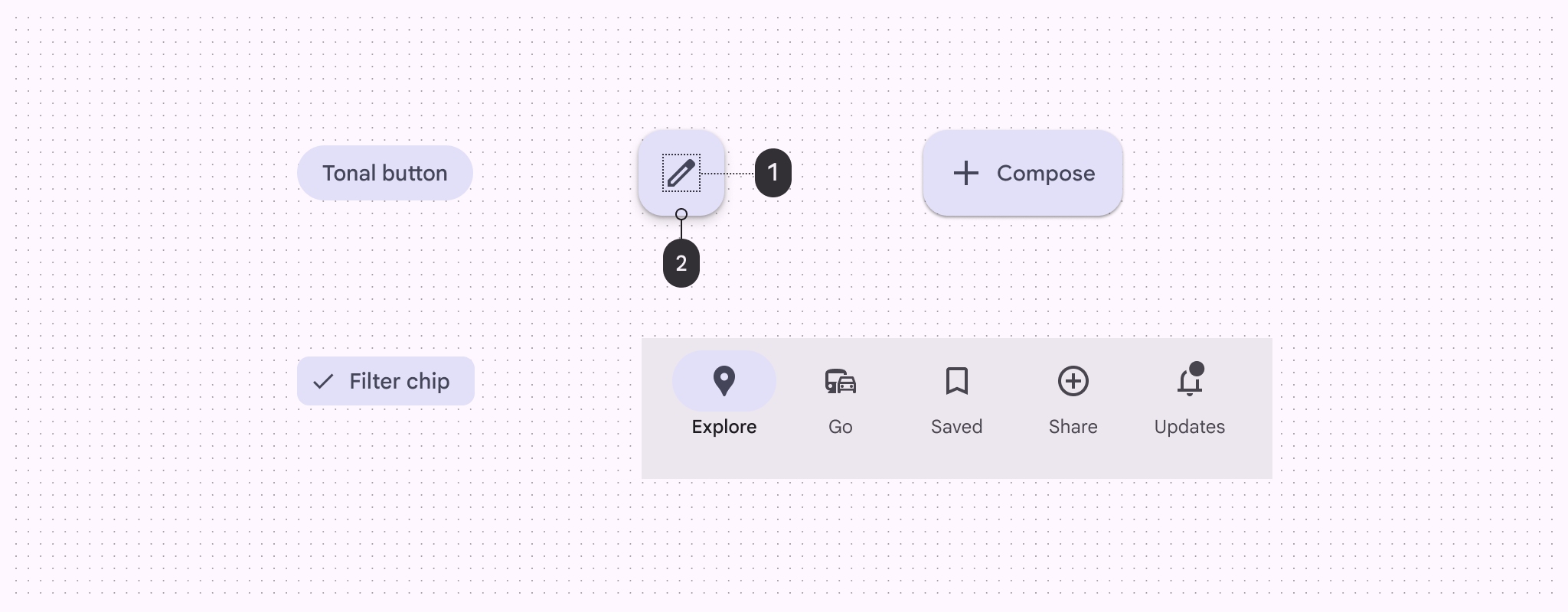
- Icon:
onSecondContainer - Button:
secondaryContainer
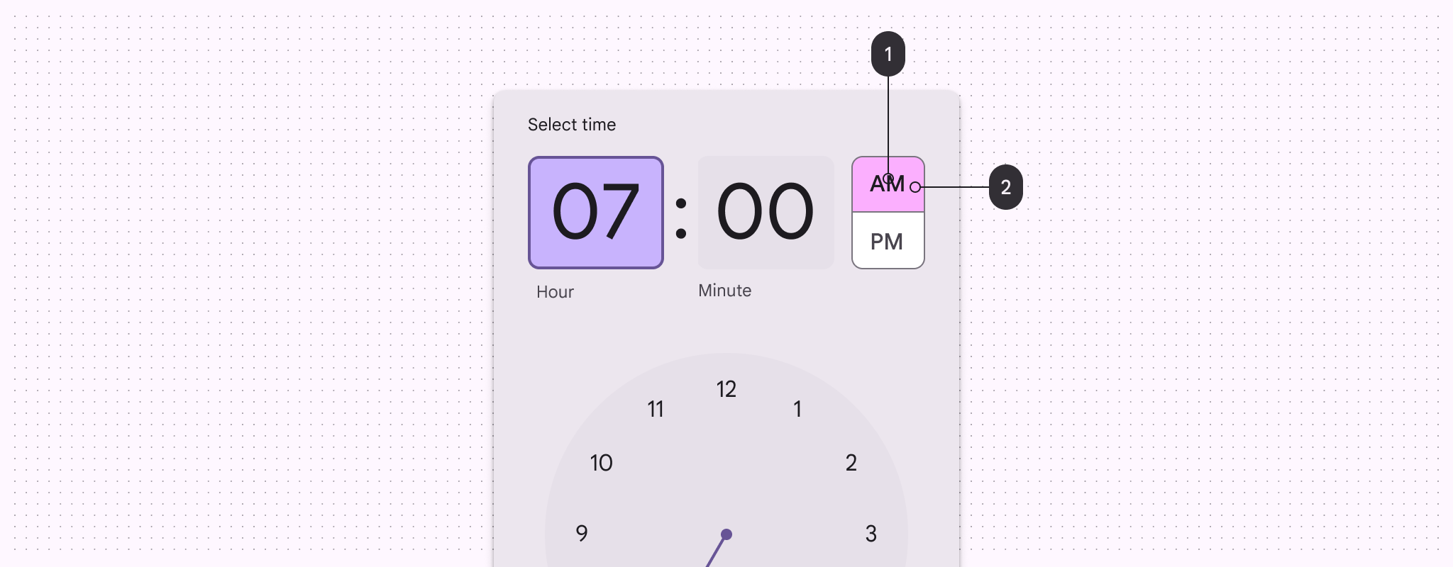
Tertiary
Use
tertiaryroles for contrasting accents thatbalanceprimary and secondary colors or bringheightenedattention to an element such as aninput field
* tertiary:required Complementary fills, text, and icons against surface
* onTertiary:Text and icons against tertiary
* tertiaryContainer:Complementary container color against surface, for components like input fields
* onTertiaryContainer:Text and icons against tertiary container
* tertiaryFixed
* tertiaryFixedDim
* onTertiaryFixed
* onTertiaryFixedVariant

onTertiaryContainertertiaryContainer
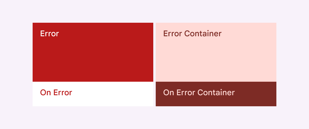
Error
Use
errorroles to communicateerrorstates, such as anincorrect passwordentered intoa text field.
error:requiredonError:requirederrorContainer:A color used for error elements needingless emphasisthanerroronErrorContainer
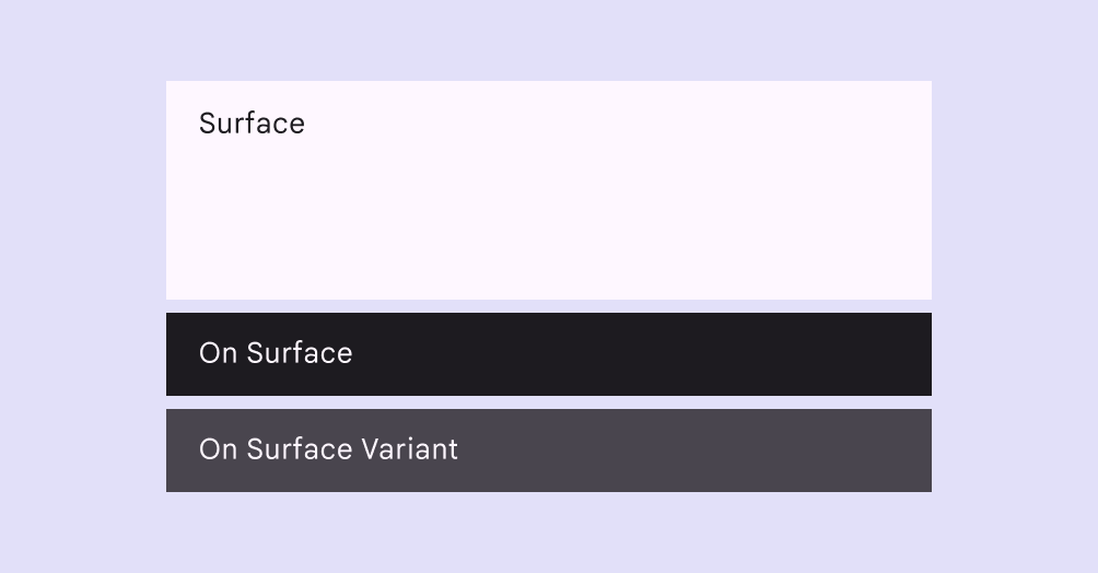
Surface
Use
surfaceroles for moreneutral backgrounds, andcontainer colorsfor components likecards,sheets, anddialogs.
surface:requiredDefault color for backgroundsonSurface:requiredText and icons against any surface colorsurfaceDim:surfaceBright:A color that’s always thelightestin the dark or light themesurfaceContainerLowest:A surface container color with thelightest toneandthe least emphasisrelative to thesurfacesurfaceContainerLow:A surface container color with alighter tonethat createsless emphasisthansurfaceContainerbutmore emphasisthansurfaceContainerLowestsurfaceContainer:A recommended color role for adistinct areawithin thesurfacesurfaceContainerHigh:A surface container color with a darker tone. It is used to createmore emphasisthansurfaceContainerbutless emphasisthansurfaceContainerHighestsurfaceContainerHighest:A surface container color with the darkest tone. It is used to create themost emphasisagainst thesurfaceonSurfaceVariant:Lower-emphasis color for text and icons against any surface colorsurfaceTint
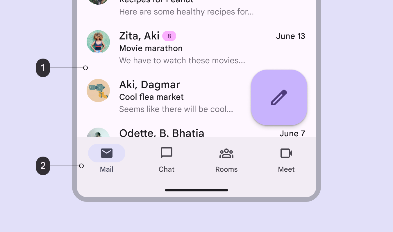
surface:background colorsurfaceContainer:navigation area
surfaceContainerLowsurfaceContainersurfaceContainerHighsurfaceContainerHighest
Outline
There are two outline colors to be used against surface:
outline:Importantboundaries, such as atextfieldoutlineoutlineVariant: Decorative elements, such asdividersshadowscriminverseSurfaceonInverseSurfaceinversePrimary
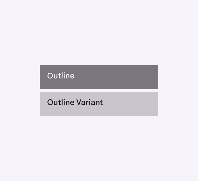
outlineoutlineVariant
Add-on Colors
Most products
won'tneed to use these add-on color roles. However, some products require the greater flexibility and control that add-on roles provide. If you aren’t sure whether your product should use the add-on roles, it probably shouldn’t and you can ignore them.
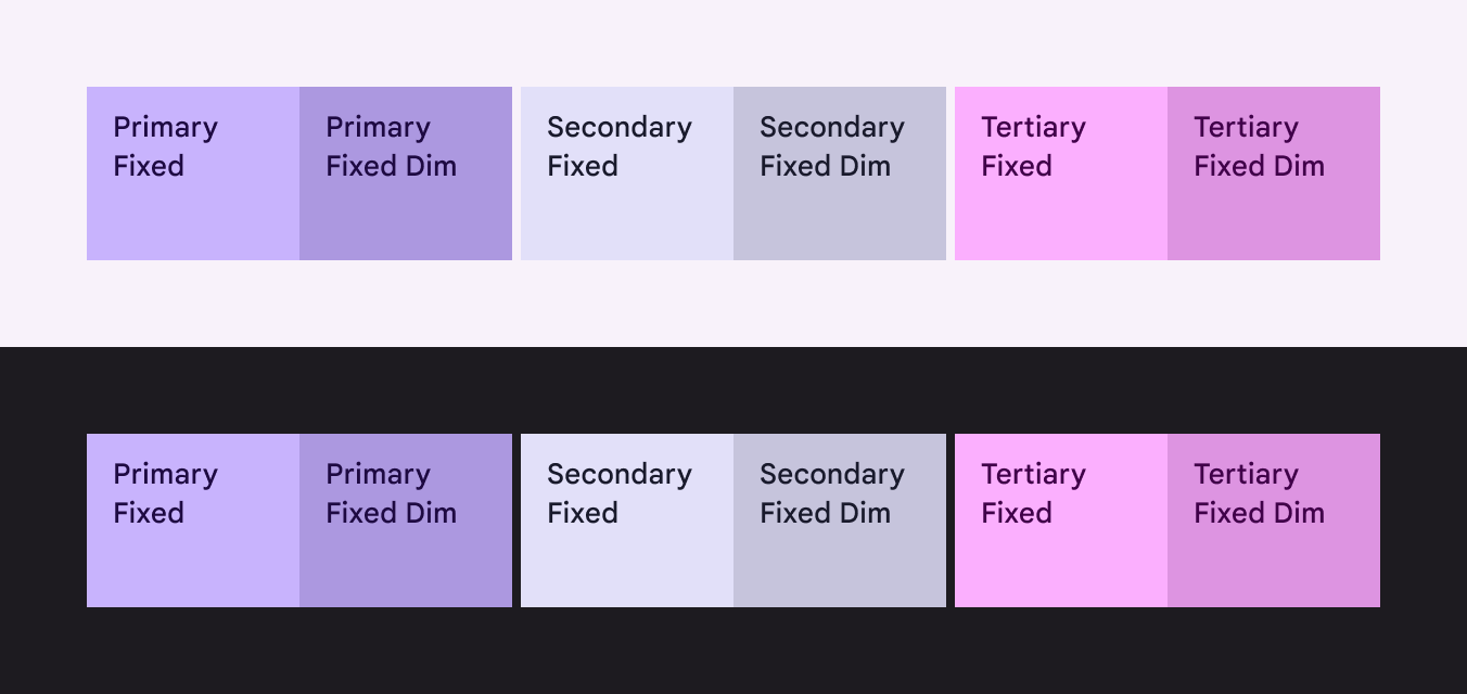
-Fixedroles are appropriate to use in places whereContainerroles are normally used, but they stay thesame colorbetween light and dark themes-Dimroles provide astronger,more emphasized colorwith the same fixed behavior-FixedVariant:also have the same color betweenlightanddarkthemes, but compared with on-Fixedroles, they provide alower-emphasisoption fortextandicons
primaryFixed
Light mode 與 dark mode 完全不變
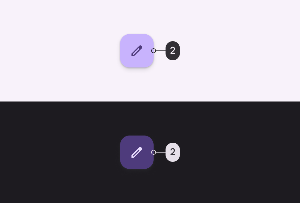
primaryContainer
Light mode 與 dark mode 不太一樣
primaryFixedprimaryFixedDim
Reference
Philipp Lackner:Introduction to Matirial 3 (Color Theming、Typography、Shapes)
Material Design, Color System
Material Design, Color Roles
Material Theme Builder