Pixel Overflow 是 Flutter 開發中常遇到的問題,透過由 MediaQuery 取得裝置長寬,可動態設定 Margin 避免 Pixel Overflow。
Version
Flutter 3.24
Flutter
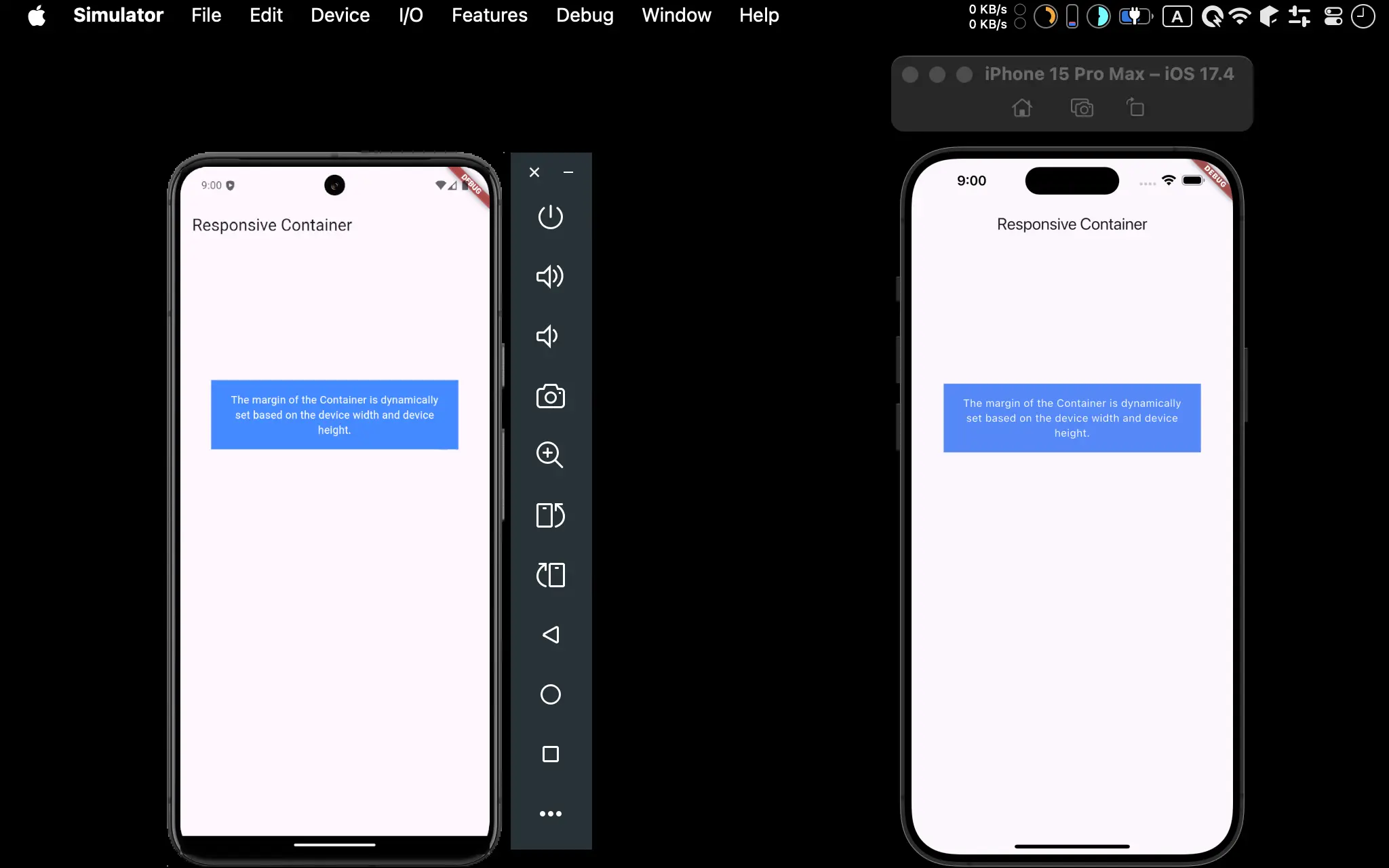
- Android 與 iOS 都成功使用
MediaQuery動態設定 Margin
MediaQuery
import 'package:flutter/material.dart';
class Home extends StatefulWidget {
const Home({super.key});
State<Home> createState() => _Home();
}
class _Home extends State<Home> {
var _deviceWidth = 0.0;
var _deviceHeight = 0.0;
Widget build(BuildContext context) {
_deviceWidth = MediaQuery.of(context).size.width;
_deviceHeight = MediaQuery.of(context).size.height;
var appBar = AppBar(
title: const Text('Responsive Container'),
);
var body = Container(
margin: EdgeInsets.only(
left: _deviceWidth * 0.1,
right: _deviceWidth * 0.1,
top: _deviceHeight * 0.2,
),
padding: const EdgeInsets.all(16),
color: Colors.blueAccent,
child: const Text(
'The margin of the Container is dynamically set based on the device width and device height.',
style: TextStyle(color: Colors.white),
textAlign: TextAlign.center,
),
);
return Scaffold(
appBar: appBar,
body: body,
);
}
}
Line 10
class _Home extends State<Home> {
  var _deviceWidth = 0.0;
  var _deviceHeight = 0.0;
}
_deviceWidth:定義_deviceWidth為 field,如此所有地方都可直接存取_deviceHeight:定義_deviceHeight為 field,如此所有地方都可直接存取
Line 15
Widget build(BuildContext context) {
  _deviceWidth = MediaQuery.of(context).size.width;
  _deviceHeight = MediaQuery.of(context).size.height;
}
_deviceWidth:在build()內由context取得裝置寬度_deviceHeight:在build()內由context取得裝置高度
Line 23
var body = Container(
  margin: EdgeInsets.only(
    left: deviceWidth * 0.1,
    right: deviceWidth * 0.1,
    top: deviceHeight * 0.2,
  ),
);
Container的 margin 並不是固定 pixel,而是使用deviceWidth與deviceHeight以比例的方式取得,如此可確保在更小的裝置會有更小的 margin
Conclusion
- 通常 designer 會先依據某一個裝置設計,開發時可使用與 designer 相同的 simulator 開發,先寫死 pixel 切版 ,待切版成功後,再使用
MediaQuery取得裝置的 width 與 height,以比例的方式設定 margin,如此可確保更小的裝置也不會 Pixel Overflow - 可將
deviceWidth與deviceHeight定義成 field,如此所有地方都可直接存取