雖然可使用 repeat(n, 1fr) 實現水平均分 Column,但實務上可能想要 Column 數不變,雖然 Column 可變小但仍有其最小寬度,可用 repeat() 搭配 minmax() 實現。
Version
CSS 3
minmax()
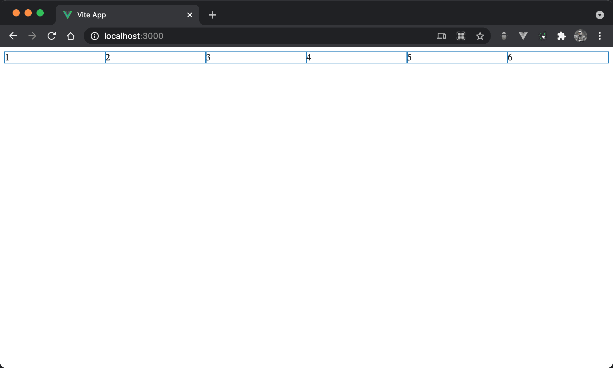
當 browser 寬度大於所有 column 寬度總合時,各 column 水平均分 browser 寬度。
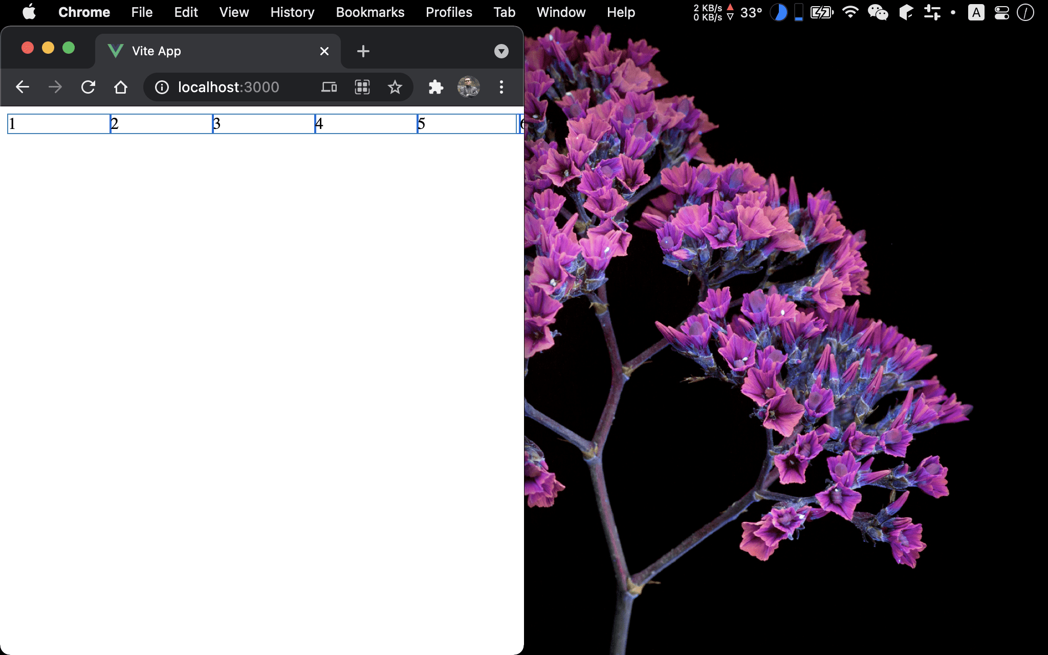
當 browser 寬度小於所有 column 寬度總合時,各 column 仍有其最小寬度。
<template lang='pug'>
section
  div 1
  div 2
  div 3
  div 4
  div 5
  div 6
</template>

<style lang='sass' scoped>
section
  display: grid
  grid-template-columns: repeat(6, minmax(100px, 1fr))
</style>
12 行
section
  display: grid
  grid-template-columns: repeat(6, minmax(100px, 1fr))
設定父層 section style:
display: grid:設定子層使用 Gridgrid-template-columns: repeat(6, minmax(100px, 1fr)):產生 6 個 column,最小為100px,最大為1fr
Conclusion
- 由於在
repeat()內寫死6,因此無論 browser 寬度多少,都永遠是 6 個 column 且不會換列 - 若要能自動換列,就要將
6改成auto-fit