若想不寫 Media Query 而讓 Grid 自動根據 Browser 寬度改變且換行, 可使用 repeat() 搭配 auto-fill 與 auto-fit 由 Browser 決定 Column 數。
Version
CSS 3
auto-fill
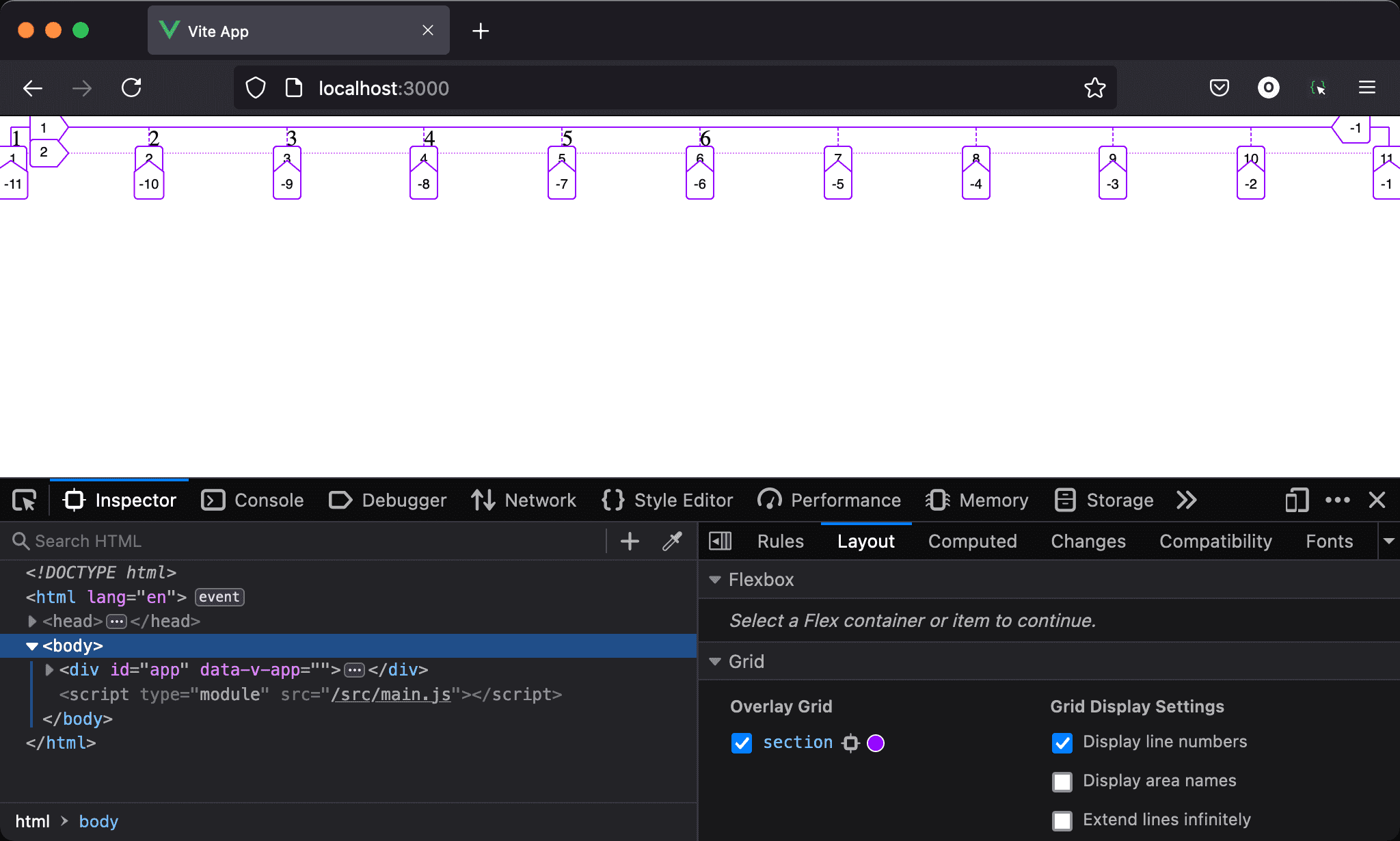
使用 repeat() 搭配 auto-fill,當 browser 寬度大於所有 column 寬度總合時,可發現自動產生不少 column 但沒有內容。
<template lang='pug'>
section
  div 1
  div 2
  div 3
  div 4
  div 5
  div 6
</template>

<style lang='sass' scoped>
section
  display: grid
  grid-template-columns: repeat(auto-fill, minmax(100px, 1fr))
</style>
12 行
section
  display: grid
  grid-template-columns: repeat(auto-fill, minmax(100px, 1fr))
設定父層 section style:
display: grid:設定子層使用 Gridgrid-template-columns: repeat(auto-fill, minmax(100px, 1fr)):由auto-fill決定repeat()的 column 數,最小為100px,最大為1fr
auto-fill會盡可能產生更多 column,儘管 column 內沒有任何內容,這也是為什麼6之後還有 column 數字,且佔據一些空間,而無法如預期使用1fr會水平均分 browser 寬度
auto-fit
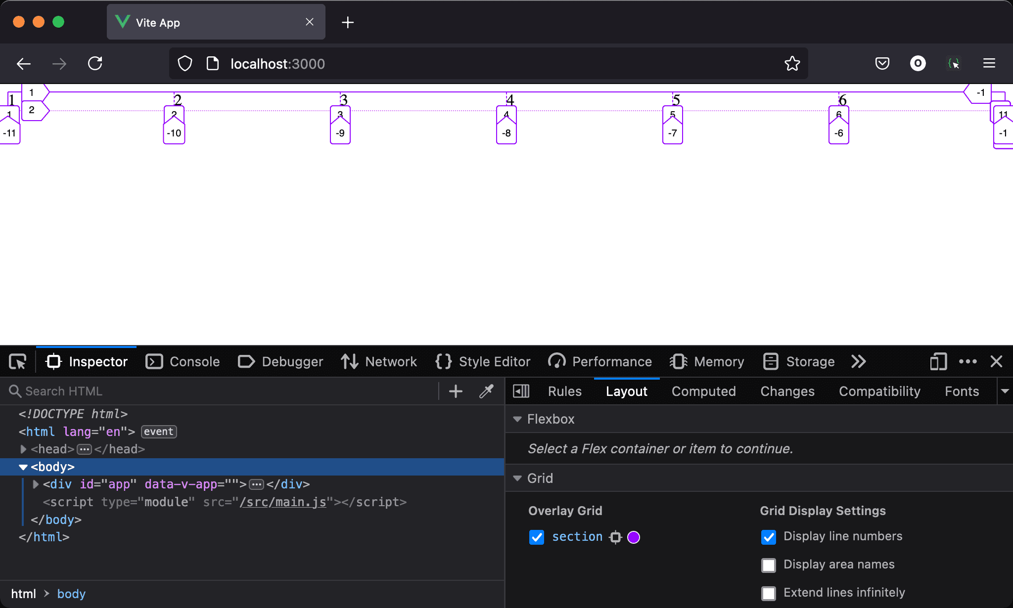
使用 repeat() 搭配 auto-fit,當 browser 寬度大於所有 column 寬度總合時,仍可水平均分 browser 寬度。
<template lang='pug'>
section
  div 1
  div 2
  div 3
  div 4
  div 5
  div 6
</template>

<style lang='sass' scoped>
section
  display: grid
  grid-template-columns: repeat(auto-fit, minmax(100px, 1fr))
</style>
12 行
section
  display: grid
  grid-template-columns: repeat(auto-fit, minmax(100px, 1fr))
設定父層 section style:
display: grid:設定子層使用 Gridgrid-template-columns: repeat(auto-fit, minmax(100px, 1fr)):由auto-fill決定repeat()的 column 數,最小為100px,最大為1fr
auto-fit也會如同auto-fill盡可能產生更多 column,但auto-fit會使沒有內容 column 的 width 為 0,因此不會佔據寬度,所以auto-fit看起來像水平均分 browser 寬度
Conclusion
auto-fill與auto-fit都可根據 browser 寬度決定 column 數與自動換列,且會盡可能產生更多 column,唯auto-fit會將沒有內容 column 的 width 為0,因此不會佔據寬度,看起來像水平均分 browser 寬度