若不換行,justify-content: space-around 可使 Item 之間間隔相等,但若搭配 flex-wrap: wrap 換行,如果 Item 個數無法整除,會出現間隔不相等,可使用 calc() 自行處理間隔。
Version
CSS 3
justify-content: space-around
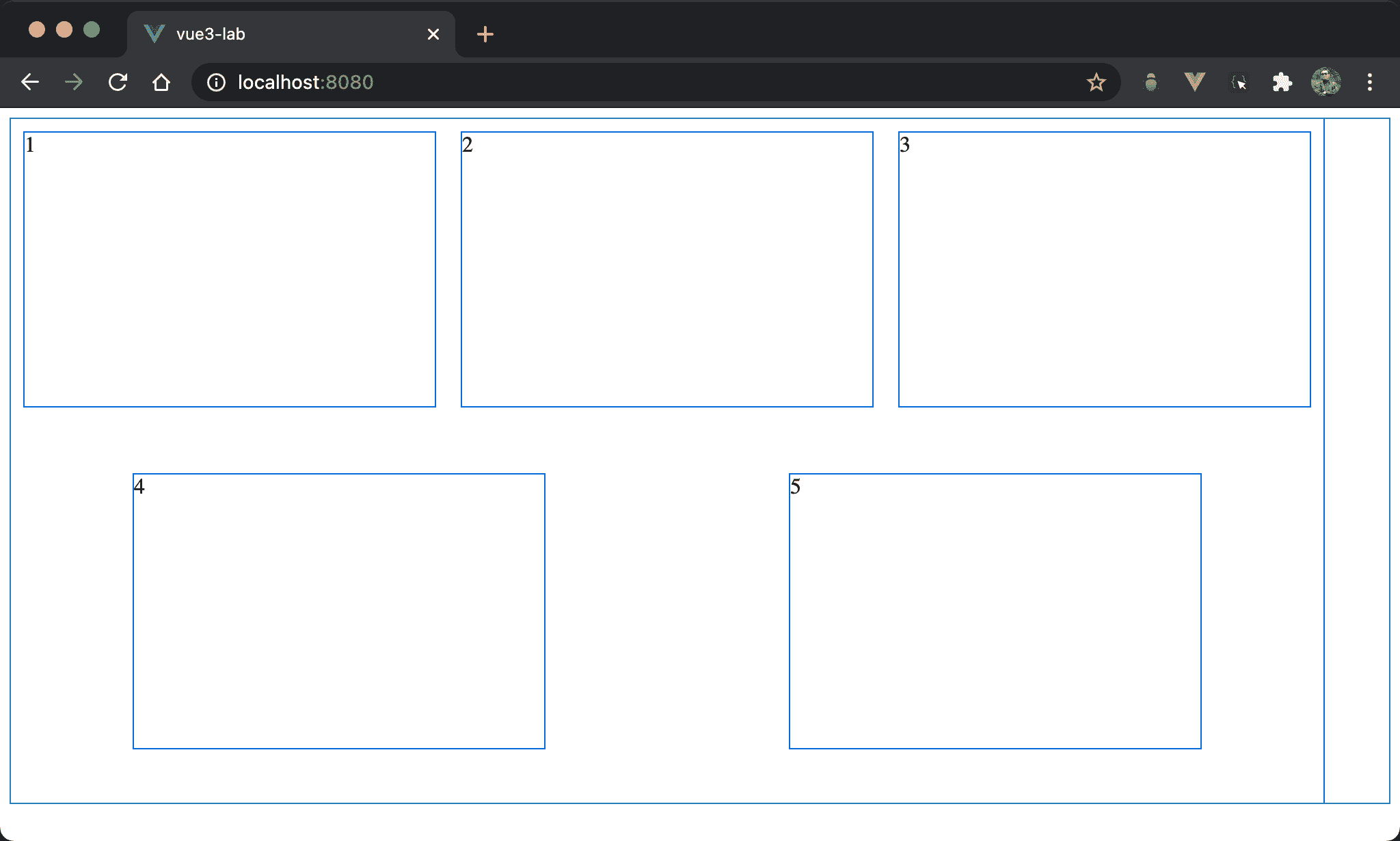
flex-wrap: wrap 與 justify-content: space-around 雖然可以順利換行,但若 item 個數無法整除,換行之後會出現上下兩列間隔不相同。
<template>
  <div class="box">
    <div v-for="x in no" :key="x" class="item">
      {{ x }}
    </div>
  </div>
</template>

<script>
export default {
  data: () => ({
    no: 5
  })
}
</script>

<style scoped>
.box {
  display: flex;
  flex-wrap: wrap;
  justify-content: space-around;
  width: 960px;
  height: 500px;
}

.item {
  width: 300px;
  height: 200px;
  margin: 10px;
}
</style>
第 2 行
<div class="box">
  <div v-for="x in no" :key="x" class="item">
    {{ x }}
  </div>
</div>
使用 v-for 產生多個 item。
11 行
data: () => ({
  no: 5
})
Item 個數由 Vue 的 data 控制,5 剛好不能被 3 整除,所以導致第二列的間隔不相等。
18 行
.box {
  display: flex;
  flex-wrap: wrap;
  justify-content: space-around;
  width: 960px;
  height: 500px;
}
display: flex:外層 box 使用 Flexboxflex-wrap: wrap:會自動換列顯示justify-content: space-around:使用spece-around自動均分剩餘寬度
26 行
.item {
  width: 300px;
  height: 200px;
  margin: 10px;
}
width: 300px:第四個 item 會超過960px而換列,導致第二列只有兩個 item 而間隔不相同,這是space-around的最大缺點
calc()
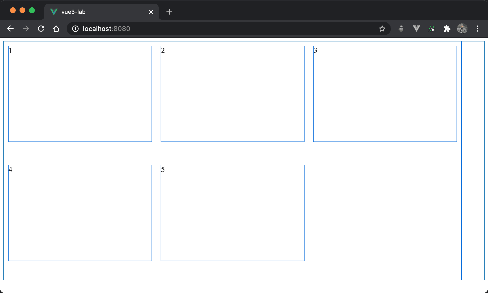
Item 順利換行且間隔相等。
<template>
  <div class="box">
    <div v-for="x in no" :key="x" class="item">
      {{ x }}
    </div>
  </div>
</template>

<script>
export default {
  data: () => ({
    no: 5
  })
}
</script>

<style scoped>
* {
  column: 3;
  margin: 10px;
}

.box {
  display: flex;
  flex-wrap: wrap;
  width: 960px;
  height: 500px;
}

.item {
  width: calc(100% / var(--column) - 2 * var(--margin));
  height: 200px;
  margin: var(--margin);
}
</style>
18 行
* {
  column: 3;
  margin: 10px;
}
--column: 3:設定 column 個數--margin: 10px:以--margin設定固定 margin
23 行
.box {
  display: flex;
  flex-wrap: wrap;
  width: 960px;
  height: 500px;
}
仍然使用 Flexbox 與 flex-wrap,但沒用 justify-content: space-around。
30 行
.item {
  width: calc(100% / var(--column) - 2 * var(--margin));
  height: 200px;
  margin: var(--margin);
}
width: calc(100% / var(--column) - 2 * var(--margin)):width 改用calc()動態計算,處以3並減去左右 margin ,如此 width 會自動隨著 RWD 改變 width 而變且間隔永遠是20pxmargin: var(--margin):使用固定 margin
Conclusion
space-around、space-between與space-evenly在flex-wrap: nowrap下很好用,但在flex-wrap: wrap則未必,若 item 個數剛好無法整除,則換列後間隔將很 tricky,可視需求改用calc()救援