一般使用 Flexbox 都只會使用其相關 Property,事實上搭配 margin: auto 可實現各種不規則 Layout。
Version
CSS 3
margin: auto
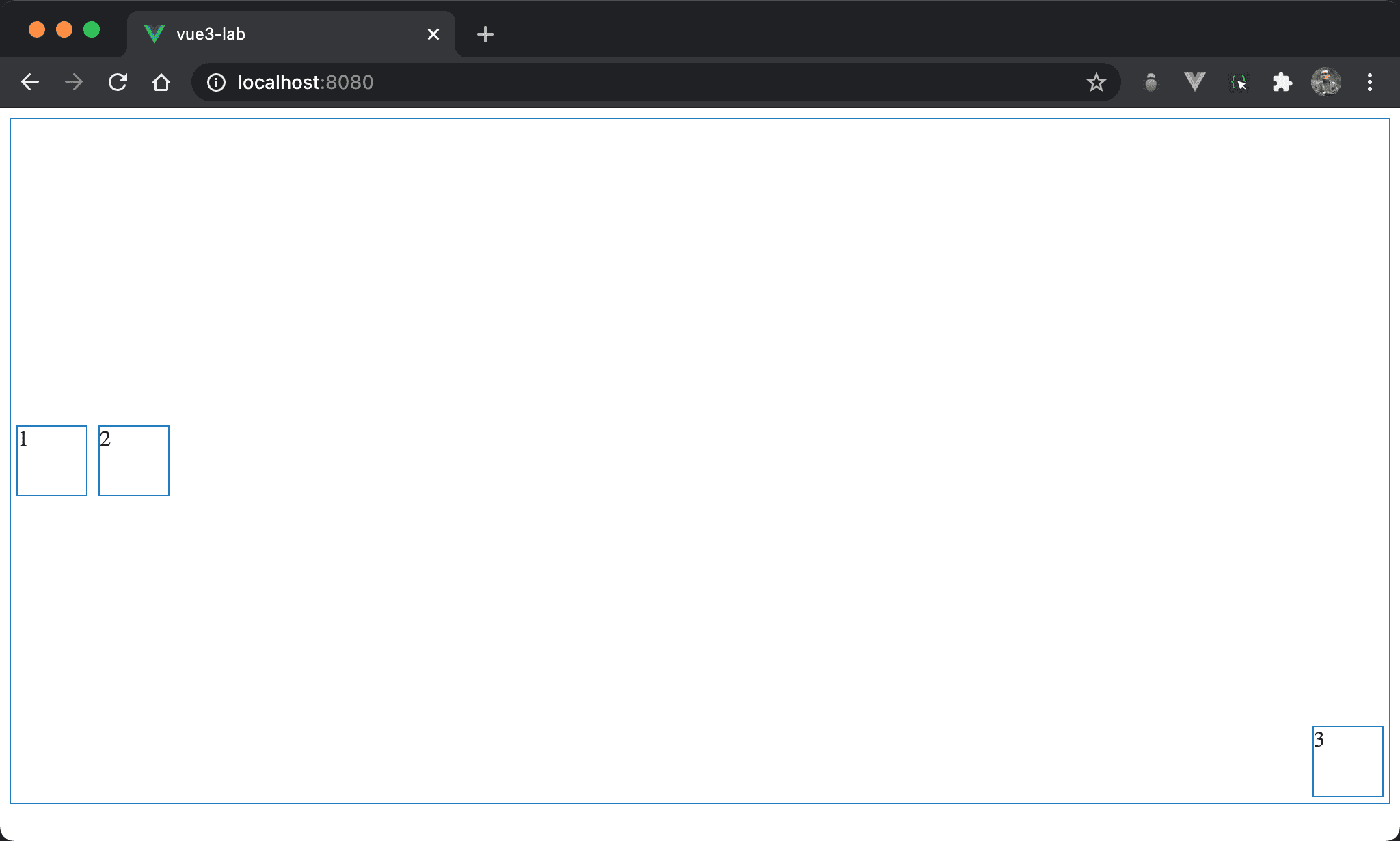
1 與 2 垂直置中並水平靠右,但 3 卻垂直靠下並水平靠右。
<template>
  <div class="box">
    <div class="item item1">1</div>
    <div class="item">2</div>
    <div class="item item3">3</div>
  </div>
</template>

<style scoped>
.box {
  display: flex;
  height: 500px;
}

.item {
  width: 50px;
  height: 50px;
  margin: auto 5px;
}

.item3 {
  margin-left: auto;
  margin-top: auto;
  margin-bottom: 5px;
}
</style>
第 2 行
<div class="box">
  <div class="item item1">1</div>
  <div class="item">2</div>
  <div class="item item3">3</div>
</div>
box:使用box設定 containeritem:設定 item 共用 propertyitem3:設定3特有 property
第 10 行
.box {
  display: flex;
  height: 500px;
}
display: flex:使用 Flexboxheight: 500px:設定 box 的 height
15 行
.item {
  width: 50px;
  height: 50px;
  margin: auto 5px;
}
設定各 item 共用 property:
width: 50px:設定 item 的 widthheight: 50px:設定 item 的 heightmargin: auto 5px:設定的 item 的 vertical margin 為auto,horizontal margin 為5px
因為 Flexbox 的 box 有設定 height,因此 vertical margin 為
auto會自動分配 vertical margin,相當於垂直置中
21 行
.item3 {
  margin-left: auto;
  margin-top: auto;
  margin-bottom: 5px;
}
margin-left: auto:設定 item3 的 left margin 為automargin-top: auto:設定 item3 的 top margin 為automargin-bottom: 5px:設定 item3 的 bottom margin 為5px
因為 item3 的 left margin 與 top margin 為
auto,所以 item3 看起來為垂直靠下且水平靠右
Conclusion
- 由於 Flexbox 會設定 height,這使得
margin: auto有用武之地,在使用 Flexbox 時別忘了使用margin: auto實現不規則 layout