若子層 Item 總 Width 大於父層 Box,卻沒有啟動換列,可設定 flex-shrink 是否自動啟動收縮。
Version
CSS 3
Exceed Width
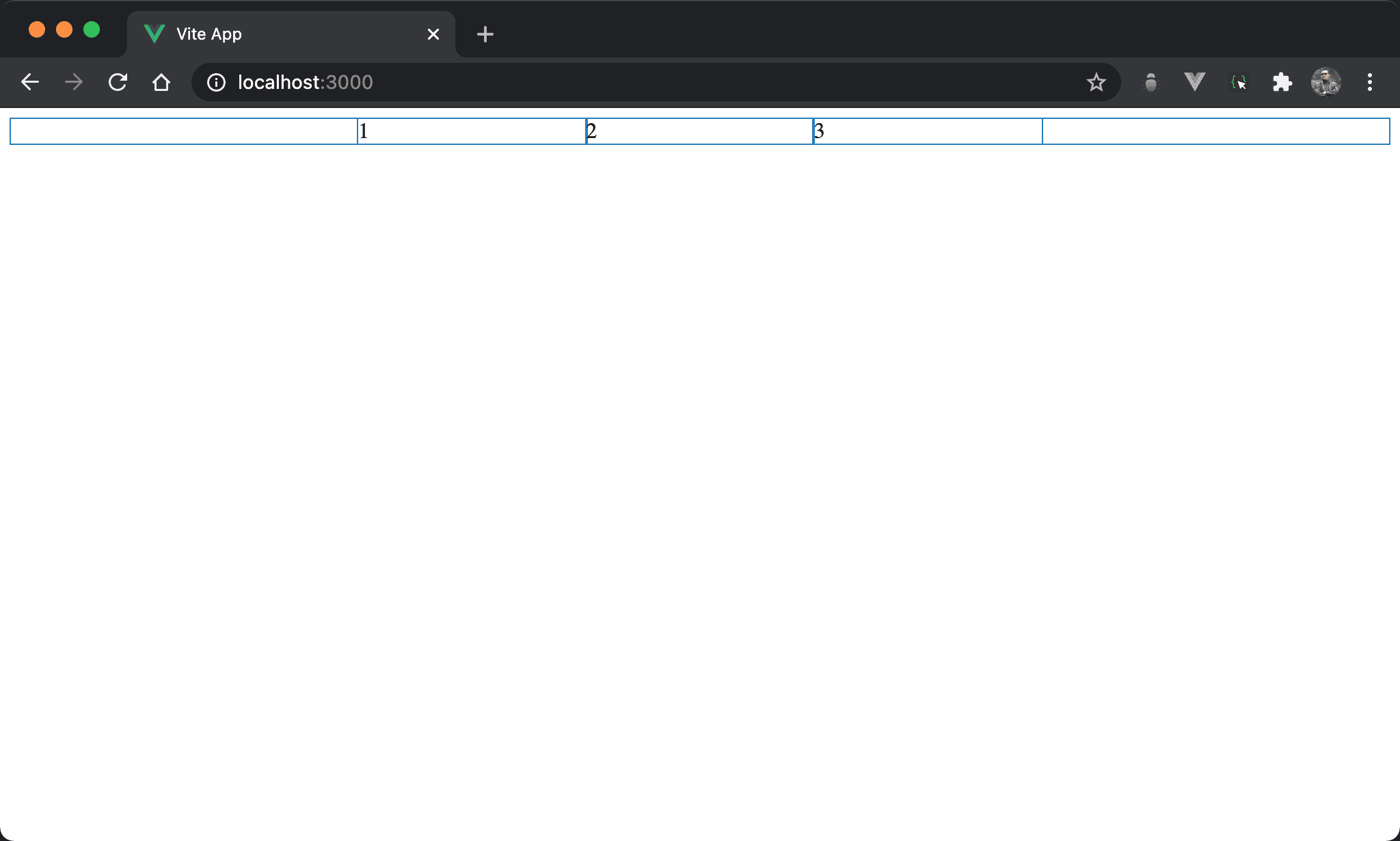
子層 item 總 width 雖然大於父層 box,但由於預設 flex-wrap: nowrap,因此子層 item 會自動收縮均分父層 box。
<template>
  <div class="box">
    <div class="item">1</div>
    <div class="item">2</div>
    <div class="item">3</div>
  </div>
</template>

<style scoped>
.box {
  display: flex;
  width: 500px;
  margin: auto
}

.item {
  width: 300px;
}
</style>
10 行
.box {
  display: flex;
  width: 500px;
  margin: auto
}
設定父層 box style:
display: flex:子層 item 使用 Flexboxwidth: 500px:設定父層 box widthmargin: auto:設定自動調整左右 margin 而水平置中
15 行
.item {
  width: 300px;
}
設定子層 item style:
width: 300px:子層 item width 各為300px,總和900px超越父層 box,但因為預設flex-wrap: nowrap,在不換列前提下各子 item 會自動收縮塞進父層 box
flex-shrink
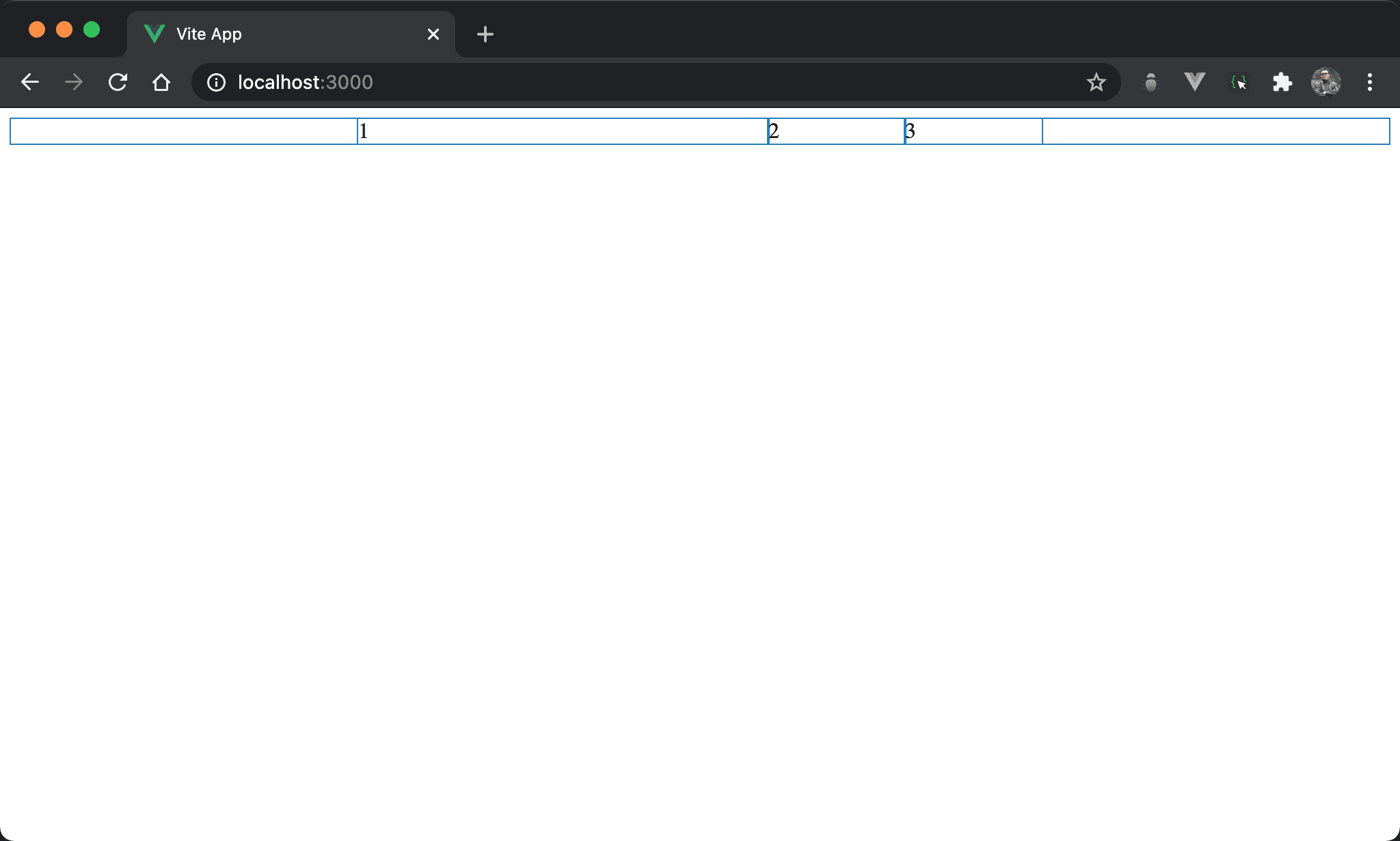
Item1 不收縮而維持原本 width,item2 與 item3 則啟動收縮。
<template>
  <div class="box">
    <div class="item item1">1</div>
    <div class="item">2</div>
    <div class="item">3</div>
  </div>
</template>

<style scoped>
.box {
  display: flex;
  width: 500px;
  margin: auto
}

.item {
  width: 300px;
}

.item1 {
  flex-shrink: 0;
}
</style>
20 行
.item1 {
  flex-shrink: 0;
}
設定 item1 特別 style:
flex-shrink: 0:flex-shrink預設為1,也就是自動啟動收縮,若想特定子層 item 不想啟動收縮,則將flex-shrink設定為0即可
Conclusion
flex-shrink會在flex-wrap: nowrap下使用,藉此控制各子層 item 是否自動啟動收縮flex-shrink實務上較少使用