若希望 Browser 能自動均分父層 Box 在 Cross Axis 剩餘高度,可使用 align-content 的 space 系列設定。
Version
CSS 3
space-between
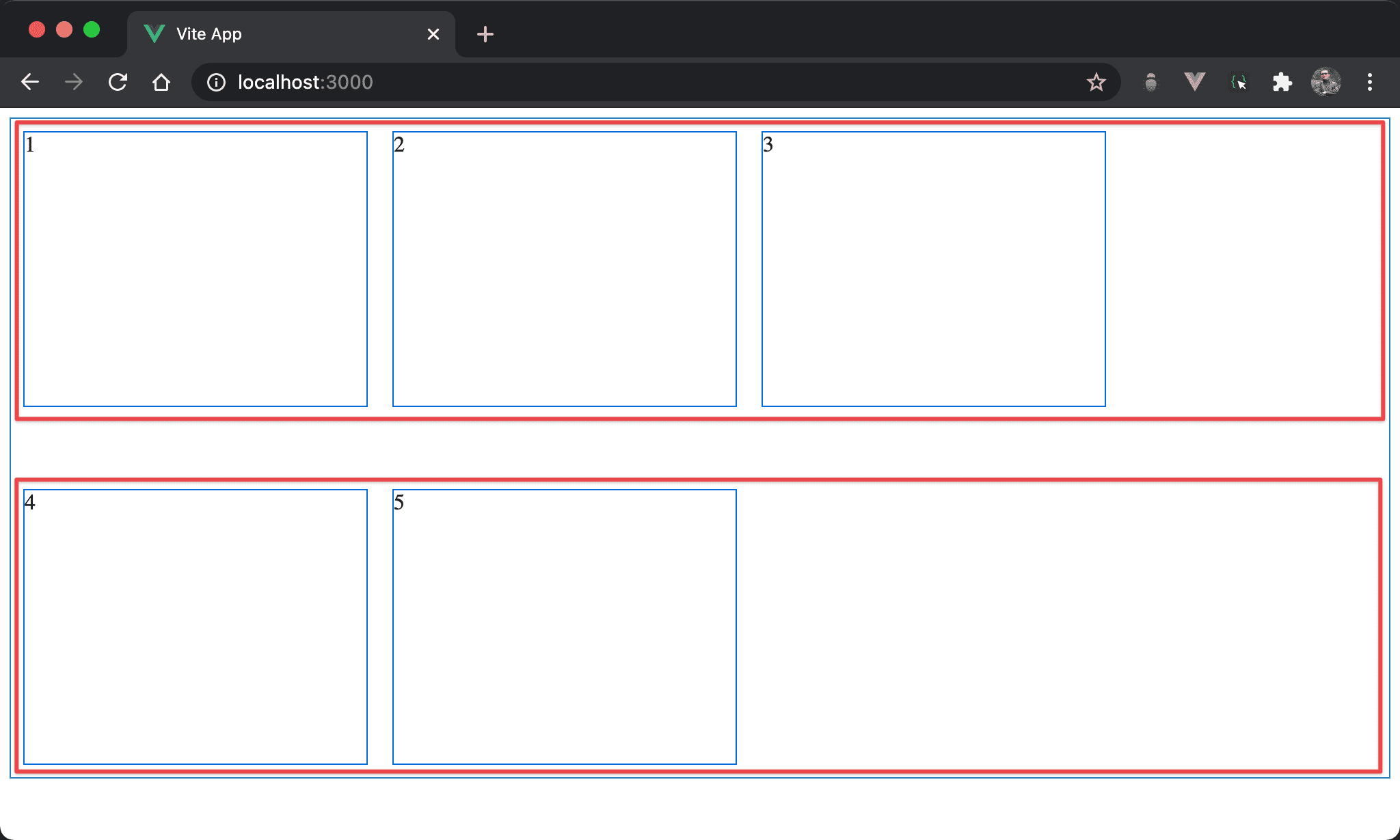
兩條 flex line 之間間隔相等,且最上方與最下方與父層 box 沒有間隔。
<template>
  <div class="box">
    <div class="item">1</div>
    <div class="item">2</div>
    <div class="item">3</div>
    <div class="item">4</div>
    <div class="item">5</div>
  </div>
</template>

<style scoped>
.box {
  display: flex;
  flex-wrap: wrap;
  align-content: space-between;
  width: 100%;
  height: 90vh;
}

.item {
  width: 250px;
  height: 200px;
  margin: 10px;
}
</style>
12 行
.box {
  display: flex;
  flex-wrap: wrap;
  align-content: space-between;
  width: 100%;
  height: 90vh;
}
設定父層 box style:
display: flex:設定子層 item 使用 Flexboxflex-wrap: wrap:設定當子層 item 總 width 超越父層 box 時自動換列align-content: between:flex line 之間的間隔平分 box 剩餘高度,第一條 flex line 與最後一條 flex line 都貼齊父層 box,不使用剩餘高度width: 100%:設定父層 box widthheight: 90vh:設定父層 box height
20 行
.item {
  width: 250px;
  height: 200px;
  margin: 10px;
}
設定子層 item style:
width: 250px:設定子層 item widthheight: 200px:設定子層 item heightmargin: 10px:設定子層 item margin
space-around
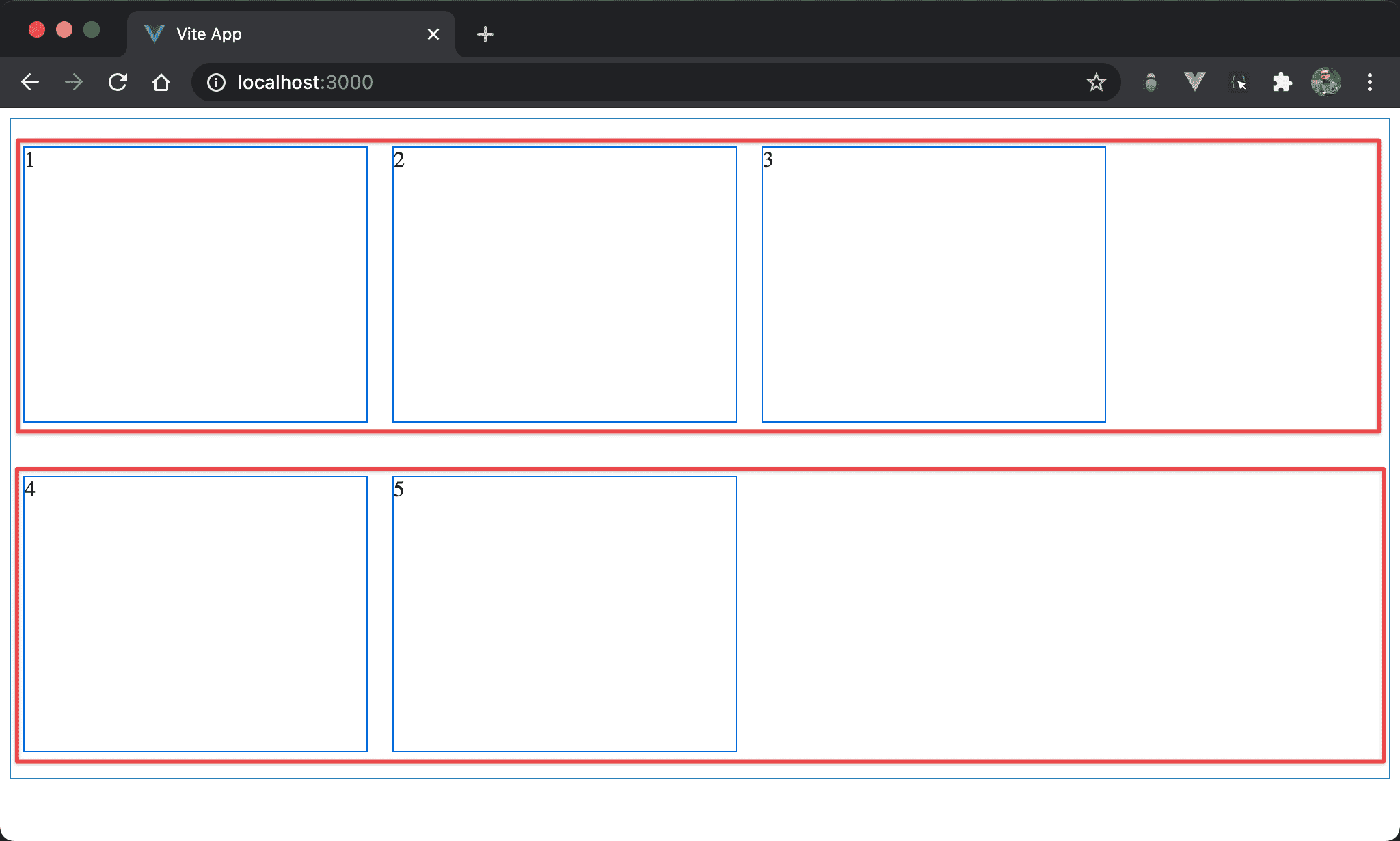
兩條 flex line 之間間隔相等,且最上方與最下方與父層 box 也有間隔,剛好為一般間隔的一半。
<template>
  <div class="box">
    <div class="item">1</div>
    <div class="item">2</div>
    <div class="item">3</div>
    <div class="item">4</div>
    <div class="item">5</div>
  </div>
</template>

<style scoped>
.box {
  display: flex;
  flex-wrap: wrap;
  align-content: space-around;
  width: 100%;
  height: 90vh;
}

.item {
  width: 250px;
  height: 200px;
  margin: 10px;
}
</style>
12 行
.box {
  display: flex;
  flex-wrap: wrap;
  align-content: space-around;
  width: 100%;
  height: 90vh;
}
設定父層 box style:
space-content: space-around:flex line 之間的間隔平分 box 剩餘高度,且首尾間隔高度為一般間隔一半
space-evenly
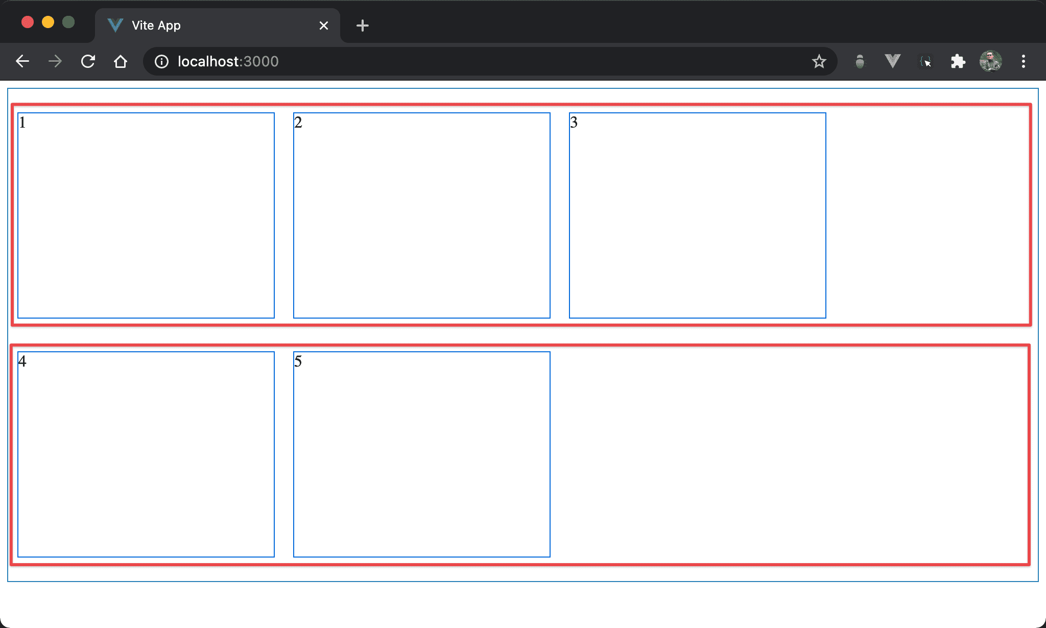
兩條 flex line 之間間隔相等,且最上方與最下方與父層 box 也有間隔,與其他間隔都相等。
<template>
  <div class="box">
    <div class="item">1</div>
    <div class="item">2</div>
    <div class="item">3</div>
    <div class="item">4</div>
    <div class="item">5</div>
  </div>
</template>

<style scoped>
.box {
  display: flex;
  flex-wrap: wrap;
  align-content: space-evenly;
  width: 100%;
  height: 90vh;
}

.item {
  width: 250px;
  height: 200px;
  margin: 10px;
}
</style>
20 行
.box {
  display: flex;
  flex-wrap: wrap;
  align-content: space-evenly;
  width: 100%;
  height: 90vh;
}
設定父層 box style:
space-content: space-evenly:flex line 之間的間隔平分 box 剩餘高度,且首尾間隔高度為一般間隔都相等
Conclusion
- 實務上
space-between與space-evenly較常使用,可平分 box 剩下高度