在 Cross Axis 處理對齊除了 align-items 外,尚有 align-content,兩者非常接近,唯 align-items 是處理 Item 對於 Flex Line,而 align-content 是處理 Flex Line 對於 Box。
Version
CSS 3
flex-start
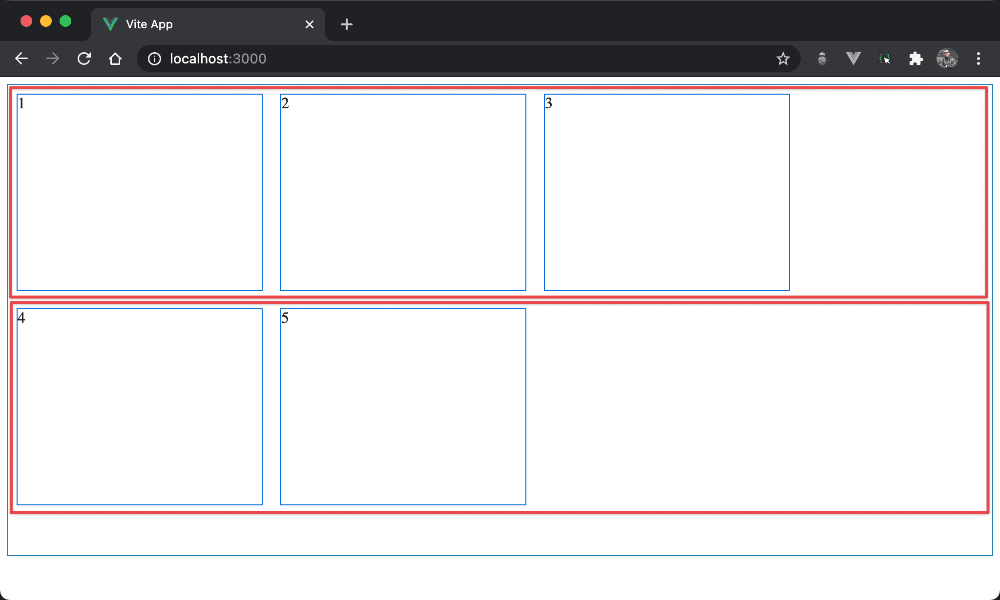
當 Flexbox 換列時,紅色部分為其內部 flex line,可發現 flex line 整體向 cross axis 的起始處對齊,因此看起來像 垂直靠上。
<template>
  <div class="box">
    <div class="item">1</div>
    <div class="item">2</div>
    <div class="item">3</div>
    <div class="item">4</div>
    <div class="item">5</div>
  </div>
</template>

<style scoped>
.box {
  display: flex;
  flex-wrap: wrap;
  align-content: flex-start;
  width: 100%;
  height: 90vh;
}

.item {
  width: 250px;
  height: 200px;
  margin: 10px;
}
</style>
12 行
.box {
  display: flex;
  flex-wrap: wrap;
  align-content: flex-start;
  width: 100%;
  height: 90vh;
}
設定父層 box 的 style:
display: flex:子層 item 使用 Flexboxflex-wrap: wrap:當子層 item 總 width 超越 box 時自動換列align-content: flex-start:flex line 在 cross axis 從起始處對齊,看起來像垂直靠上width: 100%:設定父層 box 的 widthheight: 90vh:設定父層 box 的 height
21 行
.item {
  width: 250px;
  height: 150px;
  margin: 10px;
}
設定子層 item 的 style:
width: 250px:設定子層 item 的 widthheight: 150px:設定子層 item 的 heightmargin: 10px:設定子層 item 的 margin
flex-end
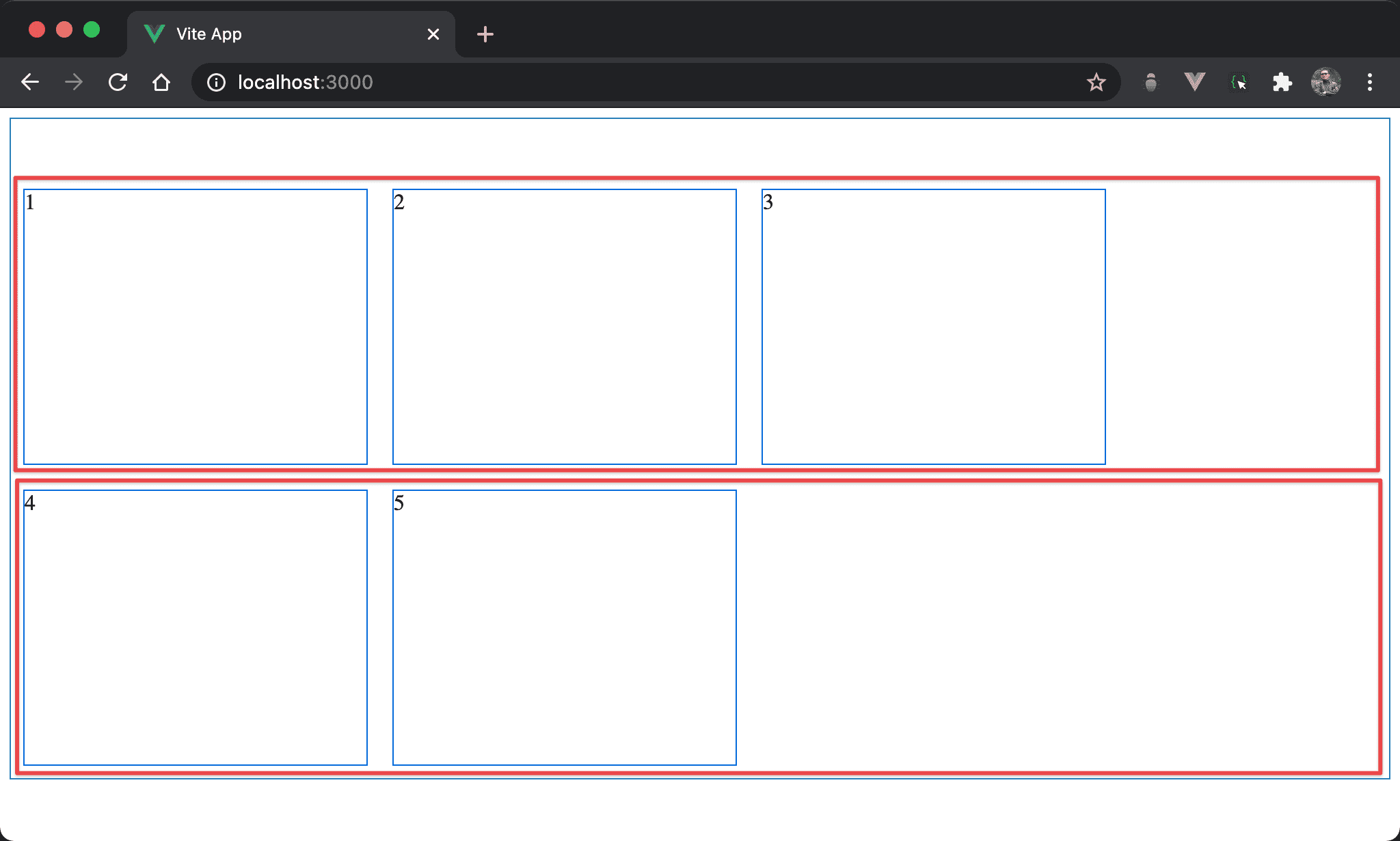
當 Flexbox 換列時,紅色部分為其內部 flex line,可發現 flex line 整體向 cross axis 的結束處對齊,因此看起來像 垂直靠下。
<template>
  <div class="box">
    <div class="item">1</div>
    <div class="item">2</div>
    <div class="item">3</div>
    <div class="item">4</div>
    <div class="item">5</div>
  </div>
</template>

<style scoped>
.box {
  display: flex;
  flex-wrap: wrap;
  align-content: flex-end;
  width: 100%;
  height: 90vh;
}

.item {
  width: 250px;
  height: 200px;
  margin: 10px;
}
</style>
12 行
.box {
  display: flex;
  flex-wrap: wrap;
  align-content: flex-end;
  width: 100%;
  height: 90vh;
}
設定父層 box 的 style:
display: flex:子層 item 使用 Flexboxflex-wrap: wrap:當子層 item 總 width 超越 box 時自動換列align-content: flex-end:flex line 在 cross axis 從結束處對齊,看起來像垂直靠下width: 100%:設定父層 box 的 widthheight: 90vh:設定父層 box 的 height
center
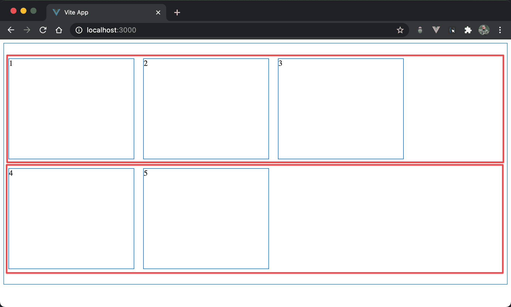
當 Flexbox 換列時,紅色部分為其內部 flex line,可發現 flex line 整體向 cross axis 置中,因此看起來像 垂直置中。
<template>
  <div class="box">
    <div class="item">1</div>
    <div class="item">2</div>
    <div class="item">3</div>
    <div class="item">4</div>
    <div class="item">5</div>
  </div>
</template>

<style scoped>
.box {
  display: flex;
  flex-wrap: wrap;
  align-content: center;
  width: 100%;
  height: 90vh;
}

.item {
  width: 250px;
  height: 200px;
  margin: 10px;
}
</style>
12 行
.box {
  display: flex;
  flex-wrap: wrap;
  align-content: center;
  width: 100%;
  height: 90vh;
}
設定父層 box 的 style:
display: flex:子層 item 使用 Flexboxflex-wrap: wrap:當子層 item 總 width 超越 box 時自動換列align-content: center:flex line 在 cross axis 置中對齊,看起來像垂直置中width: 100%:設定父層 box 的 widthheight: 90vh:設定父層 box 的 height
stretch
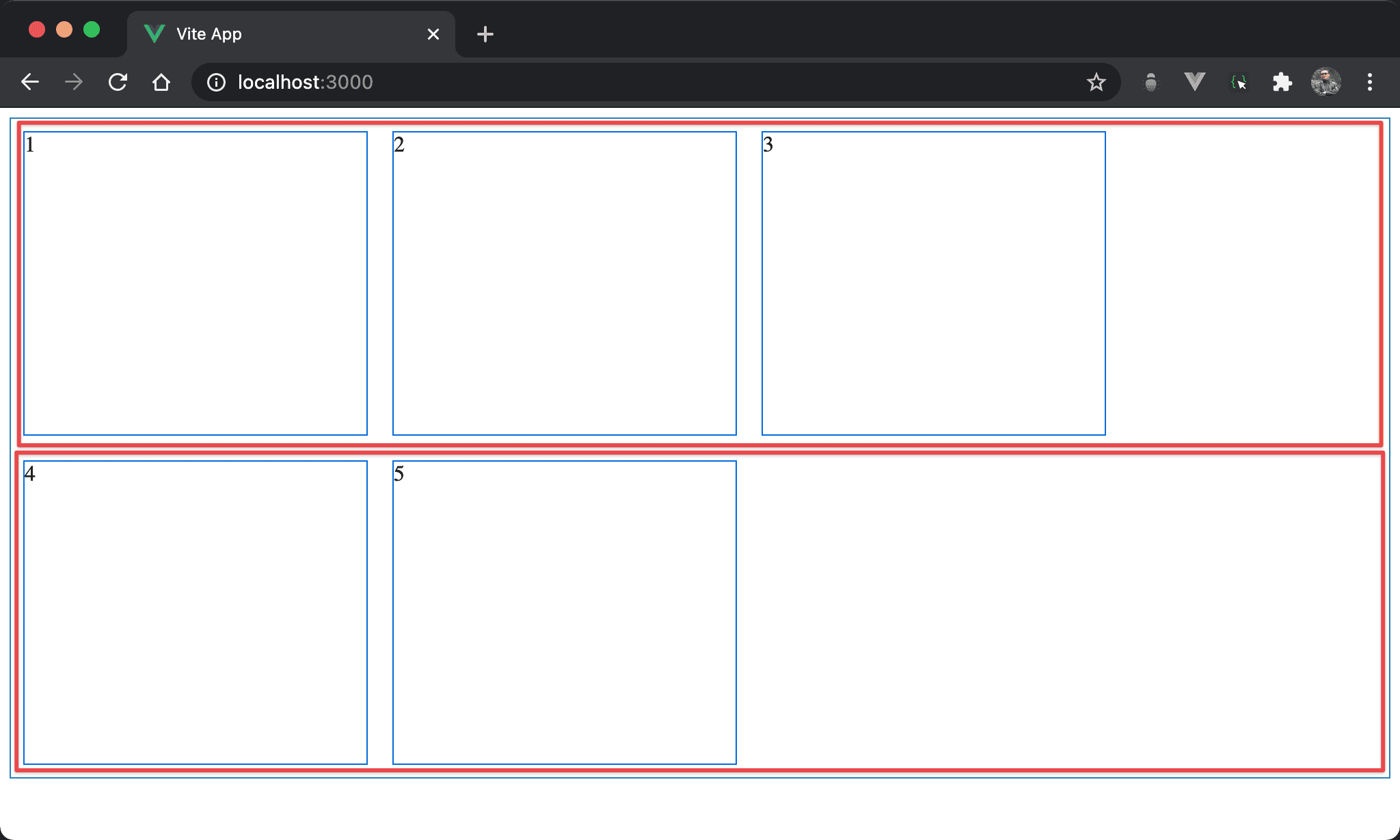
當 Flexbox 換列時,紅色部分為其內部 flex line,可發現 flex line 自動 stretch 成父層 box 高度。
<template>
  <div class="box">
    <div class="item">1</div>
    <div class="item">2</div>
    <div class="item">3</div>
    <div class="item">4</div>
    <div class="item">5</div>
  </div>
</template>

<style scoped>
.box {
  display: flex;
  flex-wrap: wrap;
  align-content: stretch;
  width: 100%;
  height: 90vh;
}

.item {
  width: 250px;
  margin: 10px;
}
</style>
12 行
.box {
  display: flex;
  flex-wrap: wrap;
  align-content: stretch;
  width: 100%;
  height: 90vh;
}
設定父層 box 的 style:
display: flex:子層 item 使用 Flexboxflex-wrap: wrap:當子層 item 總 width 超越 box 時自動換列align-content: stretch:flex line 自動 stretch 成父層 box 高度,這也是align-content的預設 propertywidth: 100%:設定父層 box 的 widthheight: 90vh:設定父層 box 的 height
20 行
.item {
  width: 250px;
  margin: 10px;
}
設定子層 item 的 style:
width: 250px:設定子層 item 的 widthmargin: 10px:設定子層 item 的 margin
重點在子層 item 沒有設定 height,因此 flex line 不會由子層 item 撐開,才可由
align-content: stretch將 flex line 自動 stretch 成與父層 box 同高
Conclusion
align-items:設定各 item 在 cross axis 方向對 flex line 對齊align-content:設定各 flex line 在 cros axis 方向對 box 對齊align-content: stretch需在子層 item 沒有設定 height 前提下才有作用