實務上常遇到一些不規則水平置中需求,如一個為水平置中,另一個卻水平靠右。
Version
CSS 3
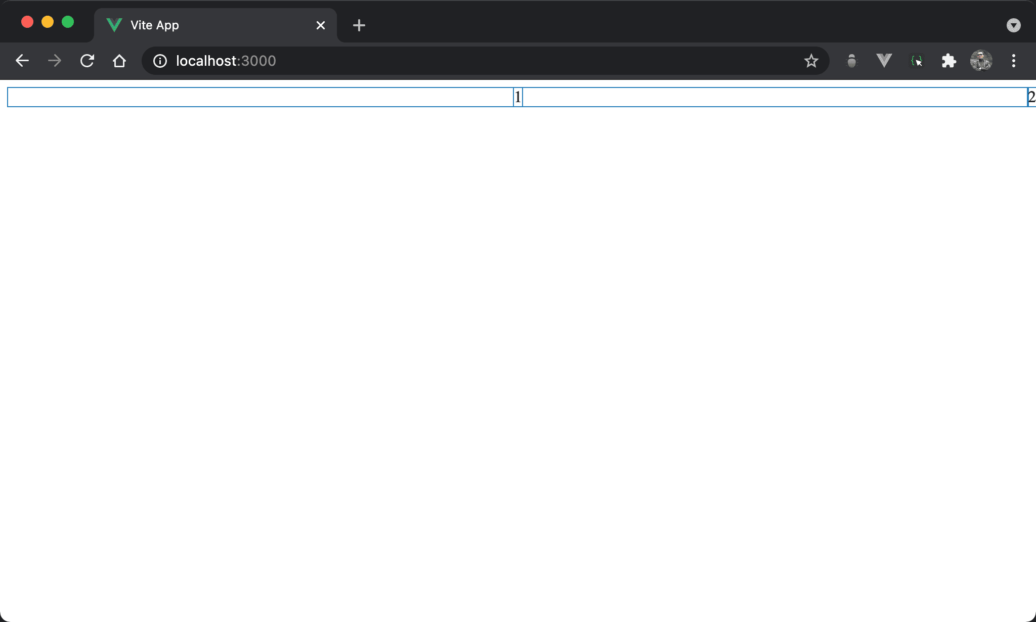
父層控制水平靠右

1 水平置中,但 2 則水平靠右。
<template>
  <div class="box">
    <div class="item1">1</div>
    <div>2</div>
  </div>
</template>

<style scoped>
.box {
  display: flex;
  justify-content: flex-end;
}

.item1 {
  width: fit-content;
  position: absolute;
  left: 0;
  right: 0;
  margin: auto;
}
</style>
第 9 行
.box {
  display: flex;
  justify-content: flex-end;
}
由父層控制水平靠右:
display: flex:子層 item 使用 Flexboxjustify-content: flex-end:直接將子層 item 水平靠右
14 行
.item1 {
  width: fit-content;
  position: absolute;
  left: 0;
  right: 0;
  margin: auto;
}
子層獨立新 layer 控制水平置中:
width: fit-content:width 與 content 同寬,但仍維持其 block 特性,讓margin: auto有操作空間position: absolute:使用 absolute position,因為其父層皆沒設定定位,相當於定位在window,亦可使用position: fixedleft: 0、right: 0:要使用margin: auto水平置中,前提必須要有空間使其調整 margin,left: 0於左側邊緣緊貼 browser,right: 0於右側邊緣緊貼 browser,因此相當於架構出無形的矩形空間,只是受限於width: fit-content只顯示與 content 同寬部分,剩下空間可由margin: auto自由發揮而水平置中margin: auto:自動調整左右 margin 而水平置中
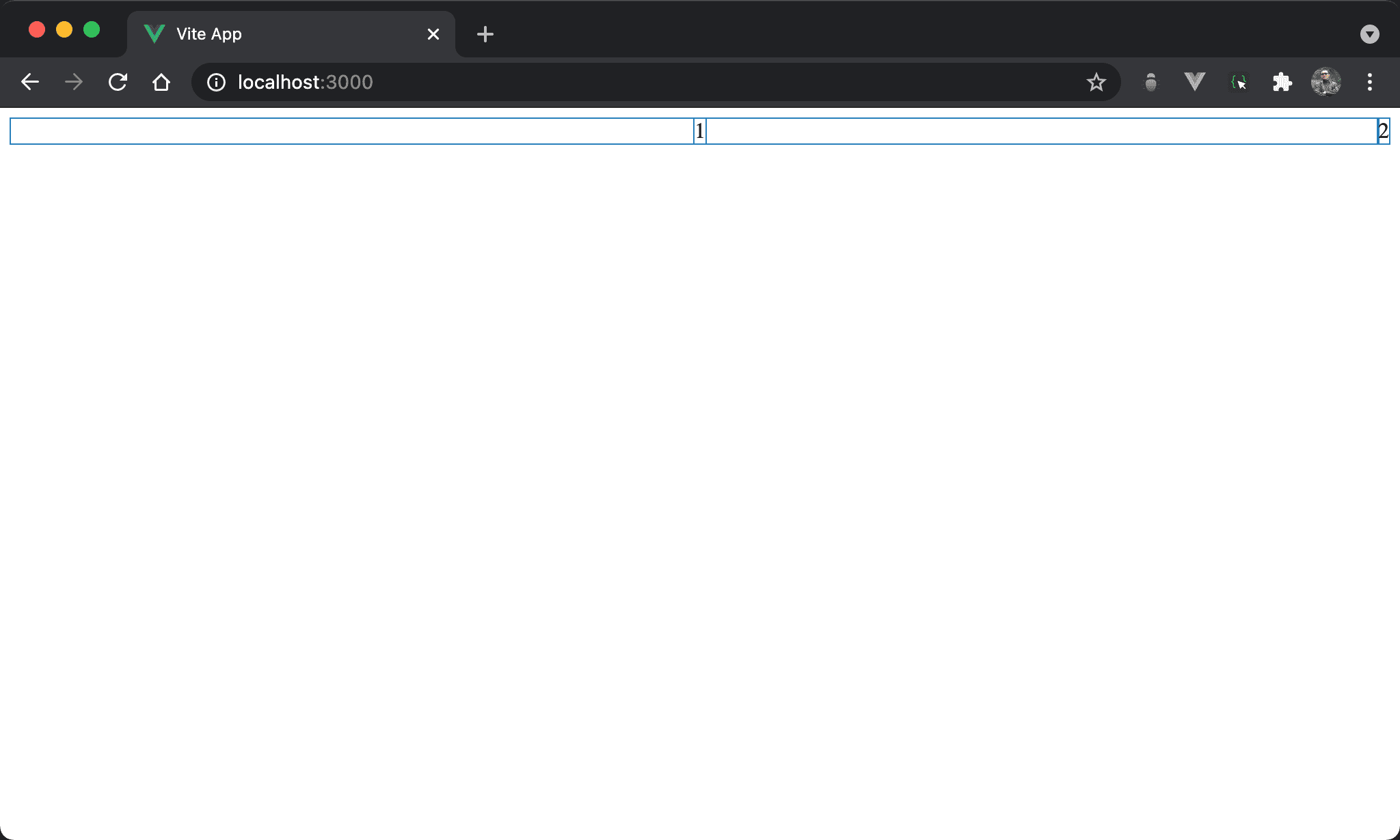
父層控制水平置中
1 水平置中,但 2 則水平靠右。
<template>
  <div class="box">
    <div>1</div>
    <div class="item2">2</div>
  </div>
</template>

<style scoped>
.box {
  display: flex;
  justify-content: center;
}

.item2 {
  width: fit-content;
  position: absolute;
  left: 0;
  right: 0;
  margin-left: auto;
}
</style>
第 9 行
.box {
  display: flex;
  justify-content: center;
}
由父層控制水平置中:
display: flex:子層 item 使用 Flexboxjustify-content: center:直接將子層 item 水平置中
14 行
.item2 {
  width: fit-content;
  position: absolute;
  left: 0;
  right: 0;
  margin-left: auto;
}
子層獨立新 layer 控制水平靠右:
width: fit-content:width 與 content 同寬,但仍維持其 block 特性,讓margin-left: auto有操作空間position: absolute:使用 absolute position,因為其父層皆沒設定定位,相當於定位在window,亦可使用position: fixedleft: 0、right: 0:要使用margin-left: auto水平靠右,前提必須要有空間使其調整 margin,left: 0於左側邊緣緊貼 browser,right: 0於右側邊緣緊貼 browser,因此相當於架構出無形的矩形空間,只是受限於width: fit-content只顯示與 content 同寬部分,剩下空間可由margin-left:auto自由發揮而水平靠右margin-left: auto:自動調整 left margin 而水平靠右

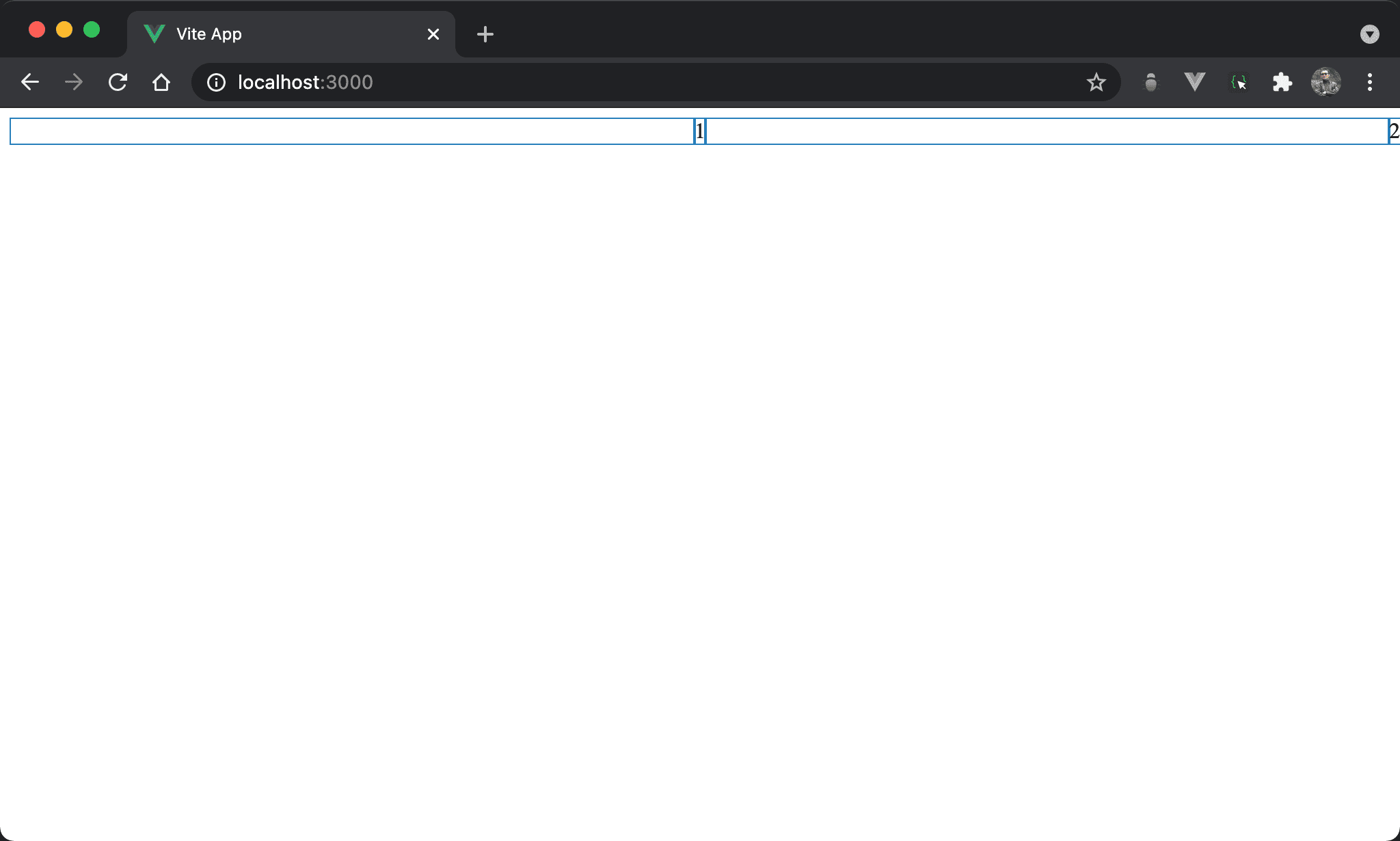
1 水平置中,但 2 則水平靠右。
<template>
  <div class="box">
    <div>1</div>
    <div class="item2">2</div>
  </div>
</template>

<style scoped>
.box {
  display: flex;
  justify-content: space-around;
}

.item2 {
  width: fit-content;
  position: absolute;
  left: 0;
  right: 0;
  margin-left: auto;
}
</style>
第 9 行
.box {
  display: flex;
  justify-content: space-around;
}
由父層控制水平置中:
display: flex:子層 item 使用 Flexboxjustify-content: space-around:原本與space-between一樣將剩餘寬度自動平分給 item 間剩餘空間,但不同的是space-around會考慮 item 的前後空間,因此平分後看起來像水平置中
14 行
.item2 {
  width: fit-content;
  position: absolute;
  left: 0;
  right: 0;
  margin-left: auto;
}
子層獨立新 layer 控制水平靠右:
width: fit-content:width 與 content 同寬,但仍維持其 block 特性,讓margin-left: auto有操作空間position: absolute:使用 absolute position,因為其父層皆沒設定定位,相當於定位在window,亦可使用position: fixedleft: 0、right: 0:要使用margin-left: auto水平靠右,前提必須要有空間使其調整 margin,left: 0於左側邊緣緊貼 browser,right: 0於右側邊緣緊貼 browser,因此相當於架構出無形的矩形空間,只是受限於width: fit-content只顯示與 content 同寬部分,剩下空間可由margin-left: auto自由發揮而水平靠右margin-left: auto:自動調整 left margin 而水平靠右

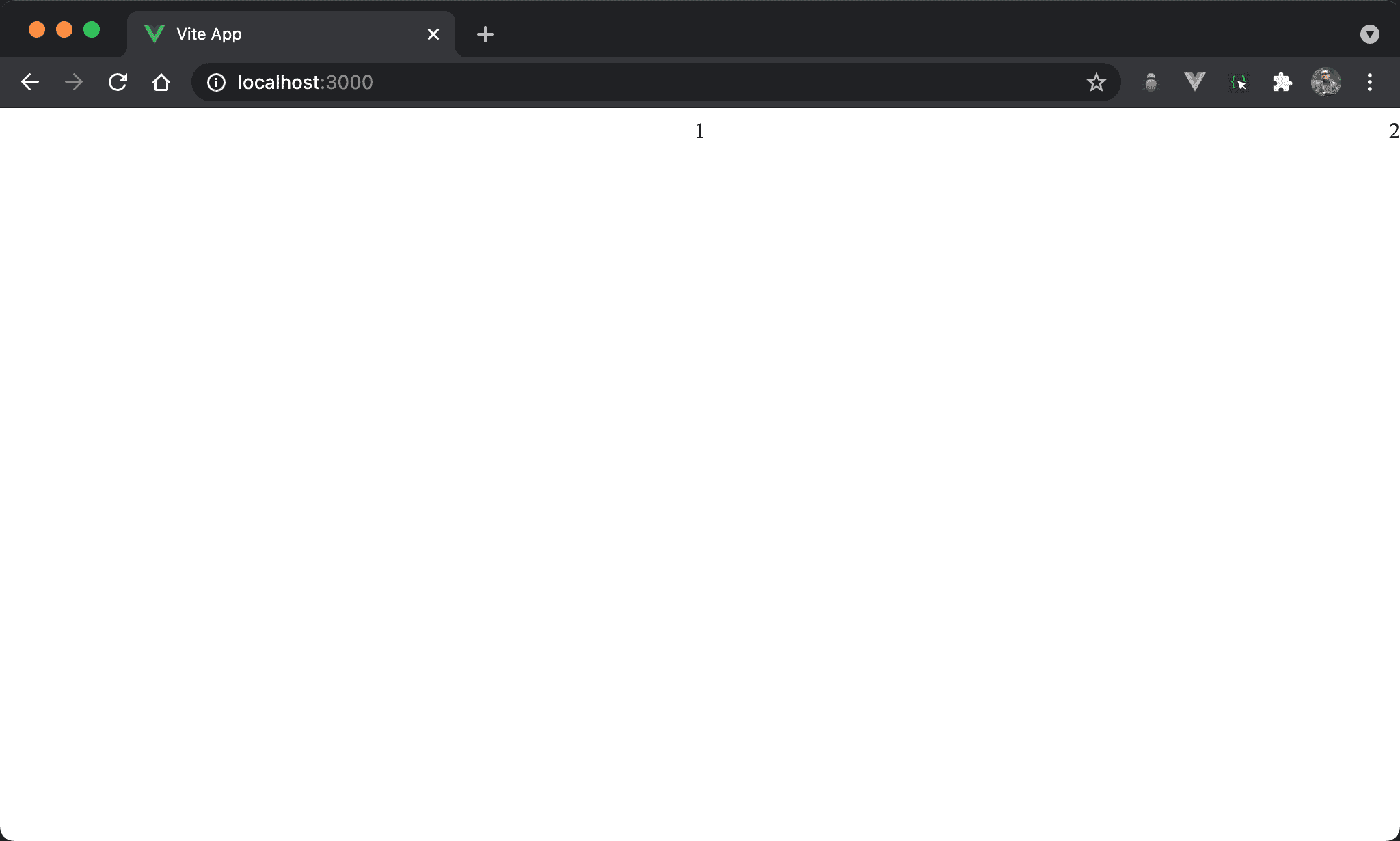
1 水平置中,但 2 則水平靠右。
<template>
  <div class="box">
    <div>1</div>
    <div class="item2">2</div>
  </div>
</template>

<style scoped>
.box {
  display: flex;
  justify-content: space-evenly;
}

.item2 {
  width: fit-content;
  position: absolute;
  left: 0;
  right: 0;
  margin-left: auto;
}
</style>
第 9 行
.box {
  display: flex;
  justify-content: space-evenly;
}
由父層控制水平置中:
display: flex:子層 item 使用 Flexboxjustify-content: space-evenly:原本與space-between一樣將剩餘寬度自動平分給 item 間剩餘空間,但不同的是space-evenly會考慮 item 的前後空間,因此平分後看起來像水平置中
space-around與space-evenly差異是儘管包含 item 前後空間,但space-evenly是真正evenly等寬,但space-arounditem 間空間會是前後寬度的兩倍,但目前因為只有一個子層 item,因此space-around與space-evenly結果相同都是水平置中
14 行
.item2 {
  width: fit-content;
  position: absolute;
  left: 0;
  right: 0;
  margin-left: auto;
}
子層獨立新 layer 控制水平靠右:
width: fit-content:width 與 content 同寬,但仍維持其 block 特性,讓margin-left: auto有操作空間position: absolute:使用 absolute position,因為其父層皆沒設定定位,相當於定位在window,亦可使用position: fixedleft: 0、right: 0:要使用margin-left: auto水平靠右,前提必須要有空間使其調整 margin,left: 0於左側邊緣緊貼 browser,right: 0於右側邊緣緊貼 browser,因此相當於架構出無形的矩形空間,只是受限於width: fit-content只顯示與 content 同寬部分,剩下空間可由margin-left: auto自由發揮而水平靠右margin-left: auto:自動調整 left margin 而水平靠右
子層控制水平靠右

1 水平置中,但 2 則水平靠右。
<template>
  <div class="box">
    <div class="item1">1</div>
    <div class="item2">2</div>
  </div>
</template>

<style scoped>
.box {
  display: flex;
}

.item1 {
  width: fit-content;
  position: absolute;
  left: 0;
  right: 0;
  margin: auto;
}

.item2 {
  margin-left: auto;
}
</style>
第 9 行
.box {
  display: flex;
}
display: flex:為了要使子層 item 能與 conent 同寬有 margin 可操作水平靠右
21 行
.item2 {
  margin-left: auto;
}
由子層控制水平靠右:
margin-left: auto:自動調整 left margin 而水平靠右
13 行
.item1 {
  width: fit-content;
  position: absolute;
  left: 0;
  right: 0;
  margin: auto;
}
子層獨立新 layer 控制水平置中:
width: fit-content:width 與 content 同寬,但仍維持其 block 特性,讓margin: auto有操作空間position: absolute:使用 absolute position,因為其父層皆沒設定定位,相當於定位在window,亦可使用position: fixedleft: 0、right: 0:要使用margin: auto水平置中,前提必須要有空間使其調整 margin,left-0於左側邊緣緊貼 browser,right-0於右側邊緣緊貼 browser,因此相當於架構出無形的矩形空間,只是受限於width: fit-content只顯示與 content 同寬部分,剩下空間可由margin: auto自由發揮而水平置中margin: auto:自動調整左右 margin 而水平置中
1 水平置中,但 2 則水平靠右。
<template>
  <div class="box">
    <div class="item1">1</div>
    <div class="empty"/>
    <div>2</div>
  </div>
</template>

<style scoped>
.box {
  display: flex;
}

.item1 {
  width: fit-content;
  position: absolute;
  left: 0;
  right: 0;
  margin: auto;
}

.empty {
  flex-grow: 1;
}

</style>
10 行
.box {
  display: flex;
}
display: flex:子層 item 使用 Flexbox
22 行
.empty {
  flex-grow: 1;
}
設定子層 empty style:
flex-grow:表示空白部分剩餘 width 將由此子層 item 平分,因此看起來為水平靠右
14 行
.item1 {
  width: fit-content;
  position: absolute;
  left: 0;
  right: 0;
  margin: auto;
}
子層獨立新 layer 控制水平置中:
width: fit-content:width 與 content 同寬,但仍維持其 block 特性,讓margin: auto有操作空間position: absolute:使用 absolute position,因為其父層皆沒設定定位,相當於定位在window,亦可使用position: fixedleft: 0、right: 0:要使用margin: auto水平置中,前提必須要有空間使其調整 margin,left: 0於左側邊緣緊貼 browser,right: 0於右側邊緣緊貼 browser,因此相當於架構出無形的矩形空間,只是受限於width: fit-content只顯示與 content 同寬部分,剩下空間可由margin: auto自由發揮而水平置中margin: auto:自動調整左右 margin 而水平置中
子層控制水平置中

1 水平置中,但 2 則水平靠右。
<template>
  <div class="box">
    <div class="item1">1</div>
    <div class="item2">2</div>
  </div>
</template>

<style scoped>
.box {
  display: flex;
}

.item1 {
  margin: auto;
}

.item2 {
  width: fit-content;
  position: absolute;
  left: 0;
  right: 0;
  margin-left: auto;
}
</style>
第 9 行
.box {
  display: flex;
}
display: flex:為了要使子層 item 能與 conent 同寬有 margin 可操作水平靠右
13 行
.item1 {
  margin: auto;
}
由子層控制水平置中:
margin: auto:自動調整左右 margin 而水平置中
17 行
.item2 {
  width: fit-content;
  position: absolute;
  left: 0;
  right: 0;
  margin-left: auto;
}
子層獨立新 layer 控制水平靠右:
width: fit-content:width 與 content 同寬,但仍維持其 block 特性,讓margin-left: auto有操作空間position: absolute:使用 absolute position,因為其父層皆沒設定定位,相當於定位在window,亦可使用position: fixedleft: 0、right: 0:要使用margin-left: auto水平靠右,前提必須要有空間使其調整 margin,left: 0於左側邊緣緊貼 browser,right: 0於右側邊緣緊貼 browser,因此相當於架構出無形的矩形空間,只是受限於width: fit-content只顯示與 content 同寬部分,剩下空間可由margin-left: auto自由發揮而水平靠右margin-left: auto:自動調整 left margin 而水平靠右
1 水平置中,但 2 則水平靠右。
<template>
  <div class="box">
    <div class="empty"/>
    <div>1</div>
    <div class="empty"/>
    <div class="item2">2</div>
  </div>
</template>

<style scoped>
.box {
  display: flex;
}

.empty {
  flex-grow: 1;
}

.item2 {
  width: fit-content;
  position: absolute;
  left: 0;
  right: 0;
  margin-left: auto;
}
</style>
11 行
.box {
  display: flex;
}
display: flex:子層 item 使用 Flexbox
15 行
.empty {
  flex-grow: 1;
}
設定子層 empty style:
flex-grow: 1:表示空白部分剩餘 width 將由子層 item 平分,因此看起來為水平置中
19 行
.item2 {
  width: fit-content;
  position: absolute;
  left: 0;
  right: 0;
  margin-left: auto;
}
子層獨立新 layer 控制水平靠右:
width: fit-content:width 與 content 同寬,但仍維持其 block 特性,讓margin-left: auto有操作空間position: absolute:使用 absolute position,因為其父層皆沒設定定位,相當於定位在window,亦可使用position: fixedleft: 0、right: 0:要使用margin-left: auto水平靠右,前提必須要有空間使其調整 margin,left: 0於左側邊緣緊貼 browser,right: 0於右側邊緣緊貼 browser,因此相當於架構出無形的矩形空間,只是受限於width: fit-content只顯示與 content 同寬部分,剩下空間可由margin-left: auto自由發揮而水平靠右margin-left: auto:自動調整 left margin 而水平靠右
兩個子層

1 水平置中,但 2 則水平靠右。
<template>
  <div class="item1">1</div>
  <div class="item2">2</div>
</template>

<style scoped>
.item1 {
  width: fit-content;
  position: absolute;
  left: 0;
  right: 0;
  margin: auto;
}

.item2 {
  width: fit-content;
  margin-left: auto;
}
</style>
第 7 行
.item1 {
  width: fit-content;
  position: absolute;
  left: 0;
  right: 0;
  margin: auto;
}
子層獨立新 layer 控制水平置中:
width: fit-content:width 與 content 同寬,但仍維持其 block 特性,讓margin: auto有操作空間position: absolute:使用 absolute position,因為其父層皆沒設定定位,相當於定位在window,亦可使用position: fixedleft: 0、right: 0:要使用margin: auto水平置中,前提必須要有空間使其調整 margin,left: 0於左側邊緣緊貼 browser,right: 0於右側邊緣緊貼 browser,因此相當於架構出無形的矩形空間,只是受限於width: fit-content只顯示與 content 同寬部分,剩下空間可由margin: auto自由發揮而水平置中margin: auto:自動調整左右 margin 而水平置中
15 行
.item2 {
  width: fit-content;
  margin-left: auto;
}
子層控制水平靠右
width: fit-content:width 與 content 同寬,但仍維持其 block 特性,讓margin-left: auto有操作空間margin-left: auto:自動調整 left margin 而水平靠右
1 水平置中,但 2 則水平靠右。
<template>
  <div class="item1">1</div>
  <div class="item2">2</div>
</template>

<style scoped>
.item1 {
  width: fit-content;
  position: absolute;
  left: 0;
  right: 0;
  margin: auto;
}

.item2 {
  width: fit-content;
  position: absolute;
  left: 0;
  right: 0;
  margin-left: auto;
}
</style>
第 7 行
.item1 {
  width: fit-content;
  position: absolute;
  left: 0;
  right: 0;
  margin: auto;
}
子層獨立新 layer 控制水平置中:
width: fit-content:width 與 content 同寬,但仍維持其 block 特性,讓margin: auto有操作空間position: absolute:使用 absolute position,因為其父層皆沒設定定位,相當於定位在window,亦可使用position: fixedleft: 0、right: 0:要使用margin: auto水平置中,前提必須要有空間使其調整 margin,left: 0於左側邊緣緊貼 browser,right: 0於右側邊緣緊貼 browser,因此相當於架構出無形的矩形空間,只是受限於width: fit-content只顯示與 content 同寬部分,剩下空間可由margin: auto自由發揮而水平置中margin: auto:自動調整左右 margin 而水平置中
15 行
.item2 {
  width: fit-content;
  position: absolute;
  left: 0;
  right: 0;
  margin-left: auto;
}
子層獨立新 layer 控制水平靠右:
width: fit-content:width 與 content 同寬,但仍維持其 block 特性,讓margin: auto有操作空間position: absolute:使用 absolute position,因為其父層皆沒設定定位,相當於定位在window,亦可使用position: fixedleft: 0、right: 0:要使用margin-left: auto水平靠右,前提必須要有空間使其調整 margin,left: 0於左側邊緣緊貼 browser,right: 0於右側邊緣緊貼 browser,因此相當於架構出無形的矩形空間,只是受限於width: fit-content只顯示與 content 同寬部分,剩下空間可由margin-left: auto自由發揮而水平靠右margin-left: auto:自動調整 left margin 而水平靠右
Conclusion
- 若兩個 item 都在同一個 layer,因為會互相影響,很難做到絕對一個水平置中,另一個水平靠右,唯有將其中一個 item 獨立成新 layer,或者兩個都獨立成新 layer 才有可能