實務上有時會需要三角形加以裝飾,此時不必使用圖片,只要使用 CSS 就可繪製三角形。
Version
CSS 3
Border
<template>
<div class="triangle"/>
</template>
<style>
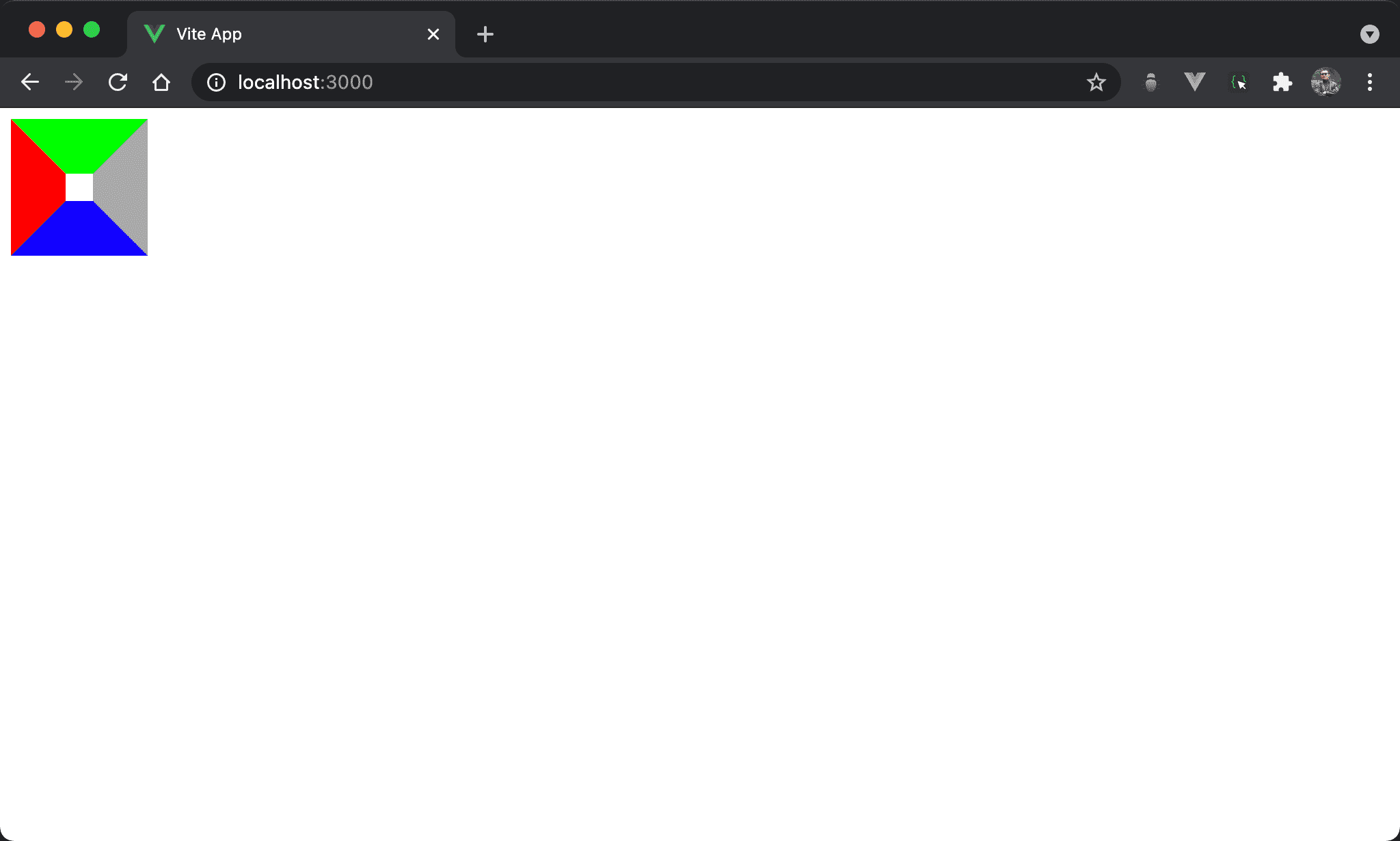
.triangle {
width: 20px;
height: 20px;
border-top: 40px solid #0f0;
border-bottom: 40px solid #00f;
border-left: 40px solid #f00;
border-right: 40px solid #aaa;
}
</style>
若 <div> 的四面都加上 border 且顏色不同,會發現 border 交界處出現類似三角形的斜邊。
Zero Width / Height
<template>
<div class="triangle"/>
</template>
<style>
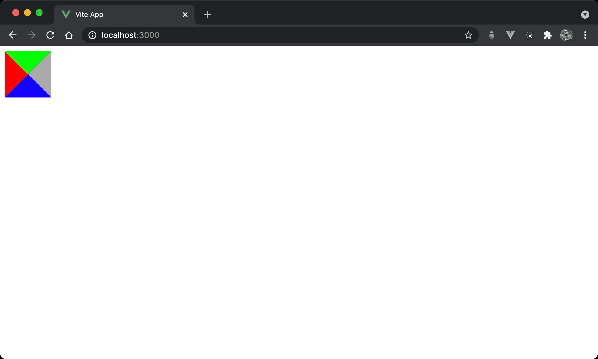
.triangle {
width: 0;
height: 0;
border-top: 40px solid #0f0;
border-bottom: 40px solid #00f;
border-left: 40px solid #f00;
border-right: 40px solid #aaa;
}
</style>
進一步將 width 與 height 都設定為 0 之後,可發現 border 可形成 4 個三角形。
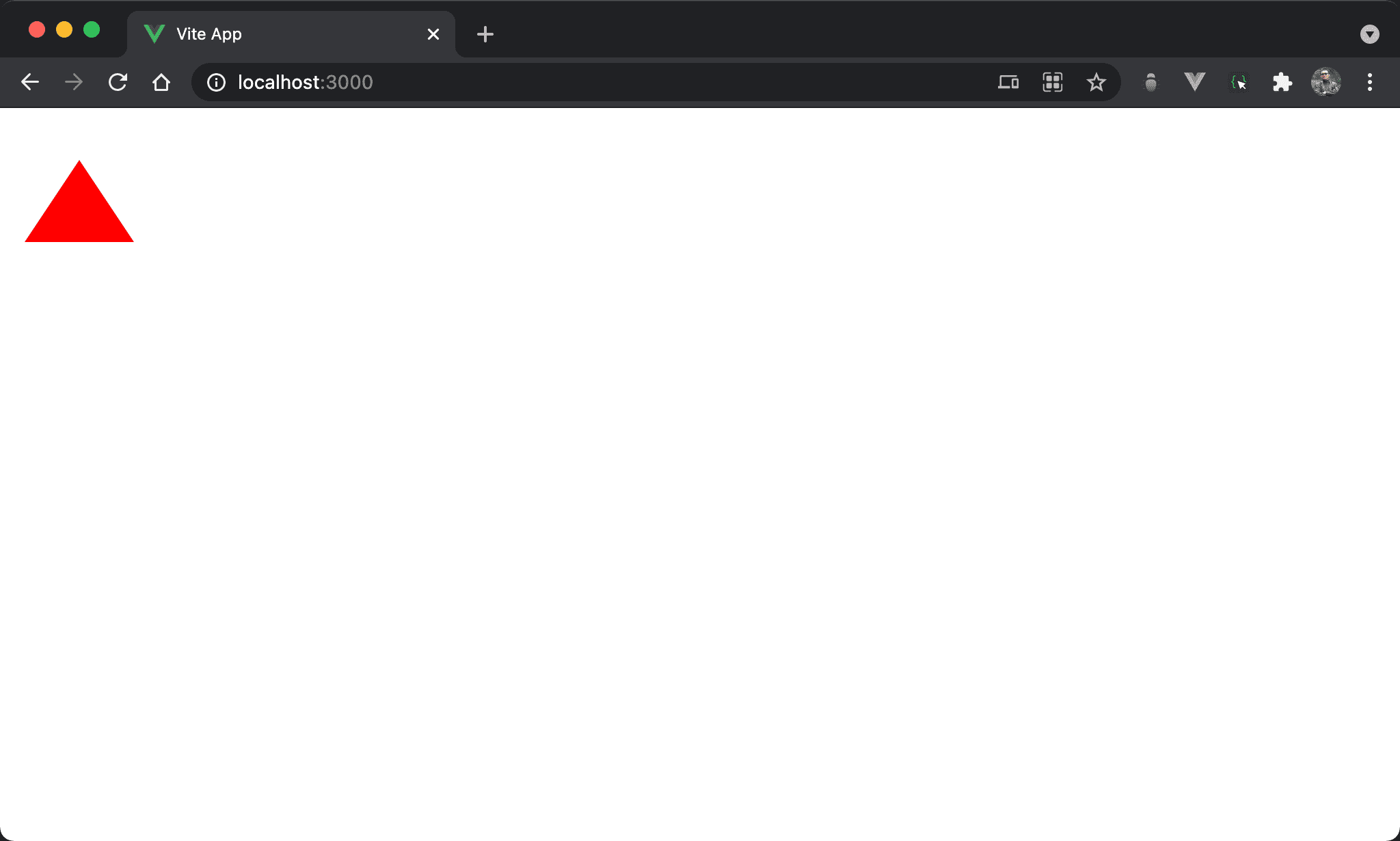
Triangle
<template>
<div class="triangle"/>
</template>
<style>
.triangle {
width: 0;
height: 0;
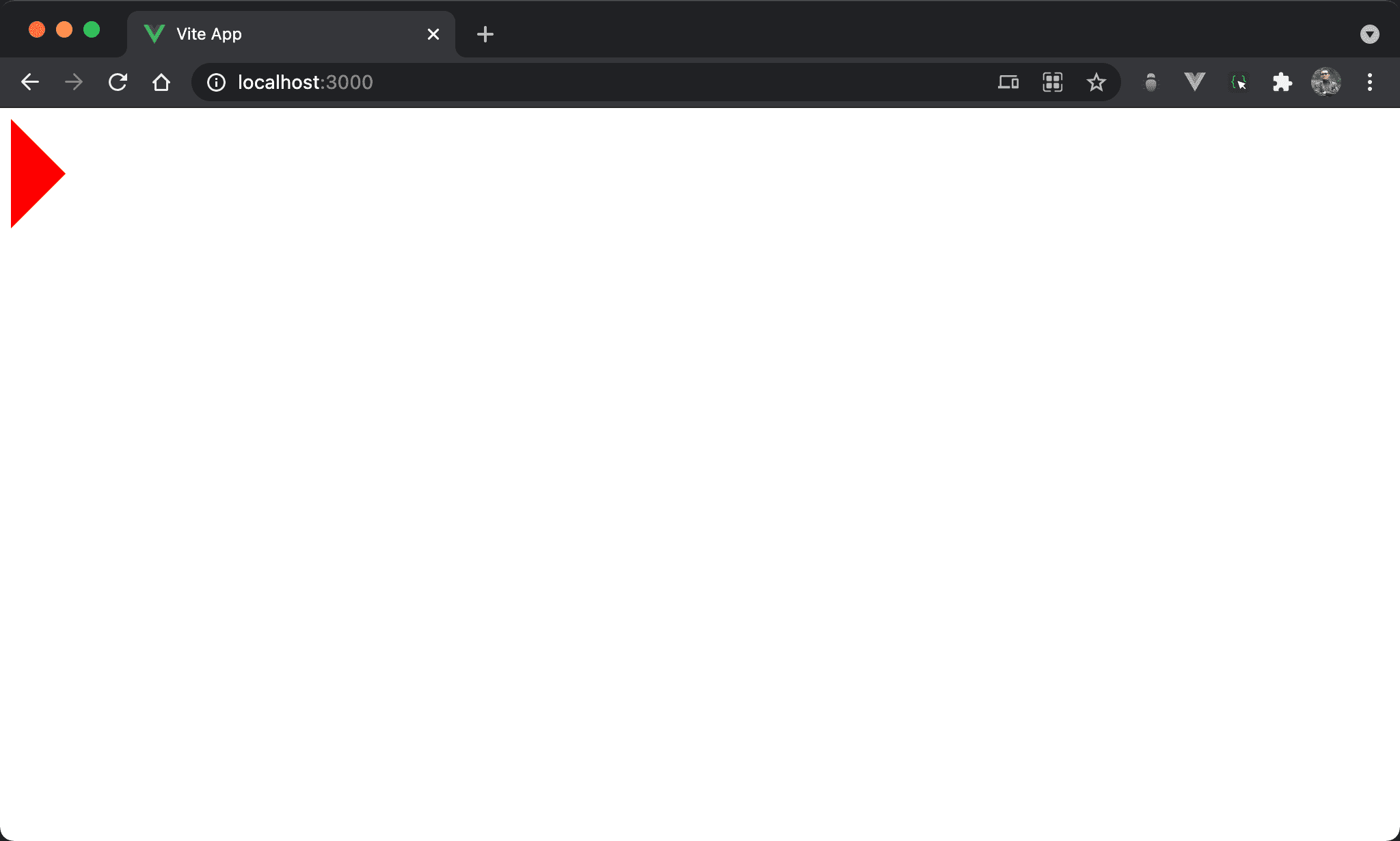
border-right: 40px solid transparent;
border-top: 40px solid transparent;
border-bottom: 40px solid transparent;
border-left: 40px solid #f00;
}
</style>
將 border-right、border-top、border-bottom 顏色均設定成 transparent
如此將顯示單一三角形。
Regular Triangle
<template>
<div class="triangle"/>
</template>
<style>
.triangle {
width: 0;
height: 0;
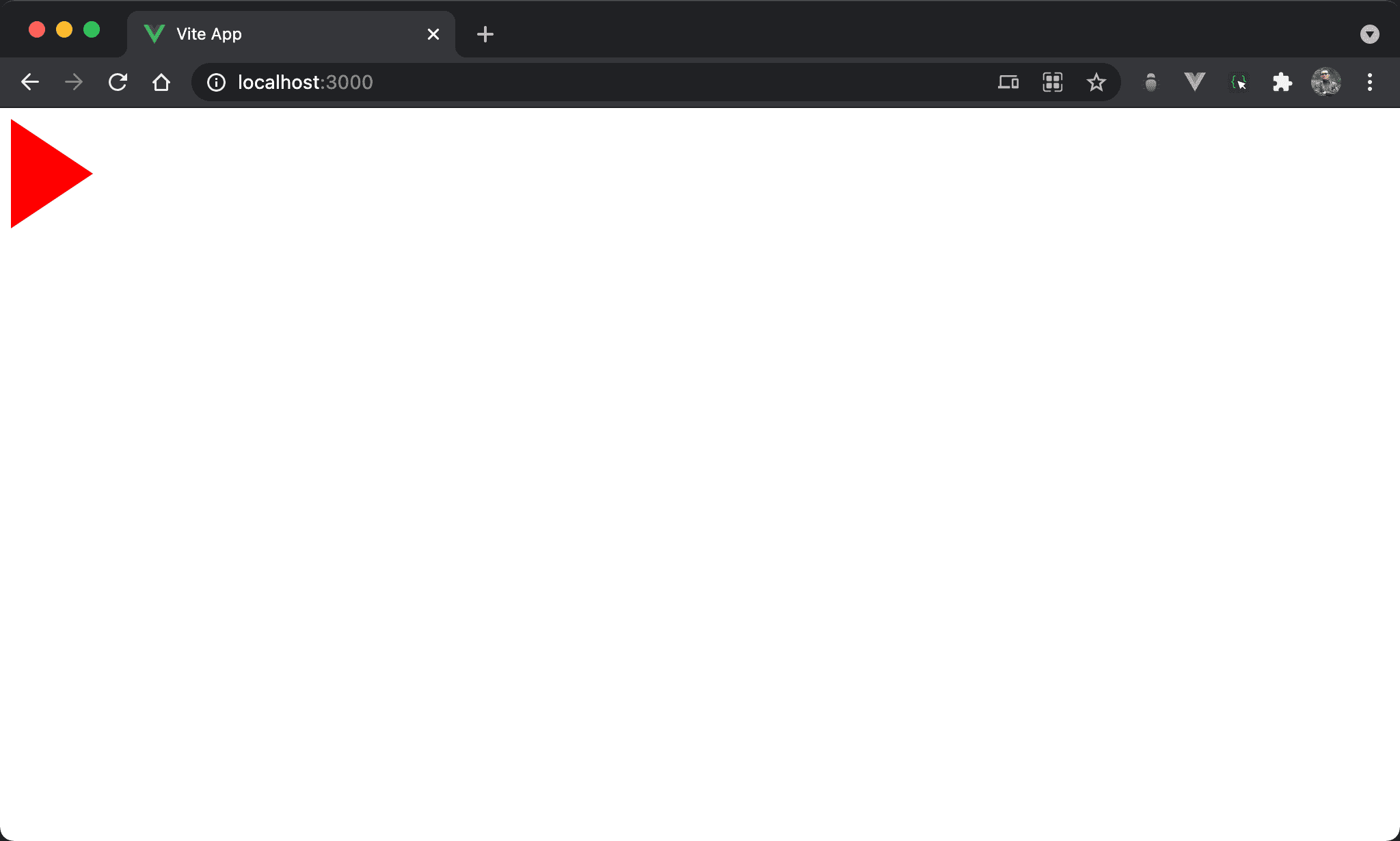
border-right: 40px solid transparent;
border-top: 40px solid transparent;
border-bottom: 40px solid transparent;
border-left: 60px solid #f00;
}
</style>
若想調整三角形大小,可調整 border-left 的 width。
Rotate
<template>
  <div class="triangle"/>
</template>

<style>
.triangle {
  width: 0;
  height: 0;
  border-top: 40px solid transparent;
  border-bottom: 40px solid transparent;
  border-left: 60px solid #f00;
  transform: rotate(-90deg);
}
</style>
可使用 transform() 選轉三角形。
Conclusion
- 透過 border 特殊的性質,可使用 CSS 巧妙的繪製出三角形